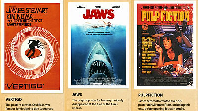
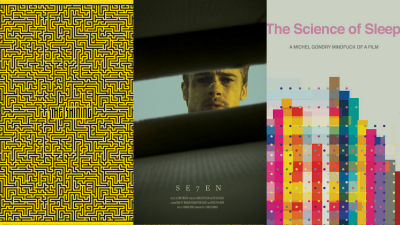
Why are 'Trajan' fonts used in movie posters more often?
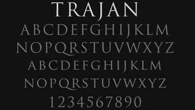
A graphic designer who has seen more than 16,000 movie posters explains why the font " Trajan (Trayjean / Torajan)" is used in so many posters on the official channel of Vox It is open to the public.
How one typeface took over movie posters - YouTube
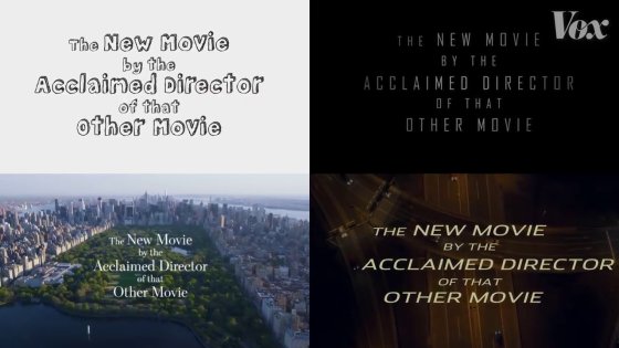
When going to the cinema, there is sometimes a phrase such as "Director's new work that received praise in that movie!" At the beginning of the trailer. If it is an example of an image, there is no doubt that it is a comedy movie first.
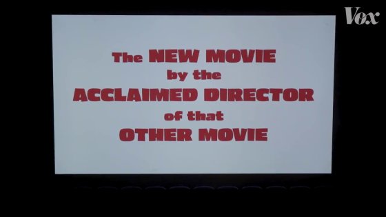
This is an action movie ......
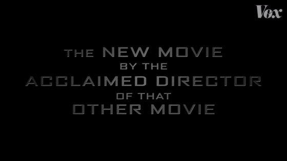
This is Love Romance. Even if there is no music, it will convey some kind of movie just by fonts.
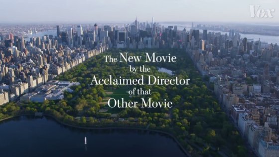
Then, as for this font, I can not imagine the image at once.
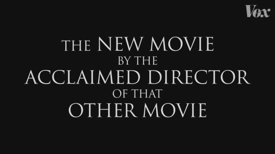
This font is a font called " Trajan " ......
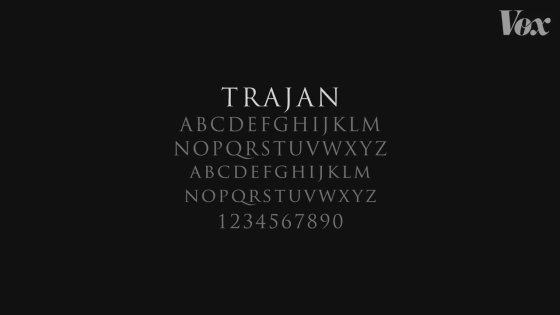
It is used everywhere regardless of genre.
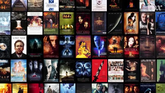
It is the graphic designer Eve Peters who tells what kind of font it is "Trajan". In the past ten years Mr. Petters has written blogs on typography and typography, and in the process he has looked over the movie poster for 100 movies a month, totaling 16,000 copies,
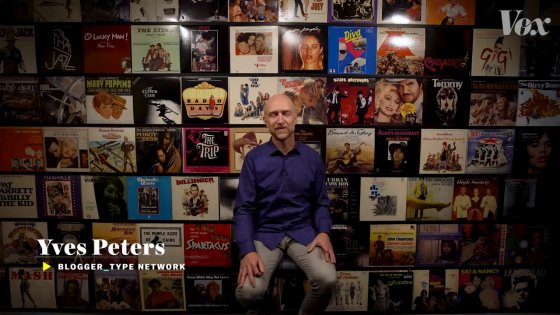
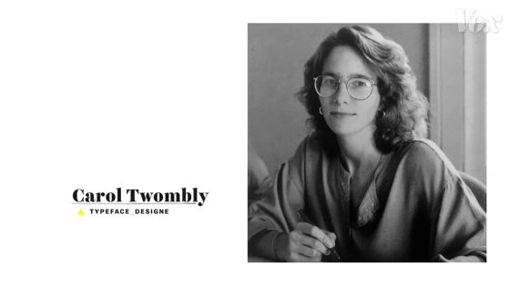
Mr. Peters noticed that Trajan has been used for 20 to 30 years here. That's why Trajan is a font that designer Carroll Tombrie invented in 1989.
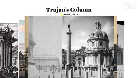
Mr. Thonburi designed "Trajan" based on the letter of the inscription of the memorial pillar of Trajan in Rome.
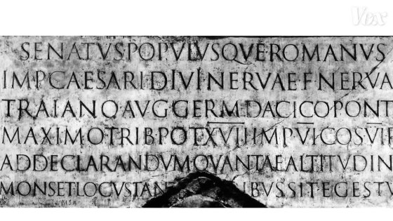
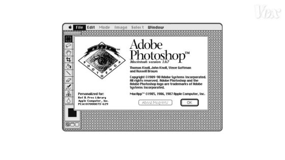
Trajan has been used for Adobe Photoshop etc. and spread.
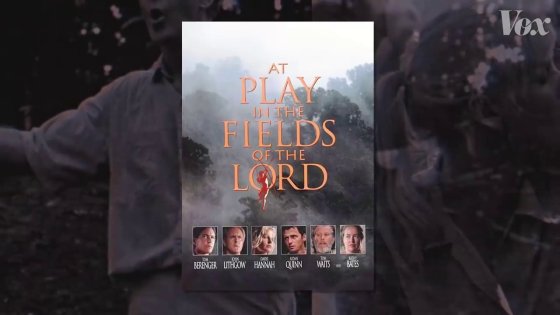
The movie poster used Trajan for the first time was the adventure movie " At Play in the Fields of the Lord " published in 1991.
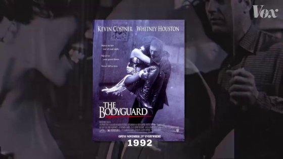
In 1992, " Bodyguard " co-starred Kevin Costner and Whitney Houston ... ...
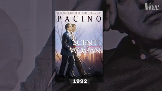
Al Pacino is used as "Academy starring actor award for" St. of Woman / Aroma of Dreams ".
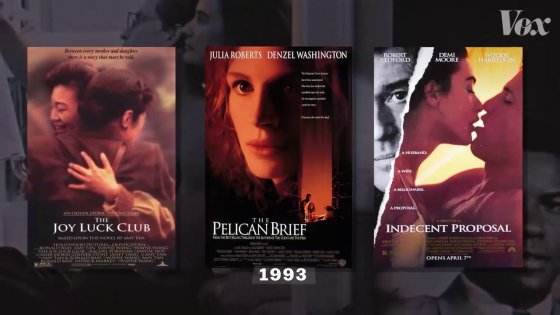
Furthermore, in 1993, works using " Joy Luck Club " " Pelican Document " " Condition of Happiness " and Trajan hit.
In 1994 it will be used in many works.
Originally it was often used for epic work, such as epic stories and the story of people who overcome the difficulty, but eventually, it became "standard font" to the extent that the expression "movie poster Arial " applies.
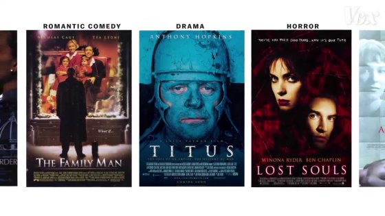
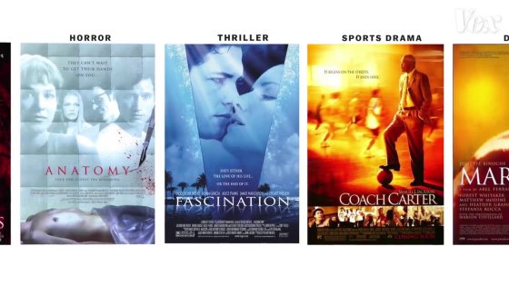
When you want to finish the poster design quickly Trajan was useful, Peters said. In other words, it is thought that the situation "born to be Trajan is true" was born, and it was in the "Trajan" case for the time being.

However, when Trajan overflows into a movie poster of every genre, it will become difficult to use Trajan this time as a major episode. For this reason, Trajan is no longer used in major works, and mainly horror movies and B class movies will be the center.
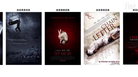
When it comes to this state, "It's not a big movie, but only the poster looks good". It seems to be said that it is the tragedy because Trajan did not have a fixed image.

Mr. Petters pointed out that "Trajan" shows the downside of using digital fonts, as the rise and fall of the fruit. When character input is digitized in poster design, fonts can be freely changed afterwards.
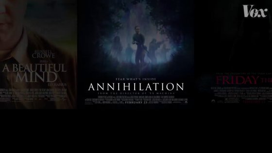
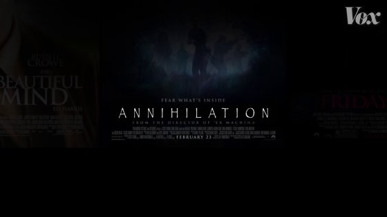
However, as I used to write letters by hand drawing or lettering once, it is a claim that there was personality in font depending on the work.
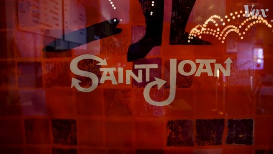
There was no such thing as "comparing a movie poster" and the movie poster was not called "genre-specific font" either.
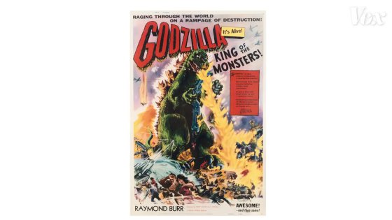
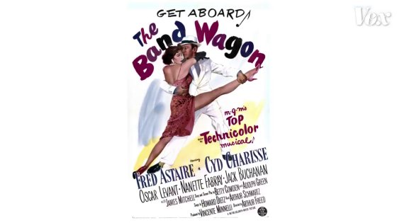
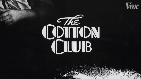
However, when a genre-specific font is created, it becomes easy to be conveyed to those who are watching that "If such fonts are used, it is this kind of style".
In the music world there are people saying "After the Beatles, good things do not come out ..."
"No, after Mozart, there are people who say that there are no good ones."

But, in fact, many interesting new music is born. This also applies to movie posters. "There are times when I miss memorizing the age of hand drawing, but even in modern times, a very good poster design is born," Peters said. There are many things that the movie poster differs between the overseas version and the Japanese version, but it may be interesting to focus on fonts and compare them.
Related Posts:
in Movie, Posted by logc_nt
