How has the film poster changed from the 1950s to the 2000s? It will be like this
A movie poster is a big element for bringing people to a movie theater, and there is a perfection degree of "level I want to decorate in a picture frame" level. Such a movie poster also has characteristics and trends depending on the times, and infographics that summarize trends of movie posters from the 1950s to the 2000s are released.
Infographic: Evolution Of Movie Poster Designs From 1950s To Present Day - DesignTAXI.com
http://designtaxi.com/news/394835/evolution-movie-poster-designs-From-1950s-To-Present-Day/
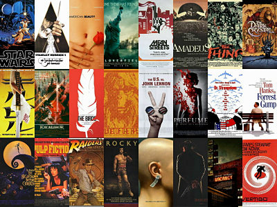
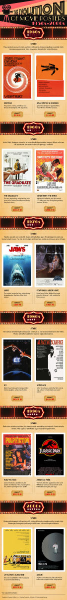
The whole picture of infographic is like this.
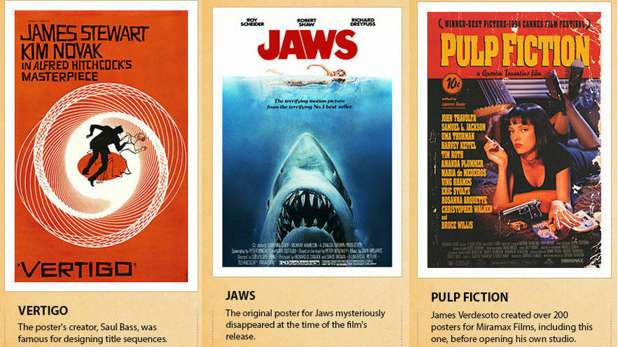
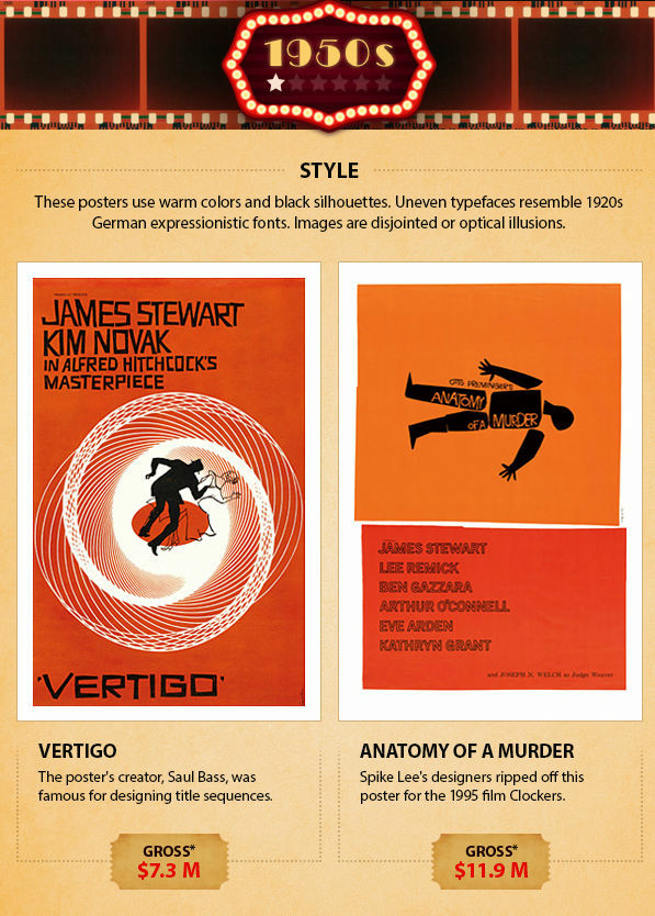
So, we will look at the tendency of posters for each age. First of all posters of the 1950s. The work raised a box office revenue of 7.3 million dollars "dizzy"And $ 11.9 million"Some murderIs cited as an example. Both are warm color based, designed with people drawn in black silhouette. Fonts in the 1920'sGerman ExpressionismIn an atmosphere like that, a visual effect such as illusion is used.
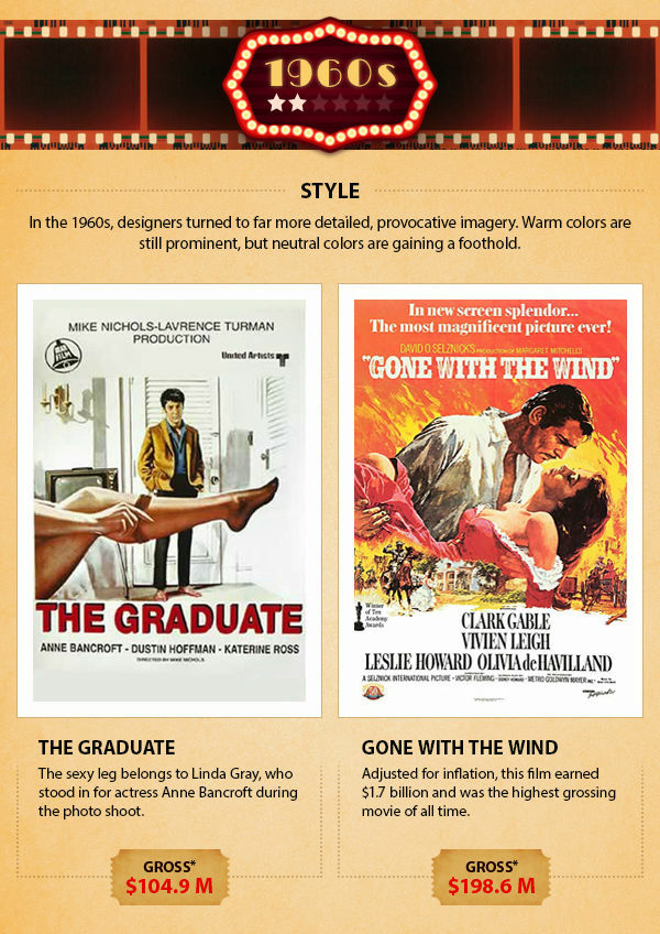
What was chosen as the work of the 1960's was "graduate"When"Gone with the wind". While the posters of the 1950s were symbolic designs, concrete and graphical illustrations are drawn. Although the color is still warm color main, it is now possible to incorporate neutral colors such as white and beige.
The posters of the 1970 'Jaws"When"Star Wars Episode 4 / New HopeTwo works of. The cold and dark colors are now in use, and the atmosphere changes as it is from the days that have passed. It is also one of the features that the periphery of the illustration became fringed white. It is designed to let the eyes go to the main character by the expression of light, and it creates hope and sinisterness by light, darkness and design effect.

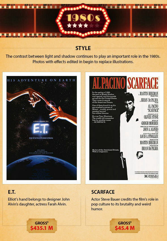
Following the posters of the 1970's, lights and shadows are effectively used in posters of the 1980's. "E. T."When"Scarface"Both posters are used as the main dark hues, photographs are now being used instead of illustrations.
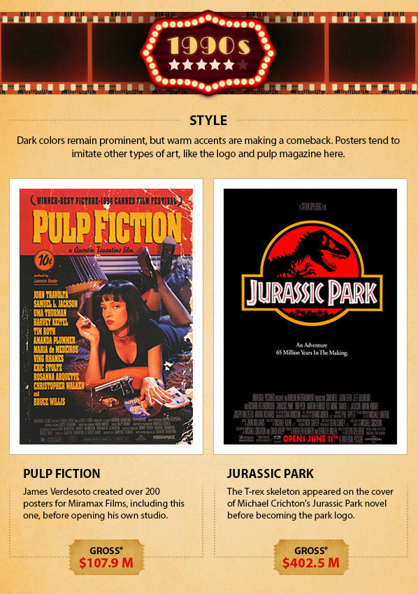
"pulp fiction"When"Jurassic Park"The posters of the 1990's typified by 2 works. Dark color continues to be main in the 1980s, but warm color has come to be accepted again as an accent.Pulp and magazineAnd the logo, etc., Designs which imitated things other than posters also started from this time.
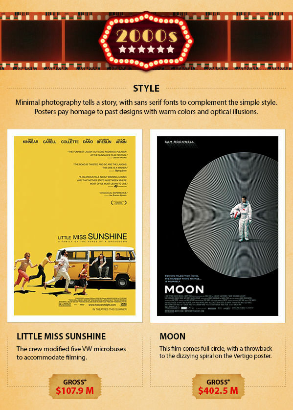
In the 2000s, a poster of type that tells a story with a minimalist design appeared. "Little Miss Sunshine"When"The man captured by the moonSimple sans serif fonts are used for title notation in both of them. A warm-tone main poster also comes back, and you can see a tribute to the poster design of the day, such as using visual effects.
Related Posts: