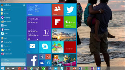
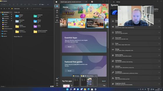
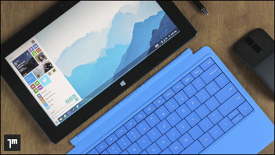
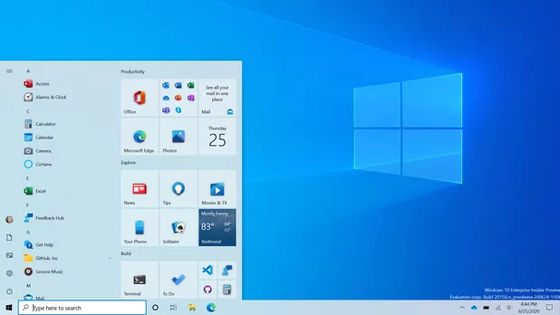
What kind of ingenuity is hidden in the design of Windows 10?
ByIsriya Paireepairit
Release at the end of July 2015Is scheduled for Windows 10, the PC version build is released for participants in the "Windows Insider Program (Windows Insider Program)", and the mobile version technical preview is also released in January 2015. Windows 10, which has undergone major changes, including the installation of a new browser and the integration of OS on PC / mobile terminal, but what kind of ingenuity is being done on the design side, the design team of Microsoft's OS development Albert Shum, who is headed by Mr. Albert Shum.
Windows 10 Design: Getting the balance right
http://blogs.windows.com/bloggingwindows/2015/04/29/windows-10-design-getting-the-balance-right/
The foundation of the design of Windows 10 is in "universal pattern and operation method". It is necessary to continue to provide an elegant user experience even if users are easy to join the platform and devices are different, and the idea of "adaptive UX" is derived from these ideas.
So the following six are currently applied to smartphones is an example of design elements.
1: Menu icon (hamburger)
2: Outlook Mail and Calendar
3: Project "Spartan"
4: People are not square
5: Photo
6: Task switching
1: Menu icon (hamburger)
The presence of a three-line navigation menu "Hamburger control" is particularly attracting attention in new Windows. When launching the browser and trying to open up Facebook, news sites, etc. First use the hamburger control in the upper left of the browser, so to say the home button on the application. It plays the role of navigation so that you can quickly call up the desired content while opening the application. Hamburger controlPivot controlIt combines with the bar on the application, the tab operation, etc., and it is improving the operability.
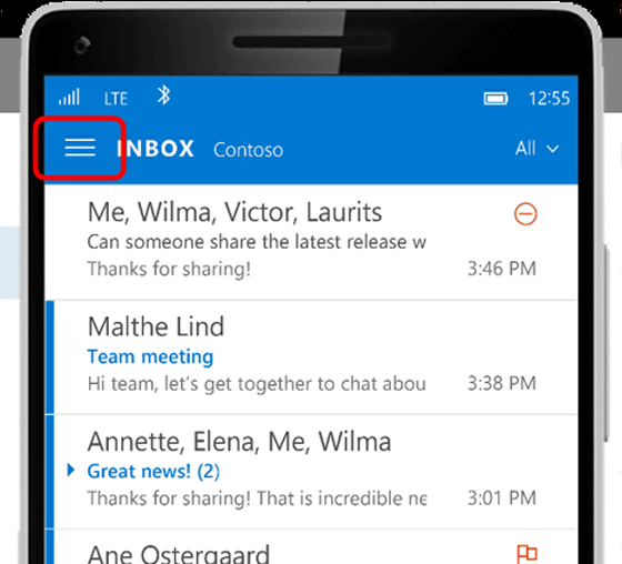
In addition, in the case of mobile version applications, hamburger control is placed at the center of contents together with operations such as swipe, etc., based on the user operating the smartphone with one hand. Meanwhile, in the case of PC version software, since the operation with the mouse and the keyboard is the focus, the hamburger control is not centered.
Albert said that hamburger control is a very useful one among the new adaptive UX.
2: Outlook Mail and Calendar
The Outlook app has parts rewritten from scratch based on the new code base. For example, it is Outlook e-mail that has been pointed out that there is no "unread box" or "multiple selection" function, but the function is expected to be added in the update currently being prepared.
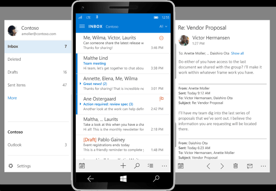
For many people, I'd like to understand immediately "which mails are in which accounts". In this regard, in the case of Outlook, in the past, in the past, there was a screen for opening a folder, opening the inbox from there, opening the corresponding mail from the list, and opening the desired mail.
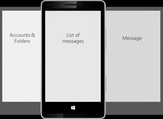
It is the hamburger control that is active here, so that you can easily move between folders and display the list simply by pressing a button. On the other hand, because I heard that my thumb does not reach the hamburger icon on the upper left of the screen, I have arranged several menu icons at the bottom of the screen instead of concentrating everything in the hamburger control. At the same time, it is thought that since the application remembers which folders the user is most using, etc., the number of times to switch accounts also decreases.
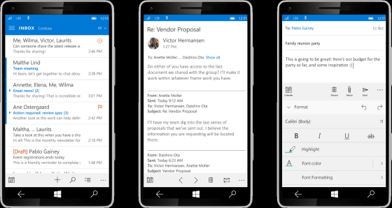
The display of past mails and message creation screen look like this.
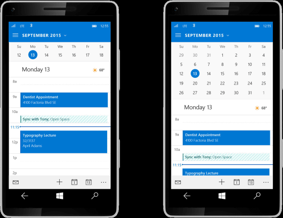
One of the many voices that "Revive the weekly / monthly calendar in the Outlook calendar". So, in the new version of Outlook, when you tap on the part of the month's name, you can see the mini calendar. In addition, if the display is a big smartphone it is designed to display a large number of days. It is a calendar that considers the balance between those who want to check only tasks of that day and those who want to check the schedule on a monthly basis.
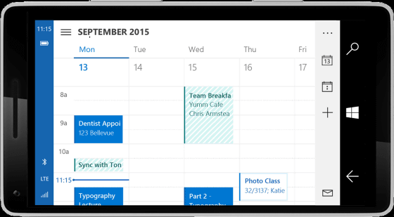
The following image is the design of the weekly calendar displayed in the landscape mode, but the display function of the weekly calendar is currently being adjusted and it is not installed yet.
3: Project "Spartan"
The project "Spartan" is a new browser "EdgeIt was announced as. In a universal application platform with a new search engine, "Design is modern and simple," Albert. From PC to Windows Phone, it will be an excellent UI that integrates all Windows 10.
Microsoft focuses on creating a consistent UI that does not change with the device, and he said he is thinking about the common placement of the address bar, which is the big point of the browser, for Windows 10 devices. However, it is also a part that receives much feedback from users, and it seems that it is not yet able to derive the best arrangement.
5: People are not square
Microsoft has adopted a round shape instead of a square when displaying a profile photo etc. in the application. However, as for the round design, there was also a voice saying "There is no harmony with the whole design."
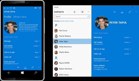
Considering receiving user's feedback and making the shape square, from the idea that people appearing in the user's life should be made visually conspicuous, even in Windows 10, the profile icons and the like are circled It seems to be displayed in shape.
5: Photo
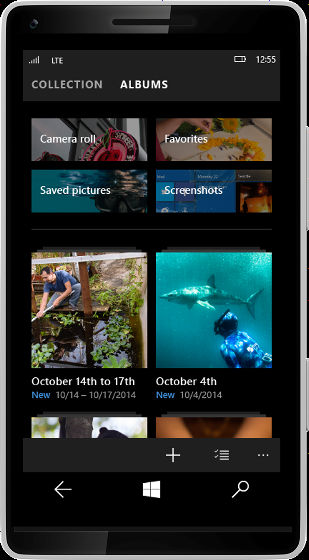
The new photo app is devised to make it easier for users to create collections and to organize favorite photos. One final goal is "to automatically create an album", so development is being promoted so that access from another device becomes easy. Using pivot, swipe operation, hamburger control, it will be easier to switch collections and albums across devices.
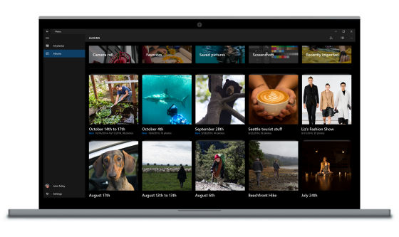
The design of the mobile version looks something like this.
6: Task switching
PC task switching is basically done from left to right, while for smartphones the task order is done from right to left. When trying to have a consistent UX through the device, how task switching is done in Windows 10 is a big problem. In this respect, the answer has not come out yet, it is still under consideration.
Various factors such as new types of patterns, controls, user colors, etc. are being considered when creating the design of Windows 10. When Microsoft first released the build, on Twitter many reactions such as "It's really messy, Microsoft should notice that the software has not been completed yet", but actually this " Miscellaneous "is important and it is best to receive feedback from users. It is because it can take plenty of time to improve and fix it if it is released at the middle stage of development.
Various builds have been released so far, but as the core code improves, the reliability of the OS increases, the battery life becomes longer, and incoming calls are also easier to use. However, as many of the applications are still in the process of development, Albert said that it is necessary to change the design and interaction so that it matches smartphones of various sizes for release.
Related Posts:
