What is the strategy the SNS "Pinterest" tackled to acquire users

SNS which users can upload photos and images of their interests and hobbies and expand the connection with people by using the function called "pin"Pinterest"is. Services started in 2010, SNS is a new category of services, but what kind of effort has been made to steadily increase the number of users steadily, the person in charge who actually engaged in this strategy I am clarifying a part of the content on the blog.
Making Pinterest - Lessons in growth and increasing signups
http://engineering.pinterest.com/post/100594540604/lessons-in-growth-and-increasing-signups
"At Pinterest, always thinking of strategies for winning new usersbrainstorming"We are talking about Jean Yang of growth strategy team. Over the past few years, Pinterest has succeeded in dramatically increasing the number of users who sign up (register) by repeating various A / B tests.

Mr. Yang talks about Pinterest's mission, "People discover about hobbies and likes, and support to actually practice those things." Since the "pin" function, message function, and recommended function that can be used with Pinterest can only be used by registered users, the team has focused on bringing new services to people who have not used it yet .
◆ Activities started from an event
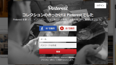
In May 2014, Pinterest started a service that can not be used unless it is registered as a user. When we started, we prepared a simple registration screen without any information like "What can I do if I register", but many newly registered users appeared.

Teams who were interested in the existence of newly registered users even though they did not understand the service content decided to observe the retention rate as to whether the users will continue to use Pinterest. Then, I found that it has the same retention rate as the user who registered in the normal flow.
Despite the less important part, it was an event that showed an unexpected appeal effect, but with this, the team created a flow that encourages similar registration in various places on the site and made experiments I decided to go.
◆ Understand users who have not registered yet
For teams who wanted to avoid overlooking "visitors" who are not yet registered, as well as focusing on new users, they set their own evaluation axis to ensure the quality of the user experience , We took measures to avoid the situation of shadowing future growth strategies.
The evaluation axis is these three. In addition to the usual "login rate" "registration rate", it is an index for grasping latent user trends.
· Unregistered user engagement amount (Unauth engagement)
→ Number of actions made by non-registered users at site visit
· Retention rate of unregistered users (Unauth retention)
→ Percentage of users who have not registered visited within one week from the time of last visit to the site
· Retention rate of registered users (Signup retention)
→ Percentage of users who actually used main services after registering services
◆ Validation by pattern change Part 1 · Variation change of UI display
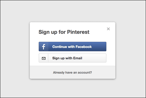
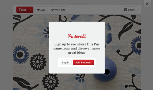
The team conducted experiments in which users made various changes on the way to registration. For example, in the window to prompt registration, the following three variations are experimented. At the stage of communicating the appeal of Pinterest to a certain extent to the user, the following experiment was done by adding some changes to the screen when prompting registration. Three variations were prepared.
Through unable to let you choose between login and registration

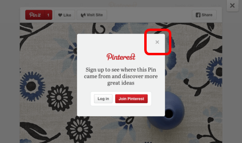
There is an option of logging in or registering, and if you click "x" at the top right of the dialog, you can proceed without registering.

In addition to "X" in the upper right, "Skip for now" button is displayed instead of logging in, and things that can be easily passed through.

Three patterns were tried and it turned out that the first "non-through" shows 2 to 3 times more registration rate than others, and the subsequent fixing rate is also good. As you can see, even with a technique that can take a bit of forcing, I know that it will lead to good results at the stage where the user's guidance has been completed properly.
◆ Verification by pattern change Part 2 · Try changing colors
Also change the display color of the registration induction dialog and compare. Two types of patterns were tried.
1. White letters on black background

2. Black characters on white background

The result is "1. White character on black background" victory. As can be seen by comparing, apparently the appealing effect seems to be high, and the registration rate shows 10% higher result.
◆ Validation by pattern change Part 3 · Try changing the content of displayed text
In addition to the above color change, this time we will change the sentences displayed on the same dialog and test comparison. The following text (A) is the text based on which five different patterns were prepared from this and a survey was conducted to see which one has the highest registration rate.

Results showed that (A) used from the beginning shows a numerical value about 5% higher than others. Contents such as "there's more content available" that is used in (A) is more content than content such as "Let's find" or "Let's touch an idea" It has become obvious that it had a high appealing effect.
◆ Judge by time as well as temporary phenomena
The team was always verifying it taking into account the existence of "novelty effect (tendency to show high response to new things)". Although a certain response appears every time a change is made on the site, it may stay in a transient phenomenon, so even if there was no effect at the beginning, I was trying to observe the passage of a certain period of time That's right.
Also, when looking at numerical values, we were checking the trend within a certain period of time, not just a specific moment. In the graph below, the specific numerical values remain obscure, but the trend of the retention rate seen in one of the two audiences is shown. The "enabled 2" group indicated by the red line always exceeded that of one "controled 2" group at a certain moment, but it always showed a lower value than the other in terms of a long-term viewpoint, You can often realize the importance of seeing trends. In addition, it is possible to take a tendency that the difference between the two values, which was initially very small, was opening in many cases.

Also, I applied for service very early "Early AdapterIt is also highlighting that the audience, which is called "high popularity" is generally high. On the other hand, users who have registered since time show comparatively low fixability. It is also important to understand that this phenomenon exists when performing this type of verification experiment.
◆ What is the next step of Pinterest?
Based on this verification, Pinterest is planning to further verify. Although certain effects have been shown in improving the registration rate and retention rate, in the future it seems that verification of the effect that appears by advancing translation and localization of each function is scheduled to be carried out.
Related Posts:
in Note, Web Service, Posted by darkhorse_log


