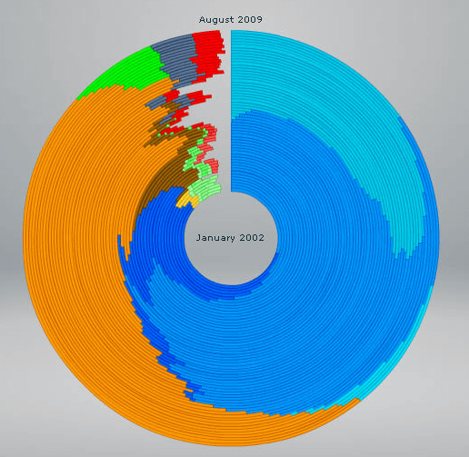
A diagram showing the change of browser share at a glance

Internet Explorer(IE),Mozilla Firefox,Google Chrome,Safari,OperaAlthough we call the software used for browsing web pages on the Internet as a web browser, there are diagrams that show at a glance how the share of these browsers has changed.
I understand the situation where IE which boasted overwhelming share is being deprived of share by other browsers and how the Google Chrome is steadily increasing market share, but if you look closely it is a little story hidden It seems that it is being done.
Details are from the following.
Michael Van Daniker: Historical Browser Statistics
This shows the change of browser share at a glance
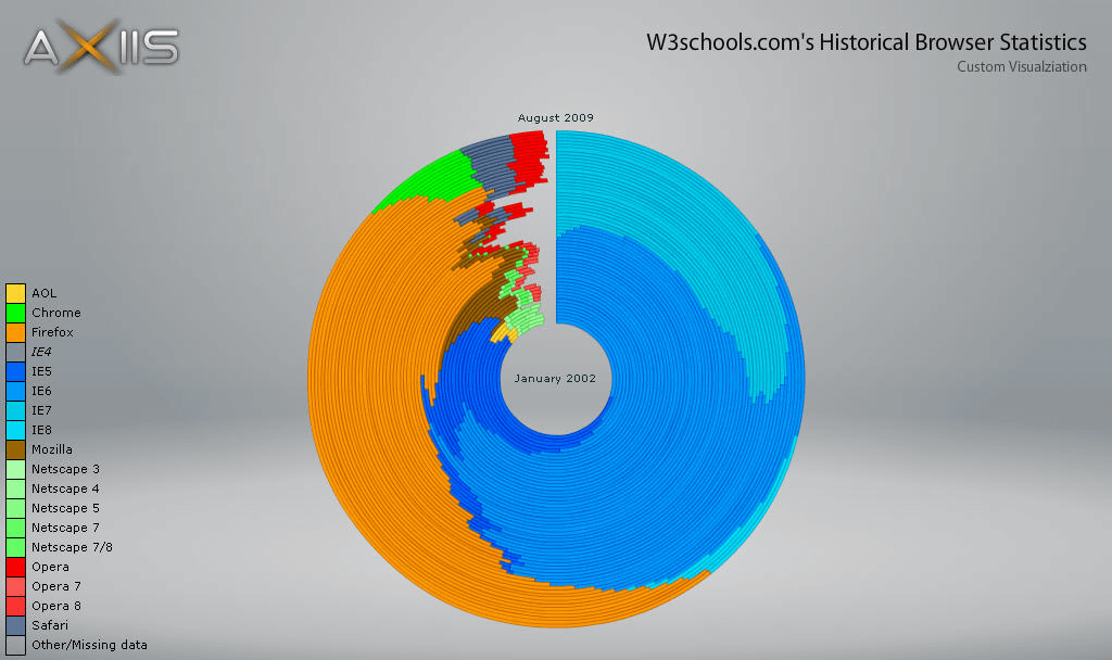
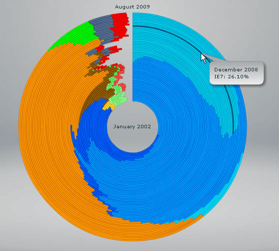
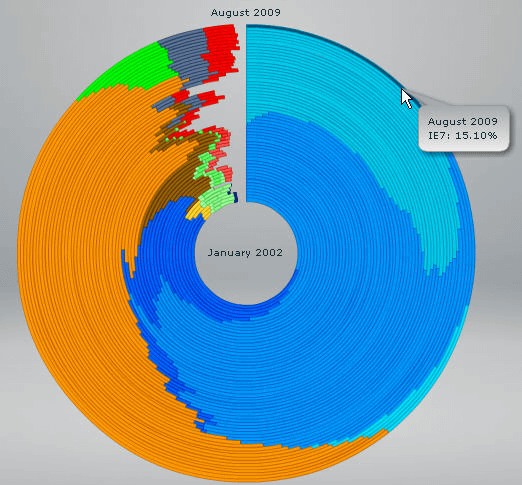
The innermost side is January 2002, the outermost side is August 2009, I will go out for two months at a time. When you move the cursor to the place you want to know details, "year, month, browser name, number of shares" is displayed.
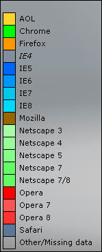
In the lower left of the figure is displayed which color indicates which browser.
The share of FireFox is steadily increasing, 47.40% at the August 2009 stage.

On the other hand, the share of IE 7 in August 2009 is 15.10%. It is 39.3% even with IE 6 and IE 8 and seems to cut 40%.
Somehow, looking at this graph as a whole vaguely, it seems that it looks like the Firefox logo. Perhaps, as in that tail, will Firefox occupy more than half of the day?
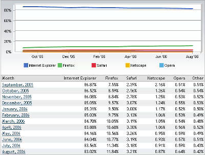
By the way,Access analysis result of GIGAZINE for December 2009The IE usage rate is 47.31%, the Firefox utilization rate is 29.63%. It is quite close but IE still dominates.
Related Posts:


in Note, Posted by darkhorse_log