Details of Google's first smartglasses physical buttons and UI design language 'Glimmer' revealed in Android XR design document for app developers
Design principles | AI Glasses | Android Developers
https://developer.android.com/design/ui/ai-glasses/guides/foundations/design-principles
Here's how you'll control and navigate Android XR glasses
https://9to5google.com/2026/02/16/android-xr-glasses-ui/
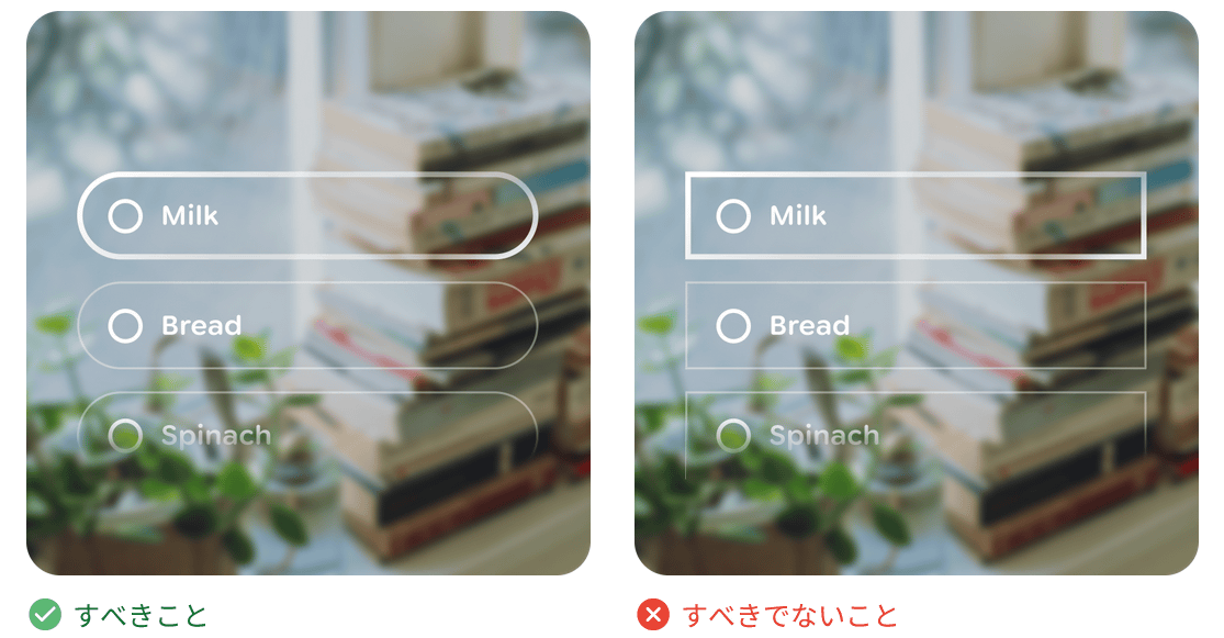
The design document begins with the following 'design principles': 'Comfort and seamless integration with the user's daily life should be prioritized. Apps should feel like a natural extension of the user's awareness, allowing easy access to information without being intrusive.' Specific examples include the ability for wearers to quickly turn off the smartglasses display at any time, and all apps should function in voice-only mode as well as gesture mode to allow easy operation even when the display is off. The document also stipulates that on-screen distractions should be minimized, with UIs designed to appear only when necessary and disappear once the task is completed.

Distracting notifications, such as app UI overwhelming the user's visual field or audio alerts blocking out ambient sounds, are prohibited. The design document also includes UI components specifically for XR, all of which are designed with visibility and matching the field of view in mind, with Google stating that 'user comfort is our top priority.'
This design, which prioritizes visual comfort for Android XR glasses, is called
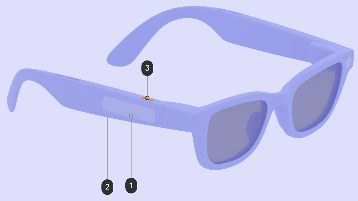
The design document also reveals the physical buttons on the smart glasses. Below is an image from the '
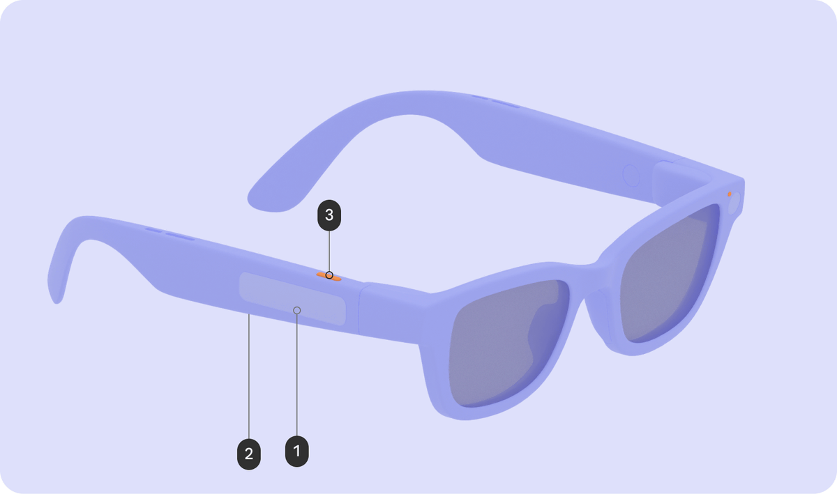
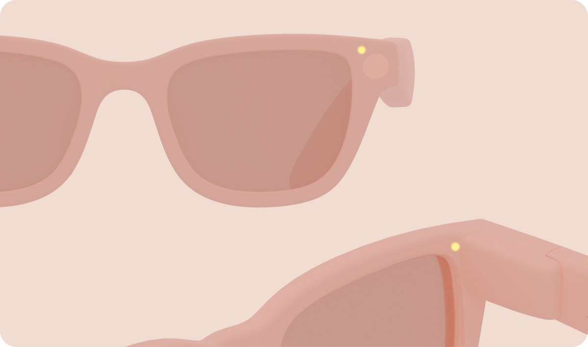
There are two LEDs near the lenses of the smart glasses, one on the outside and one on the inside. The inside LED is for the wearer, and the outside LED indicates the status of the smart glasses to those around them. For privacy reasons, the LED indicators indicate when the smart glasses are taking photos or recording videos.
Related Posts: