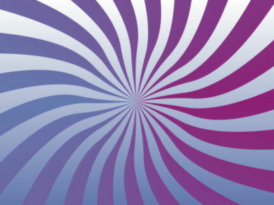
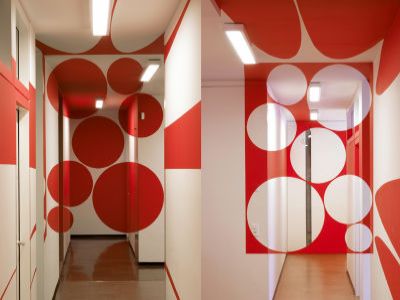
Experience the world of optical illusions with CSS
An optical illusion is a type of illusion that occurs in the visual system, causing something to appear that does not actually exist or that is different from reality. There are a wide variety of known patterns for optical illusions, and ' CSS Optical Illusions ' is a website where you can experience a variety of optical illusions using CSS.
CSS Optical Illusions
https://alvaromontoro.com/blog/68091/css-optical-illusions
Poggendorff illusion
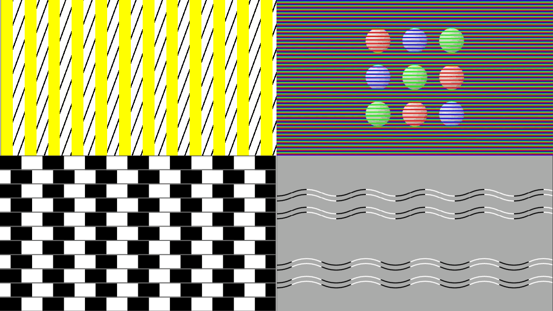
The Poggendorff illusion is a type of geometric optical illusion in which, when a diagonal line is partially hidden in an object such as a rectangle, the separated line segments appear misaligned. In the embedded CodePen below, hovering your mouse cursor (or tapping on a smartphone) will reveal the hidden diagonal line, allowing you to experience the Poggendorff illusion. By clicking the 'CSS' button, you can see that this demo implements the diagonal line and vertical bar using only the CSS ::before and ::after pseudo-elements.
See the Pen CSS Optical Illusion: Poggendorff Illusion (I) by Alvaro Montoro ( @alvaromontoro ) on CodePen .
The same effect can be achieved with more complex shapes using multiple diagonal and vertical bars. This demo implements it in the body only, with two gradients defined within the body, intersecting at a 70-degree angle.
See the Pen CSS Optical Illusion: Poggendorff Illusion (II) by Alvaro Montoro ( @alvaromontoro ) on CodePen .
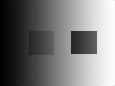
◆ Guiding gradient
With a guided gradient, the three bars (two vertical bars on either side and one horizontal bar in the middle) are all the same gray, but the background gradient creates an optical illusion in which they appear to be different colors. The horizontal bar in the middle, in particular, appears to have a gradient even though it is a solid color. Checking the CSS reveals that all the bars are the same solid color.
See the Pen CSS Optical Illusion: Gray Bars by Alvaro Montoro ( @alvaromontoro ) on CodePen .
In the more complex demo below, the center bar appears to be a gradient, but when you hover your mouse over it, it obscures the background and reveals that it is actually a solid color.
See the Pen CSS Optical Illusion: Induced Gradient by Alvaro Montoro ( @alvaromontoro ) on CodePen .
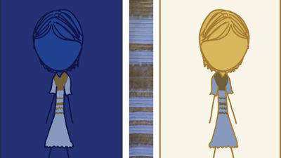
◆Colored sphere
In the demo below, it appears as if there are red, blue, and green spheres, but they are actually all the same gray. When you hover your mouse over them, the background disappears, and you can see that they are actually gray. This optical illusion is equivalent to the White illusion or the Munker illusion .
See the Pen CSS Optical Illusion: Gray Color Circles by Alvaro Montoro ( @alvaromontoro ) on CodePen .
Curvature blindness
The demo below shows horizontal wavy lines. The top wavy line appears to be made up of relatively straight lines, while the bottom wavy line appears to be made up of very curved lines. However, both lines actually have the same curvature, which can be confirmed by hovering the mouse over them. This optical illusion is called curvature blindness (PDF file) . The CSS implementation for the wavy lines was apparently implemented using the Wavy Shape Generator .
See the Pen CSS Optical Illusion: Curvature Blindness by Alvaro Montoro ( @alvaromontoro ) on CodePen .
Cafe Wall illusion
The Cafe Wall illusion is a classic optical illusion in which the boundaries of a tiled pattern appear to be tilted. In the demo below, hovering your mouse over the illusion reveals that the tile boundaries are actually horizontal. While the demo may appear complex, the implementation uses only three basic CSS elements:
See the Pen CSS Optical Illusion: Café Wall by Alvaro Montoro ( @alvaromontoro ) on CodePen .
Ponzo illusion
The Ponzo illusion is an optical illusion that uses a background that creates a sense of depth and perspective, causing figures of the same size to appear to be different sizes. In the demo below, two yellow line segments lined up one above the other are the same length, but the top line appears to be longer. You can confirm that the two line segments are the same length by hovering your mouse. To create the demo, a 3D rotation was applied using the rotate3d() function in CSS, technically achieving a realistic perspective.
See the Pen CSS Optical Illusion: Ponzo Illusion by Alvaro Montoro ( @alvaromontoro ) on CodePen .
Vertical-horizontal illusion
The vertical-horizontal illusion is when vertical and horizontal lines of the same length appear to be different lengths. In the demo below, the vertical and horizontal lines of the T-shaped shape are the same length, but the vertical lines appear longer. There is no animation when hovering, so CSS implementation is very simple.
See the Pen CSS Optical Illusion: Ponzo Illusion by Alvaro Montoro ( @alvaromontoro ) on CodePen .
◆Müller-Lyer illusion
The Muller-Lyer illusion , a classic optical illusion, causes line segments of the same length to appear to be different lengths. When you hover your mouse over the illusion, the extra lines extending from the line segments disappear, revealing that the two line segments are the same length. In terms of CSS coding, both shapes are made up of pseudo-elements, and the direction of the arrow-shaped edges is changed using ::before and ::after.
See the Pen CSS Optical Illusions: Müller-Lyer illusion by Alvaro Montoro ( @alvaromontoro ) on CodePen .
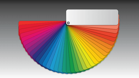
◆Color fan
The demo below shows a rotating green and red fan animated by CSS. If you look at the black dot in the center, the green circle's edges may appear dark green or brown, but if you move your gaze away from the black dot and look at the green circle, you'll see that it's a uniform color.
See the Pen CSS Optical Illusion: Color Fan by Alvaro Montoro ( @alvaromontoro ) on CodePen .
◆Breathing Square
The demo below uses CSS animation to create an optical illusion called breathing rectangles . When you look at a central blue rectangle rotating behind four green rectangles, it appears to expand and contract repeatedly. Hovering your mouse over it will move the four green rectangles, while the central blue rectangle is simply rotating.
See the Pen CSS Optical Illusion: Breathing square by Alvaro Montoro ( @alvaromontoro ) on CodePen .
In addition to the above, 'CSS Optical Illusions' also provides demos of various other optical illusions created using CSS, so if you're interested in optical illusions and CSS, be sure to check it out.
Related Posts: