WebKit Official Explains What CSS Grid Lanes Are

Masonry layout has long been a source of concern for web designers, and numerous solutions have been proposed. CSS Grid Lanes , a new CSS feature for achieving masonry layout, was drafted by the W3C at the end of 2025. CSS Grid Lanes is an essential feature for future web design, and a WebKit official, deeply involved in the specification's development, explains what CSS Grid Lanes is.
Introducing CSS Grid Lanes | WebKit
To demonstrate how to use Grid Lanes, we'll use the following HTML, which has a container element with several child elements:
[code]
<main class='container'>
<figure><img src='photo-1.jpg'></figure>
<figure><img src='photo-2.jpg'></figure>
<figure><img src='photo-3.jpg'></figure>
<!-- The rest omitted -->
</main>
[/code]
Apply the following CSS to the container element:
[code]
.container {
display: grid-lanes;
grid-template-columns: repeat(auto-fill, minmax(250px, 1fr));
gap: 16px;
}
[/code]
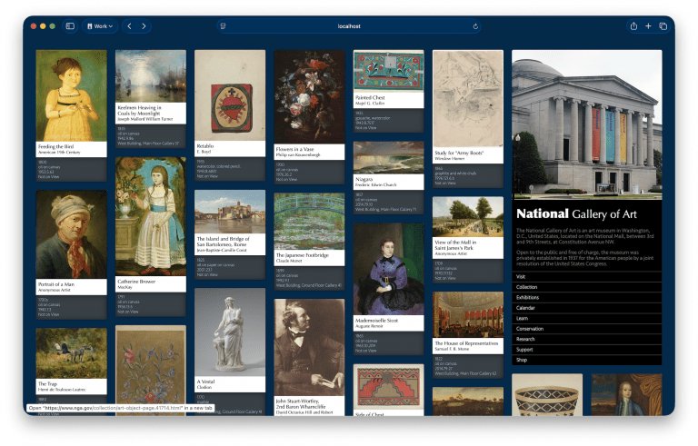
By applying the above CSS, you can create the following design, which looks familiar, with just three lines of CSS, without using any libraries.
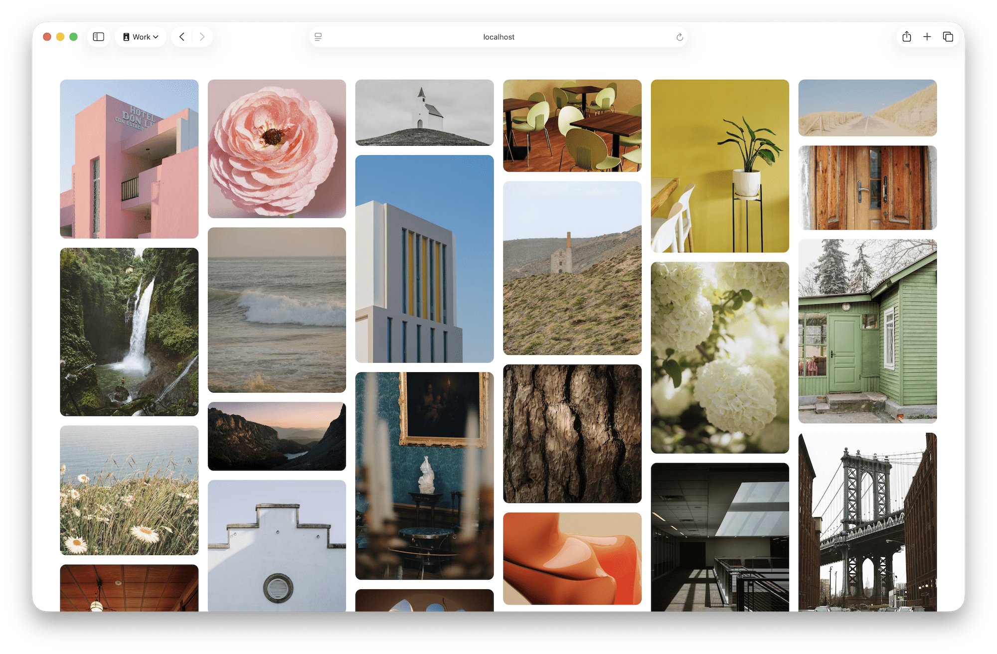
If we take a closer look at the CSS instructions above, we see the following:
display: grid-lanes : Specifies the grid lane layout
grid-template-columns: repeat(auto-fill, minmax(250px, 1fr)) : Creates flexible columns with a minimum width of 250 pixels.
gap: 16px : Inserts a 16 pixel gap between lanes and between items within a lane.
In a grid lane layout, items are placed sequentially in the lane closest to the top of the window. A familiar analogy might be to imagine a congested highway. Each car 'changes lanes' and selects the lane that allows it to move 'furthest forward.' With a grid lane layout, users can move between lanes using the tab key, sequentially accessing all currently displayed content. There's no need to navigate to the bottom of the first lane and then return to the top of the next lane, which can be cumbersome. It's also possible to build a site that loads content infinitely as the user scrolls, without any layout manipulation using JavaScript.
The grid lane layout lets you fully utilize the power of CSS Grid by defining lanes using
The only change required to implement this is to add the following line to the CSS above:
[code]
grid-template-columns: repeat(auto-fill, minmax(8rem, 1fr) minmax(16rem, 2fr)) minmax(8rem, 1fr);
[/code]
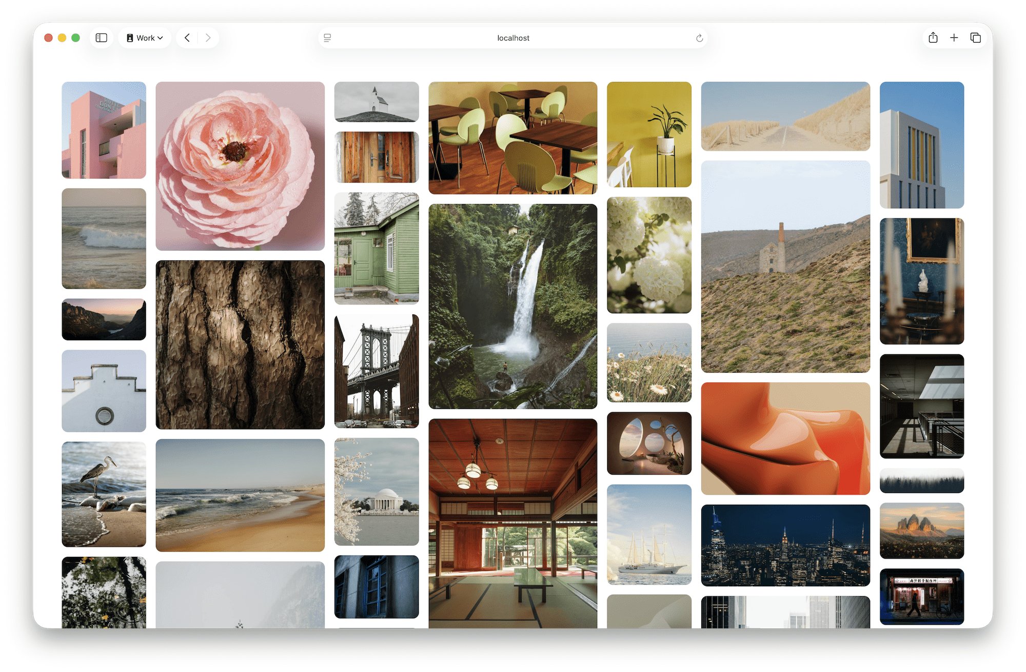
Taking full advantage of the grid layout features, it is of course possible to arrange items across lanes. In the example below, the width and height are all the same and the design is dynamic, setting it apart from the 'mainstream design of the past decade' where items are symmetrical.
To achieve this, apply the following CSS:
[code]
main {
display: grid-lanes;
grid-template-columns: repeat(auto-fill, minmax(20ch, 1fr));
gap: 2lh;
}
article {
grid-column: span 1;
}
@media ( 1250px < width ) {
article:nth-child(1) {
grid-column: span 4;
}
article:nth-child(2), article:nth-child(3), article:nth-child(4), article:nth-child(5), article:nth-child(6), article:nth-child(7), article:nth-child(8) {
grid-column: span 2;
}
}
[/code]
Here's a quick summary of what the CSS does:
All items: Display them in one lane
- First item: Only if the screen width is more than 1250 pixels, display it to fit in four lanes
- Items 2 to 8: Display them in two lanes only if the screen width is greater than 1250 pixels
You can also specify the lane that the item will be displayed in. In the example below, the 'Header' will always be displayed in the last column regardless of the number of columns.
The CSS is as follows:
[code]
main {
display: grid-lanes;
grid-template-columns: repeat(auto-fill, minmax(24ch, 1fr));
}
header {
grid-column: -3 / -1;
}
[/code]
All of the examples so far have been 'waterfall' layouts where content is arranged vertically, but Gridlane can also create 'brick' layouts where content is arranged horizontally.
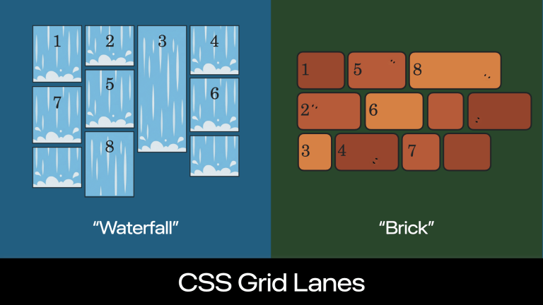
When you specify columns using grid-template-columns in a grid lane layout, the browser automatically creates a waterfall layout.
[code]
.container {
display: grid-lanes;
grid-template-columns: 1fr 1fr 1fr 1fr;
}
[/code]
If you want a brick layout, use grid-template-rows instead of grid-template-columns to define the rows.
[code]
.container {
display: grid-lanes;
grid-template-rows: 1fr 1fr 1fr;
}
[/code]
The key to automatically determining whether a grid will be waterfall or brick is the newly added default value ' normal ' to
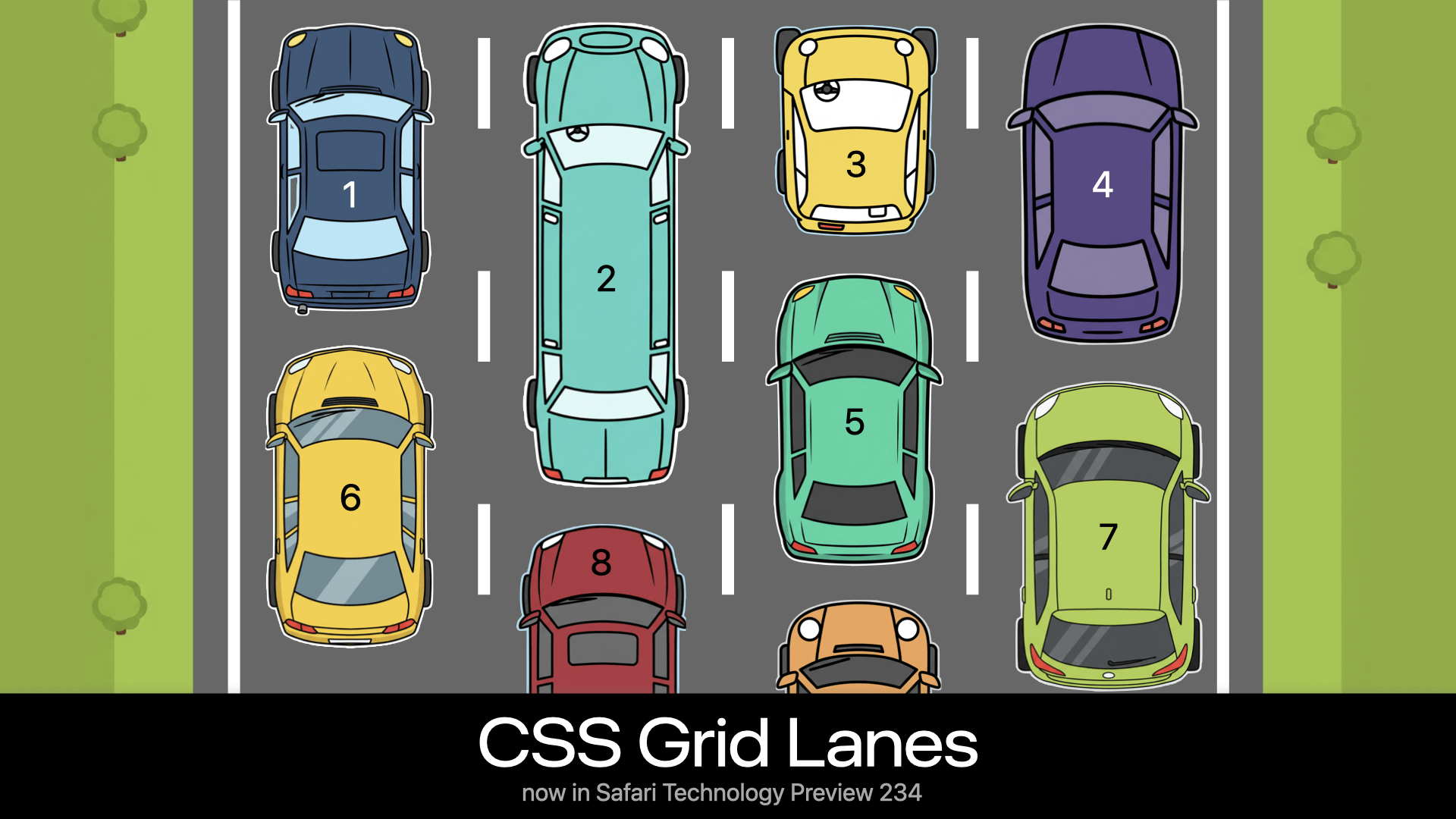
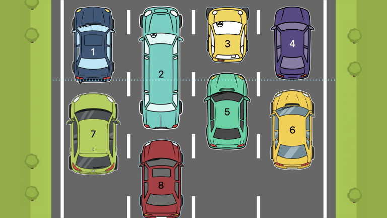
Finally, we'll look at a new concept created for grid lanes: 'Tolerance.' This adjusts the strictness of the layout algorithm in determining where items are placed. Using the example of a congested highway, this refers to how much subtle differences in the length of cars are reflected in 'lane changes.' In the diagram below, if we look at the length of the leading car in each lane, we can see that car 4 is slightly shorter than car 1. If 'Tolerance' were 0, car 6 would be placed behind car 4, following the principle of 'place it as far forward as possible.' Car 7 would be placed behind car 1, following the same principle. The final horizontal order of content will be '1, 2, 3, 4,' and the next horizontal order of content will be '7, 5, 6.'
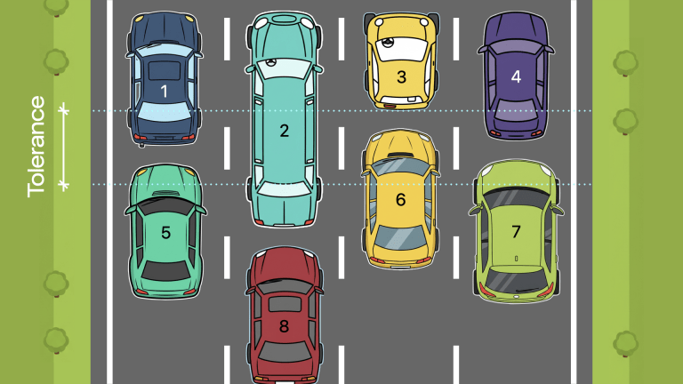
However, because the difference in length between cars 1 and 4 is so slight, it could be argued that car 6 is closer to the top of the page, but within the margin of error. Therefore, a situation where car 6 is on the right and car 7 is on the left could be confusing. Thinking about it from the perspective of 'Would you change lanes just to get a few centimeters further ahead?', 'tolerance' could be rephrased as 'how calmly do you expect the driver to drive?' Translating this to web design, users tabbing through content could be confused by the unintuitive behavior, and could also lead to an unexpected experience if the content order is somehow labeled.
In practice, such small size differences rarely cause problems, so it's more convenient to consider items like car 1 and car 4 to be the same size. 'Tolerance' is the concept for this purpose, and is defined as item-tolerance with a default value of 1em. In other words, only differences in content length of more than 1em will be taken into account when determining the position of the next item. If you want to arrange items more neatly, set the item-tolerance value to a larger value. In the example below, the item-tolerance value is set to half the length of car 1, so all cars except car 2, which is clearly longer than the others, will be treated as having similar lengths, and the second content will be arranged in the intuitively easy-to-understand order of '5, 6, 7'.
Grid lanes have a very good chance of becoming an essential feature in future web design, so if you're interested, you should dig deeper into the W3C draft.
CSS Grid Layout Module Level 3
https://jp.htmlspecs.com/css/css-grid-3/
Related Posts:


in Software, Design, Web Application, Posted by log1c_sh