Do you need icons next to your menu items?
Menus are often accompanied by icons to help users understand what each item represents. However, designer and coder Jim Nielsen strongly argues that icons are essentially unnecessary, saying they 'just add noise.'
Icons in Menus Everywhere — Send Help - Jim Nielsen's Blog
In Google Chrome, when you open the menu, icons will be displayed to the left of the menu items, from 'New Tab' to 'Exit,' as shown below.
The same is true for the context menu, which looks like this in Google Sheets. In some cases, multiple icons are used, such as 'Paste' and 'Paste Special.'
Nielsen said of the icons, 'To me, it's noise. I'm not saying, 'Don't put icons on menu items,' and I think some can be very useful. I just don't like the idea of 'put an icon on each menu item' becoming the default.'
Nielsen says this mindset encourages designers to take the stance that 'I need to put an icon here.' Designers should instead ask themselves, 'Does the cognitive load of understanding the icon I added here help or hinder the menu experience?'
To support his point, Nielsen points to macOS, because for a long time Apple didn't put an icon on every menu item.
However, in macOS Tahoe, all menu items now have icons.
However, it seems that the update has not yet been fully implemented, and some menus are missing icons.
The patterns can be classified into four types: 'Text only,' 'Text + Icon,' 'Text + Toggle (shortcut key combination),' and 'Text + Icon + Toggle.'
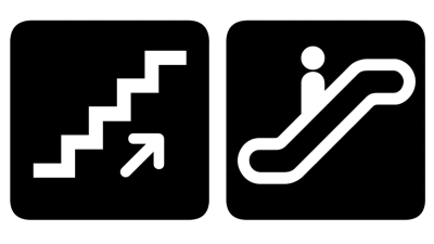
While it's unclear why this is the case, Nielsen says it's not a total disaster, citing the Finder as an example: showing window positions with icons is easier to understand than having them spelled out as 'Left' or 'Top Right.'
![]()
Incidentally, the Apple Human Interface Guidelines, which Apple established rules for UI, have included a section called 'Using Symbols in Menus' in Chapter 12, 'Menus,' since 2005, which states, 'Menus may use some standard symbols to provide additional functionality, but should not use other arbitrary symbols because they clutter the appearance and confuse users.' According to this rule, only four symbols can be used.
Below is an example of what not to do, as outlined in the guidelines. Nielsen describes it as 'a macOS Tahoe menu.'
Nielsen lamented that even Apple has become a 'menu icon' faction, making it difficult to convince those opposed, and is asking for help.
Related Posts: