The official WebKit blog has published a design example of a masonry layout that arranges items in a tiled pattern.

The official blog of Safari's rendering engine,
Help us invent CSS Grid Level 3, aka “Masonry” layout | WebKit
https://webkit.org/blog/15269/help-us-invent-masonry-layouts-for-css-grid-level-3/
A masonry layout is a layout in which content is stacked like a brick or stone wall, as shown below. It is also called a waterfall layout because the content flows down the page like a waterfall.

Using a masonry layout, you can neatly arrange content of different aspect ratios, arrange your content in a natural reading order as the page scrolls, and load additional content below without changing the display of the page.
While it has been possible to design with masonry layout using JavaScript in the past, WebKit aims to implement it in CSS Grid Layout Level 3, as incorporating masonry layout into CSS will enable more creative designs.
You can actually see how CSS Grid Layout Level 3 works by using
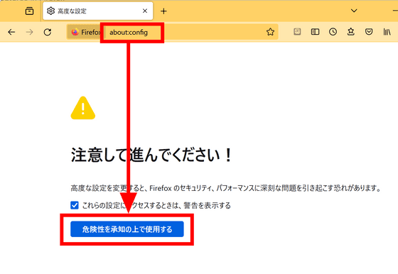
Enter 'layout.css.grid-template-masonry-value.enabled' in the search field at the top, and click the button on the right to set it to 'true.'

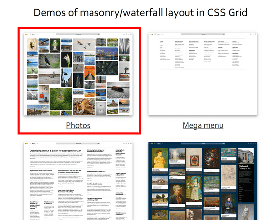
When you access
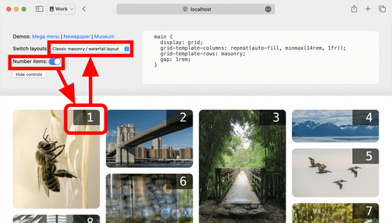
If you enable 'Number items' in the menu above, numbers will be displayed in the upper right corner of the image, making it easier to see the order in which the items are displayed. You can also click 'Switch layouts' to see various layout examples.
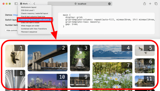
For example, 'Alternating narrow & wide columns' looks like this.
There is also a movie that shows what happens when you resize the window.
By specifying the maximum and minimum values for the columns, the columns are automatically arranged, making it possible to create designs that accommodate a variety of sizes with just a few lines of code.
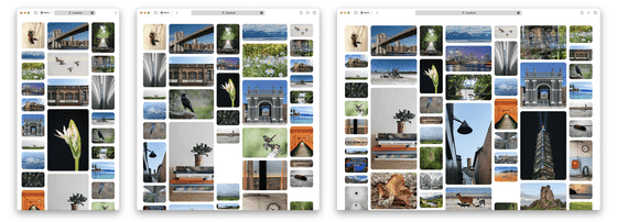
Of course, you can also set column widths based on a simple ratio to the width of the window. The image below shows an example of a layout that uses the Fibonacci numbers '1', '1', '2', '3', '5', and '8'.

You can also specify that some images should be used in multiple columns. The image below shows an example of a layout where images that are multiples of 5 are set to take up two columns in width.

You can also design an image so that when a user clicks on it, it expands across multiple columns. This demo requires Safari Technology Preview 192 or later, and automatically animates when the image expands.
Let's also take a look at a demo where you place an article instead of an image. In a typical traditional design, the frame size was fixed, and it was necessary to unify the size of the text and images.
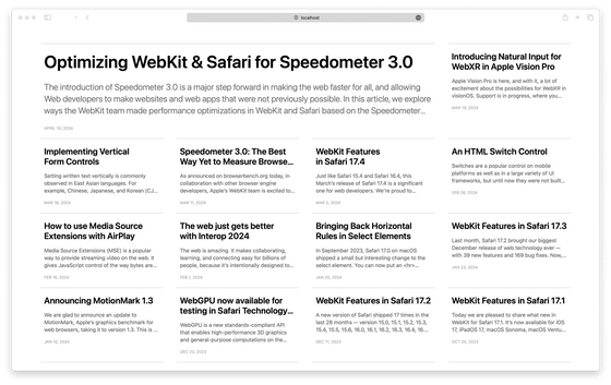
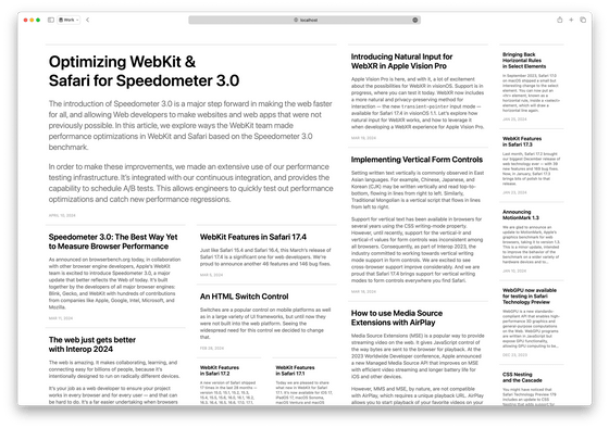
Using the Masonry layout, you can change the frame to suit each piece of content, as shown below, and you can also design it so that the most recent articles are displayed larger and older articles are displayed smaller.
Regarding masonry layout, there is no consensus within the CSS Working Group, which is developing the CSS specification, and there are fundamental questions such as 'Is masonry layout even necessary on the web in the first place?' and 'It should be implemented as a display type, not as part of the CSS Grid.'
WebKit wants web designers and developers to join the discussion and voice their opinions on the Masonry Layout. 'Your opinions can really make a difference,' they said.
Related Posts:
in Web Application, Posted by log1d_ts
