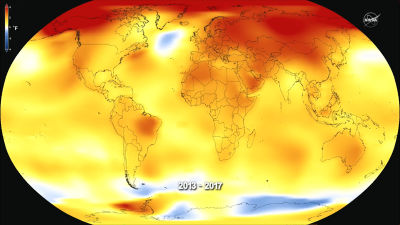
NASA releases a video 'Climate Spiral' that allows you to understand the temperature rise due to climate change in 1 minute
It is clear from the records that the temperature has risen sharply in recent years, such as the announcement that July 2021 was
SVS: GISTEMP Climate Spiral
https://svs.gsfc.nasa.gov/4975
Watch Global Temperatures Spiral Out of Control in New Climate Change Animation
https://www.sciencealert.com/watch-global-temperatures-spiral-out-of-control-in-this-new-climate-change-animation
The 'Climate Change Spiral' published by NASA can be seen below.
A spiral of global surface temperatures from 1880 to 2021 --YouTube
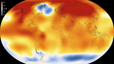
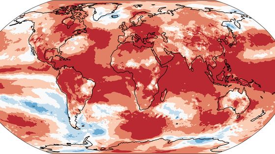
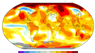
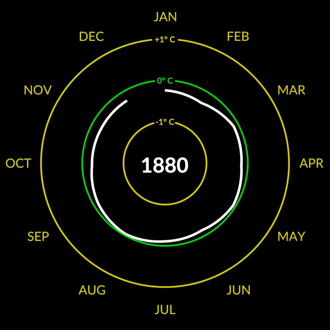
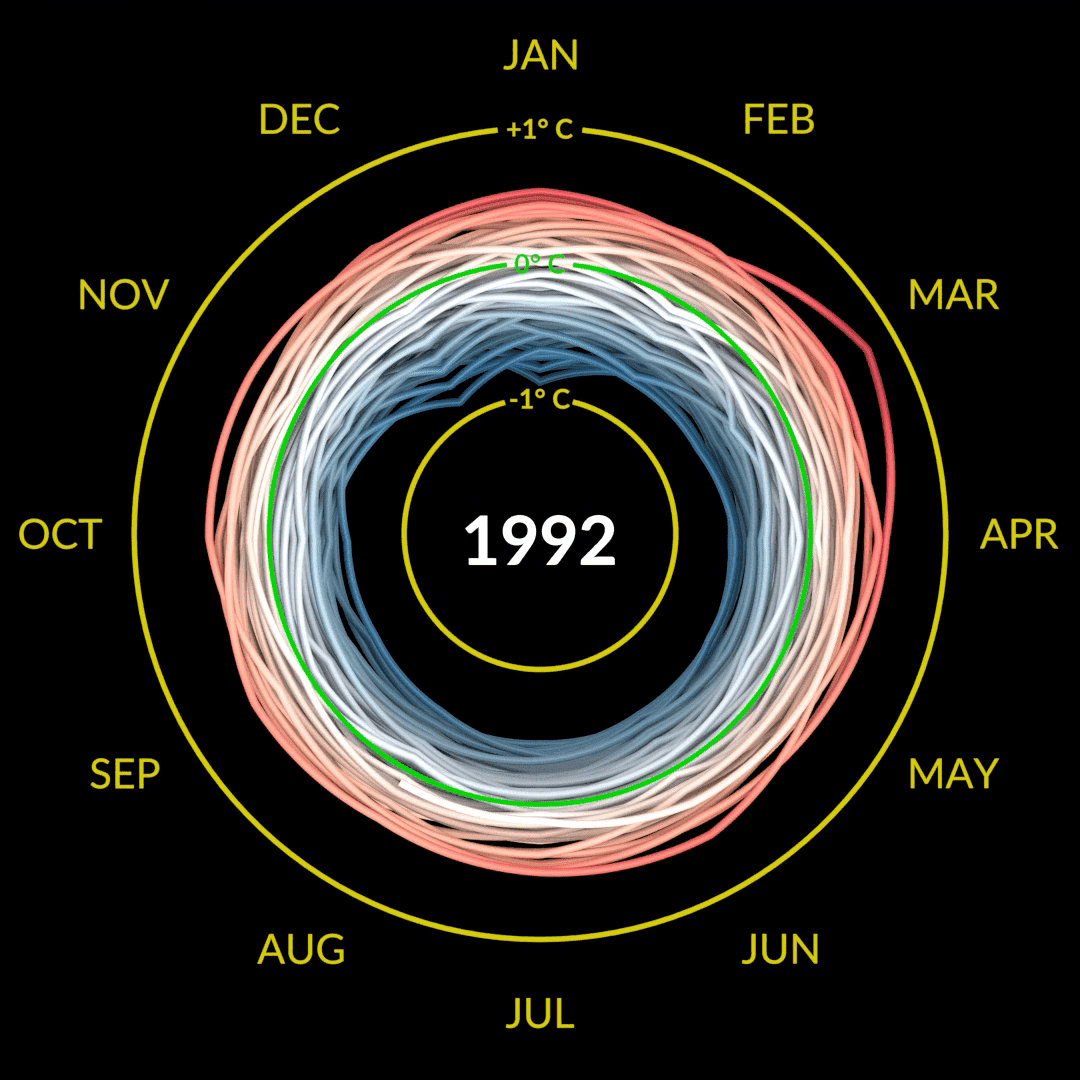
When the movie starts, a white line shows the temperature transition from January to December 1880. This circle is based on the data of GISS Surface Temperature Analysis , which calculates the estimated value of the surface temperature change of the whole earth, and is based on the average temperature of each month from 1951 to 1980, and the average temperature and 1880 to 2021. It shows the difference in the average temperature of each month. For example, in 1880, all months were below the norm, so the line fits inside the green circle.
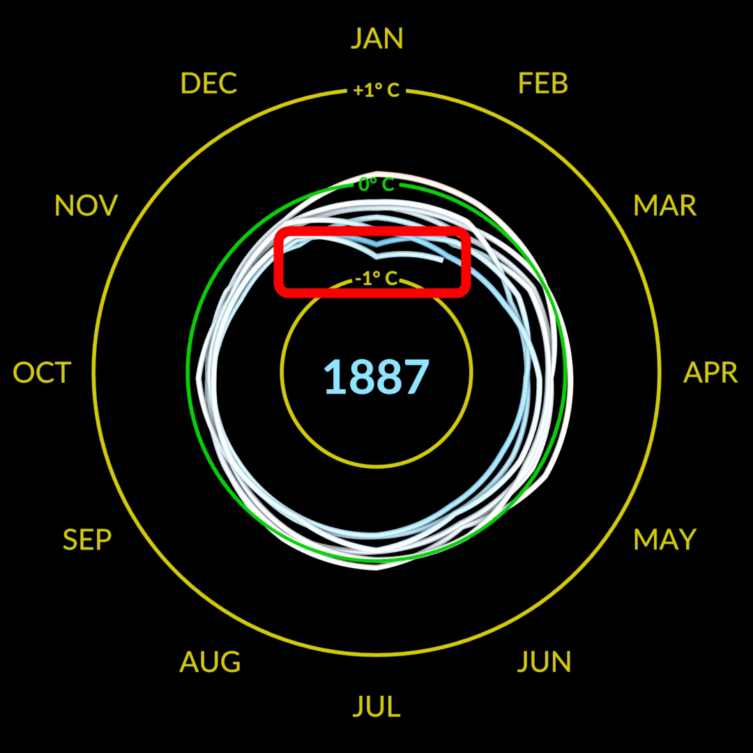
After that, lines will be added as you go round and round. This January 1887 was the second coldest January in January, so the line was especially close to the inside.
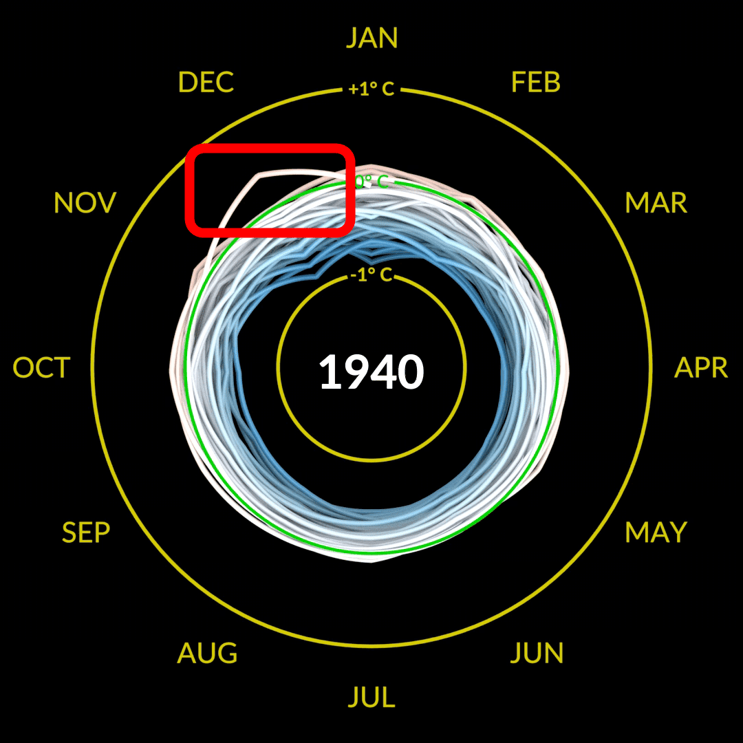
There was no particular change in the 20th century, but in the 1940s the line suddenly began to swing outwards.
After September 1992, which was 0.01 degrees below the standard, the line no longer goes inside the green circle, and the color of the line changes to red, which indicates that the temperature has risen. ..
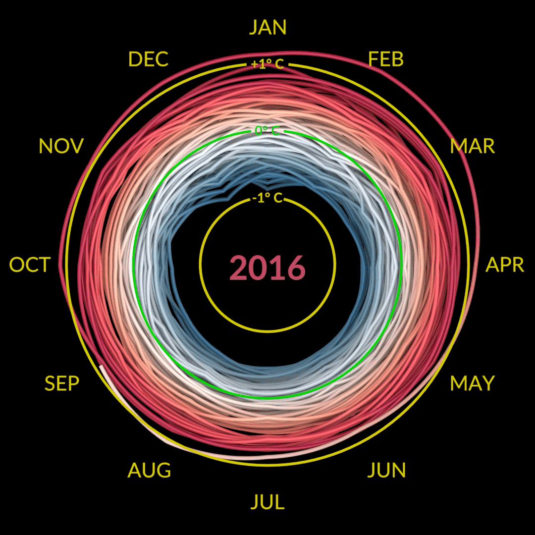
In 2016, it is natural that the standard will be exceeded at least once.
And as of 2021, the line turned bright red as shown below.
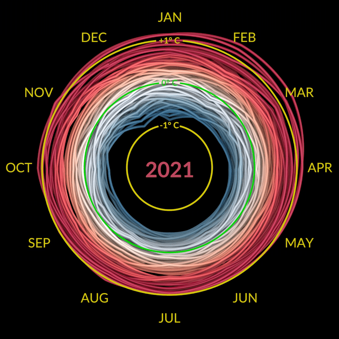
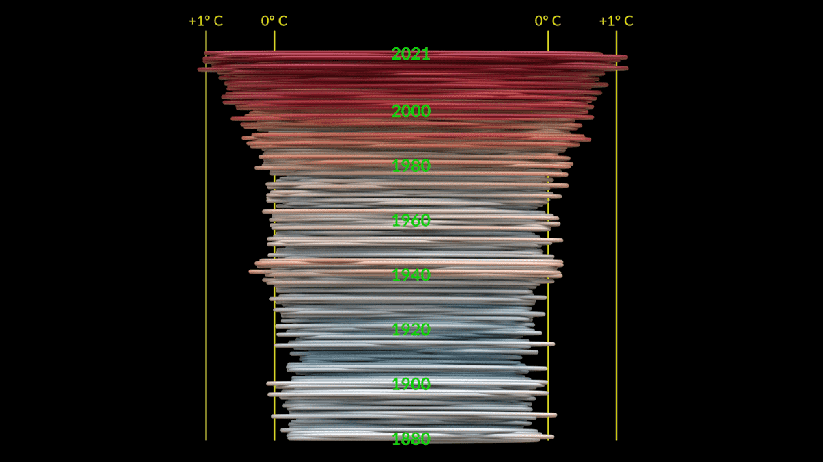
Looking at the 'climate spiral' from the side, you can clearly see that the temperature has risen sharply since the 1980s.

This visualization is by Ed Hawkins, a climate scientist at the University of Reading, England. It was taken up at the opening ceremony of the Rio Olympics held in Brazil in 2016 and became a hot topic .
Spiralling global temperatures from 1850-2016 (full animation) https://t.co/YETC5HkmTr pic.twitter.com/Ypci717AHq
— Ed Hawkins (@ed_hawkins) May 9, 2016
Related Posts: