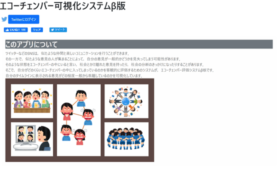
I tried using the beta version of the ``echo chamber visualization system'' that allows you to visualize how much biased information you are exposed to on Twitter
On social media such as Twitter and Facebook, people tend to connect with people who have similar values to themselves, which makes it easy to gain agreement with their opinions, giving them the illusion that their opinions are those of society as a whole. This may happen. This is called the '
I created a system to visualize how long you are in an echo chamber | tori | note
https://note.com/torix/n/ncaeb83af595d
The echo chamber visualization system analyzes tweets flowing on Twitter's timeline and determines how biased they are compared to Twitter as a whole. The echo chamber visualization system is in beta version at the time of article creation, and the only social media supported is Twitter.
Echo chamber visualization system beta version
https://torilab.sakura.ne.jp/twitter/echamber/
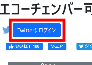
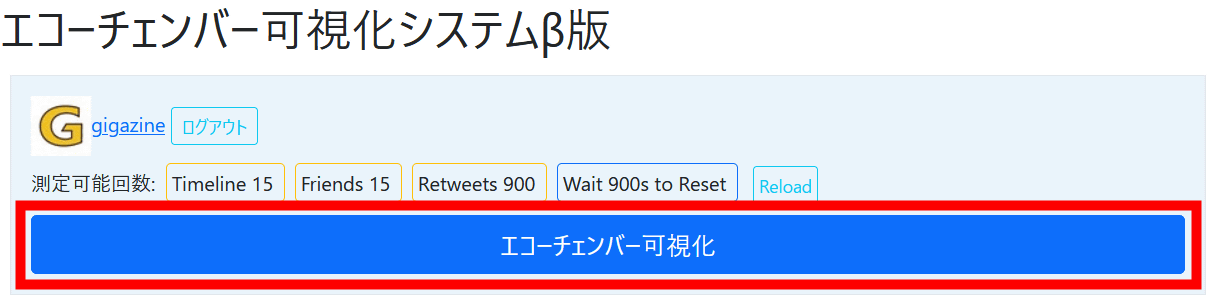
It's easy to use, go to the top page and click 'Log in to Twitter'.
Enter your Twitter account information and click 'Login'.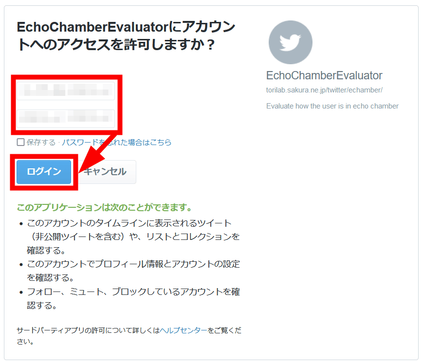
Click 'Echo Chamber Visualization'.
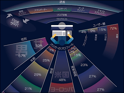
The following is displayed on this screen.
Account information and usage data used for echo chamber visualization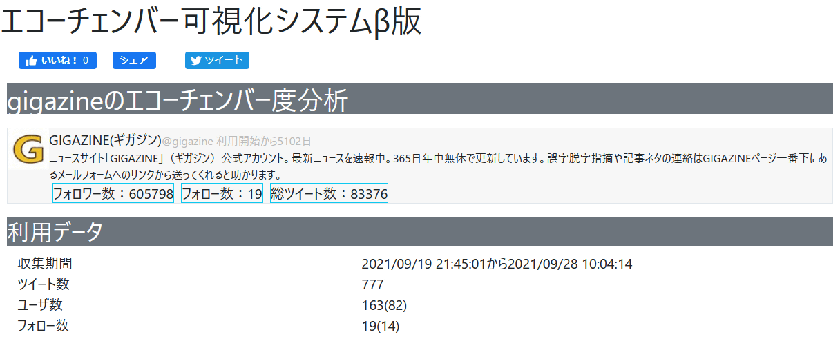
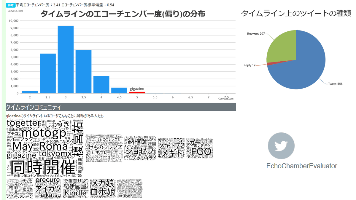
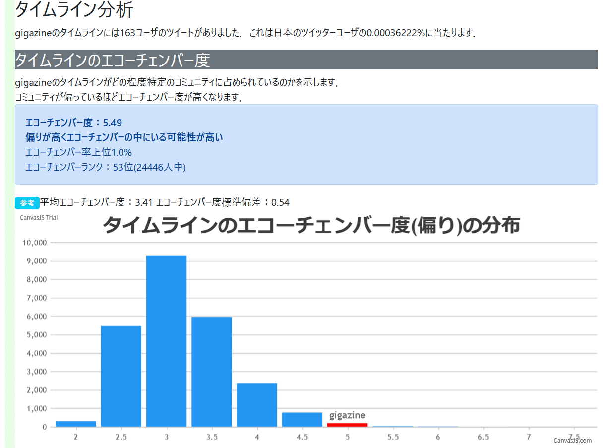
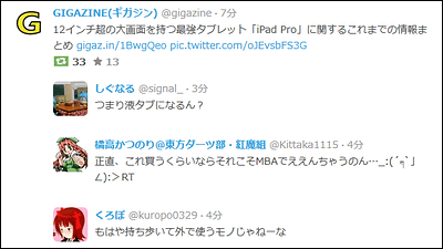
'Timeline echo chamber level' displays the echo chamber level of the Twitter account. The average echo chamber degree is '3.41', and GIGAZINE's echo chamber degree is '5.49', so the echo chamber rate seems to be in the top 1%.
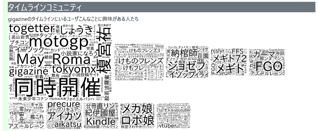
'Timeline Community' where topics that users on the timeline are interested in are text-mined and visualized.
In 'Breakdown of tweets on timeline', you can check the types of tweets on the timeline.

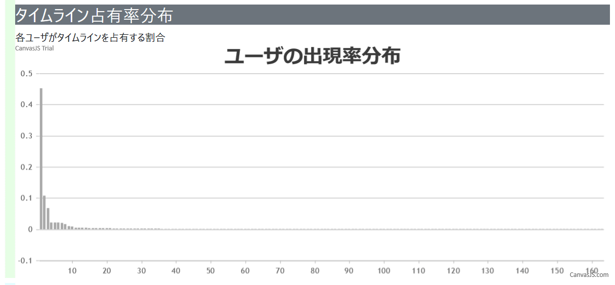
'Timeline occupancy distribution' displays the percentage that each user occupies the timeline.
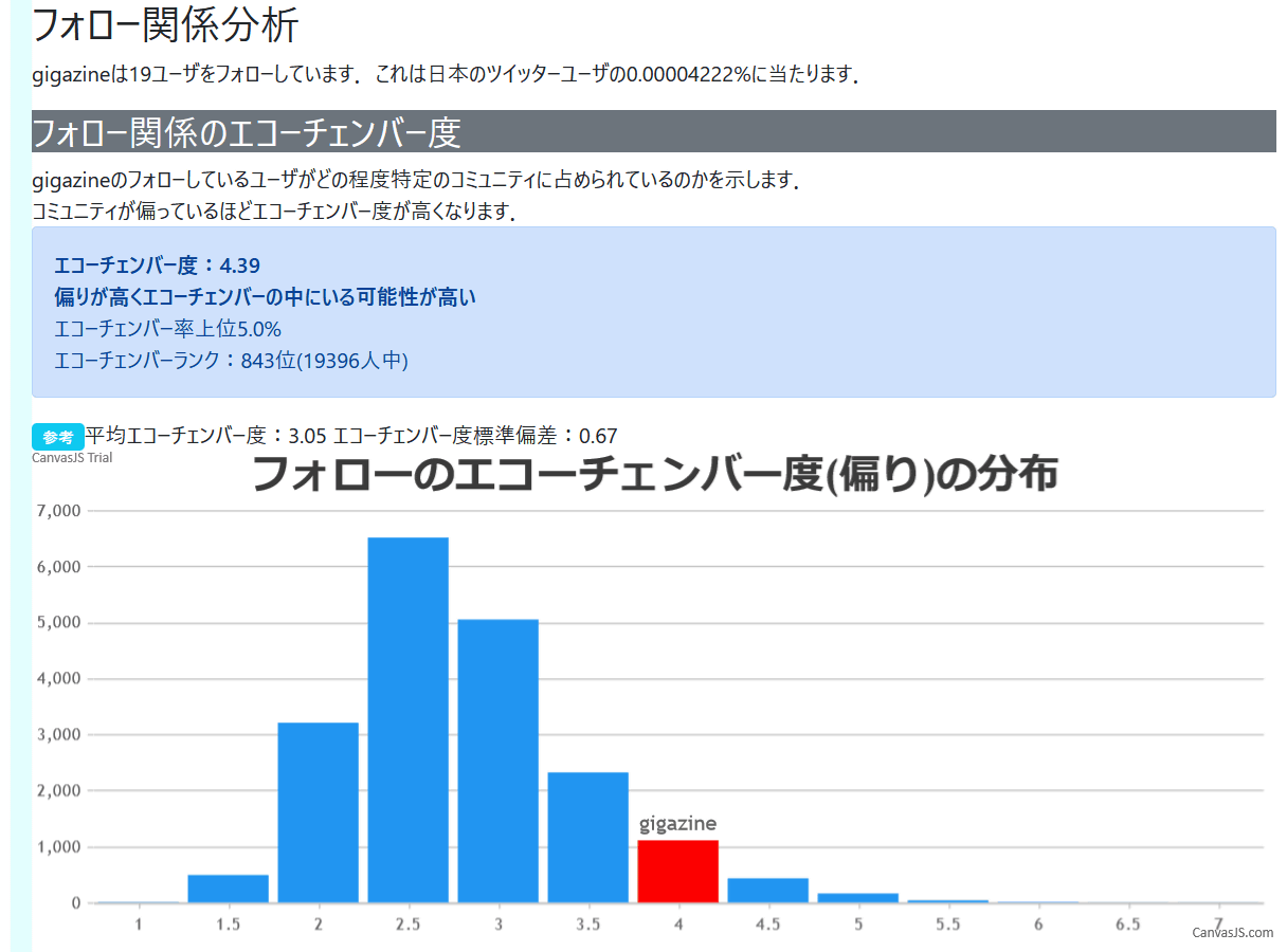
``Degree of echo chamber in following relationships'' analyzes the degree of echo chamber of followers of one's own Twitter account. The average echo chamber degree of followers is '3.05', so in the case of the image below, it means that you have followers with a slightly high echo chamber degree.
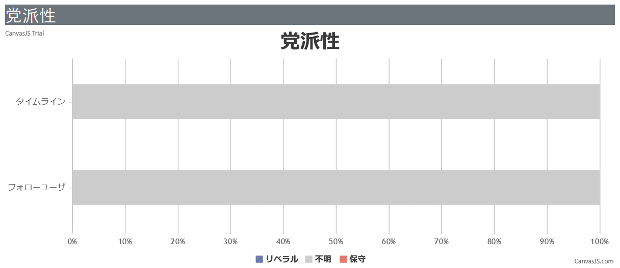
It is also possible to analyze the partisanship of your followers.
At the end, users who frequently appear on the timeline will be listed.

In addition, if you are a person who says, ``I use different accounts for specific genres or works, such as anime, manga, or games,'' it is inevitable that there will be a high degree of echo chamber, so ``My Twitter account is divided into these types of accounts.'' It would be a good idea to use it to help people understand that the tweets are flowing.
The echo chamber visualization system was created by Fujio Toriumi , a computational social scientist. His explanation of the echo chamber visualization system is posted on note , so please check it out if you are interested.
Related Posts:


in Review, Software, Web Service, , Posted by logu_ii