The theory that Amazon changed the icon of the application because it 'looks like Hitler's beard' emerged

by
In January 2021, Amazon revised the icon of the official mobile app ' Amazon Shopping App'. However, it is reported that Amazon has made a new 'minor modification' of this icon, and it was pointed out that 'it looks like Hitler's beard' in the background.
Amazon Changes New App Icon After It's Compared To Hitler Mustache – NBC New York
https://www.nbcnewyork.com/news/tech/amazon-changes-new-app-icon-after-design-is-compared-to-hitler-mustache/2919590/
Amazon changed its new app logo that some said looked like a Hitler mustache --The Washington Post
https://www.washingtonpost.com/technology/2021/03/02/amazon-logo-hitler-mustache/
Amazon shaves app icon mustache that raised eyebrows --The Verge
https://www.theverge.com/tldr/2021/3/1/22307870/amazon-new-app-icon-mustache-shave-change-design-update
In January 2021, Amazon revised the icon of the official mobile app. We have abolished the icon that imaged the shopping cart that we used so far, and adopted a new icon that imaged cardboard. The new icon had an arrow mark that can be seen in the mouth of a smile and a blue gum tape.
Amazon's new app icon ???? pic.twitter.com/kK6JFkmePs
— Andreas Storm (@avstorm) January 26, 2021
However, on February 22, 2021, Amazon made a 'minor fix' to the revised icon. This minor correction changes the shape of the blue gum tape. Before the correction, the cut end of the gum tape was jagged, but after the correction, the cut end is straight and the right corner side is bent.
![]()
There is a view that this minor correction was caused by being pointed out as 'similar to Hitler's beard,' reports major American news media such as NBC News and The Washington Post. It is reported that the icons at that time, which were revised in January, had a series of voices saying, 'The arrow icon looks like Hitler's chobby beard with a jagged cut in the mouth.'
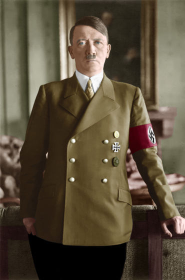
By Bundesarchiv
In response to a series of reports, an Amazon spokeswoman avoided direct mention, saying, 'We are always looking for ways to please our customers. When we start shopping on our mobile phones, our cardboard is at the front door. We designed a new icon with the hope of reminding us of the excitement, excitement, and joy of the experience of reaching. '
The new icon is also said to 'look like the head of the main character of ' Avatar: The Last Airbender '.'
i know the new amazon app icon is supposed to represent their packages but every time i see it i just see Aang from Avatar smiling at me lololol pic.twitter.com/kIPwneHr2p
— Flipboitamidles (DAMN%) (@flipboitamidles) February 26, 2021
Related Posts:
in Web Service, Design, Posted by darkhorse_log
