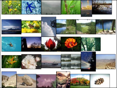
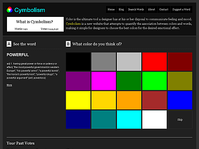
'Colorize' review that seems to be useful for design & color scheme, it will tell you by averaging the 'color' of the image displayed in the search result when you look up the word
'Color' plays a large role in graphic design and web design, and careful color selection is important because
Colorize
https://alexbeals.com/projects/colorize/
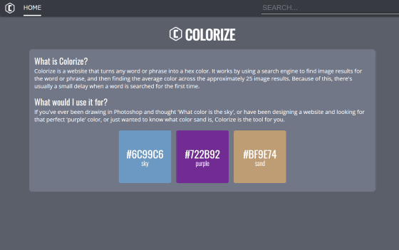
When you open Colorize from the above URL, it looks like this.
To search for a color using Colorize, enter the word you want to search for in the text field at the top right of the screen and press the enter key. First, try typing 'lemon' ...

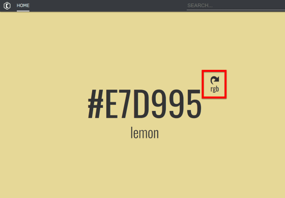
A slightly dull yellow color was displayed like this. By default, the hexadecimal color code of the color that is the search result is displayed, but if you click 'rgb' ...
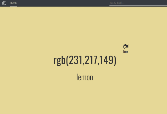
The display switches to the RGB color code. You can easily pick up color information by copying and pasting the displayed color code according to the purpose.
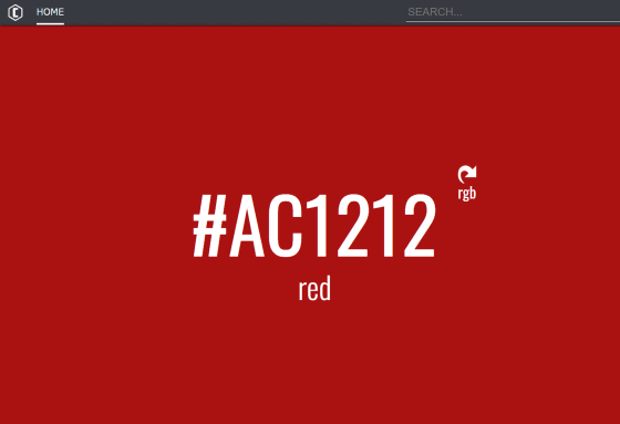
In addition, you can search not only for things but also for colors. If you search for 'red' ...

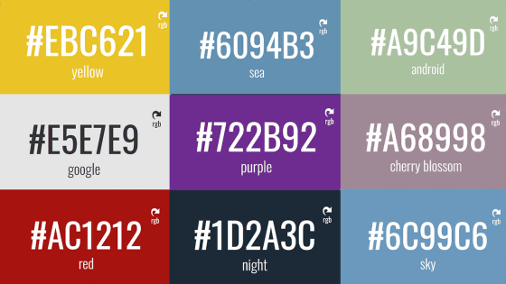
A slightly dark red color '# AC1212' was displayed. The average value of the images displayed in the 'red' search results seems to be a little darker.
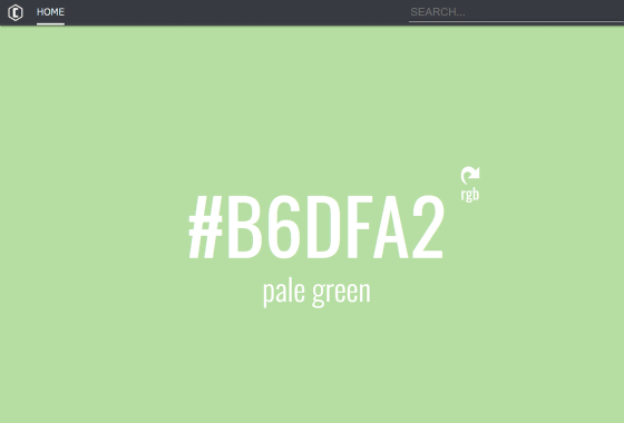
The subtle shade of 'pale green' is also displayed without any problem.
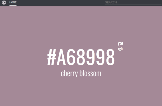
However, when I looked up words such as 'cherry blossom', the result was 'Is it a little different from the image?'
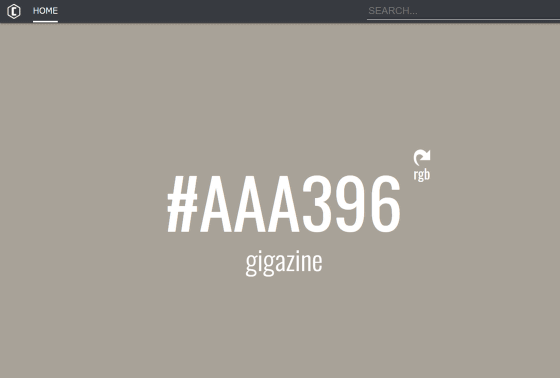
Also, when I searched for 'GIGAZINE', colors that were not used on the GIGAZINE site were displayed. It seems that this is due to Colorize's feature of 'averaging the colors used in the top 25 images displayed in the search results', and the more diverse the search results, the more colors are mixed, and it looks like gray. This is probably because it is close to a dull shade.
'Sky', where each search result tends to be close, was displayed in blue.

With 'osean' (ocean) ...
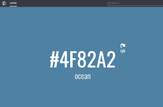
It is also interesting that the shades of the 'sea' are slightly different.
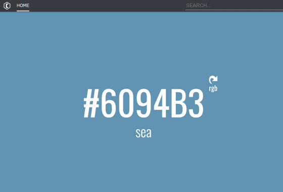
It seems difficult to display the color itself that is imagined from proper nouns such as 'GIGAZINE', 'lemon', and 'cherry blossom', but what kind of color is actually shown from words of colors such as 'red' and 'purple'. It seems to be useful when checking if there are many. It was also interesting to know the nuances of how the colors shown in the search results differ depending on the words, such as the difference between 'sea' and 'ocean'.
Related Posts:
in Web Service, Review, Design, Posted by darkhorse_log
