Specifications changed so that Google can not distinguish search results and advertisements at a glance, voices of criticism from various places
by
Google search results have a pure search result, the 'organic search' part and the 'advertisement' part, and both have been clearly color-coded so far. However, due to a new specification change announced on January 14, 2020, the two categories cannot be distinguished at a glance. In response, voices have been raised from various places.
Google's ads just look like search results now-The Verge
https://www.theverge.com/tldr/2020/1/23/21078343/google-ad-desktop-design-change-favicon-icon-ftc-guidelines
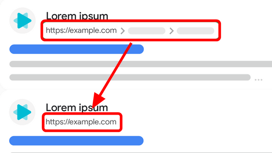
On January 14, 2020, Google announced that the display of search results will change on Twitter. According to Google, the search result display on mobile, which was changed in 2019, will be introduced on the desktop version.
Last year, our search results on mobile gained a new look.That's now rolling out to desktop results this week, presenting site domain names and brand icons prominently, along with a bolded “Ad” label for ads.Here's a mockup: pic.twitter .com / aM9UAbSKtv
— Google SearchLiaison (@searchliaison) January 13, 2020
This is the new design of the search results. Google explains that `` The domain name of the site and the brand icon are displayed large with the bold label 'Ad' '', but at a glance it is possible to determine whether the displayed one is an advertisement or an organic search result It is difficult to do.
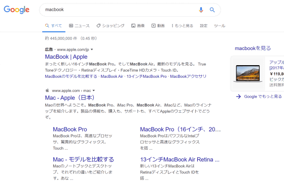
According to
Many have pointed out the problem. Hern , editor of the British newspaper the Guardian, said, ` ` Google decided to turn around and put small tags and text on the title of non-advertised search results instead of removing ad labels. '' There is no visual distinction between advertising and search results.Technically speaking, this is 'labeling,' but it's hard to tell at a glance where an ad ends, 'says Twitter. Said.
I would argue there is now no visual distinction between ads and results.There is still, technically, * labelling *, but it's hard to escape the conclusion that it is supposed to be difficult to spot at a glance where the adverts end.pic. twitter.com/qjUmisbLER
— Hern (@alexhern) January 23, 2020
In search results up to 2013, the background of the advertising part was different in color as follows. This made it clear what was the ad.
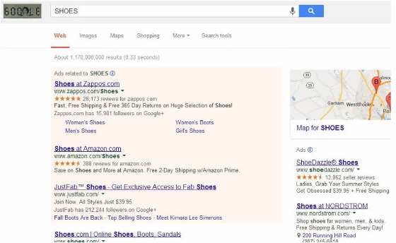
In 2016, Sundeep Jain, product management director of Google's search results section, said in 2016 that `` simpler design makes it easier for users to digest information '' `` Google has many colors on the page to harmonize the layout that and we are trying to reduce 'the use had been told .
Related Posts:
in Web Service, Posted by darkhorse_log

