The next major version of Android 'Android 10' has a new logo without nickname

The official name
A pop of color and more: updates to Android's brand
https://www.blog.google/products/android/evolving-android-brand/
The following movie is very easy to understand about how to change the logo and key colors.
The next evolution of Android-YouTube
The original logo that appeared at the beginning

Droid-kun flies across the screen
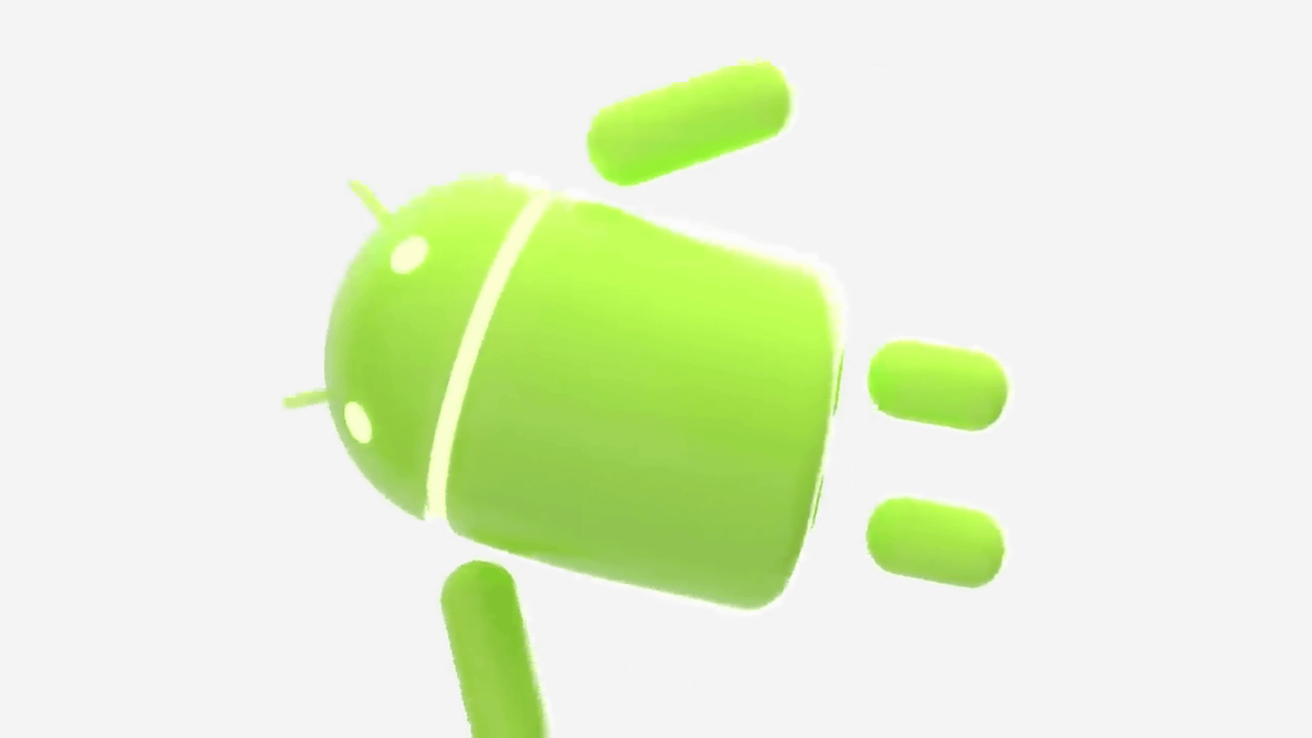
And peace sign from the side of the screen. The logo was changed in 2014.

This time, more work has been done here. The logo text is selected ...

The font has been changed.

Mouse cursor to select “Design File”

Droid's head

That design change was made.
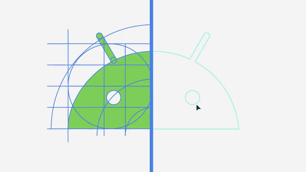
Move eye position ...

The curvature of the head is also changed.

Also change the color. Since 2014, Droid has been a bright yellowish green.

However, the new color has a slightly reduced yellow component and feels slightly closer to light blue.

The font has rounded corners.

The new logo looks like this.

Related Posts:


in Video, Software, Smartphone, Design, Posted by logc_nt