A site 'Can not Unsee' that can verify how much he has the feeling about design
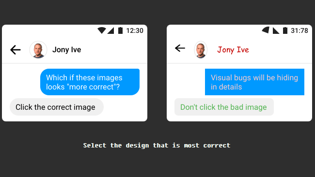
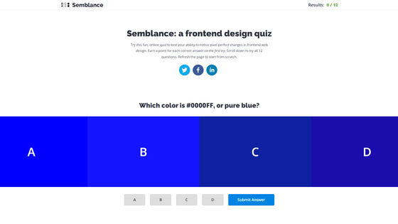
Even on smartphones and web pages that we normally use casually, each one of the screens displayed is carefully designed, but by making quizzes for such design differences in two choices and solving themselves " Can not Unsee " is a site that can confirm how superior design can be seen.
Can not Unsee
https://cantunsee.space/
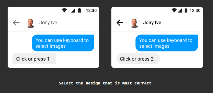
As soon as you open the page, the quiz begins, and three tutorials are asked first. It is said that you can click on the image of one who felt it was more appropriate. Try clicking on the image on the left this time.
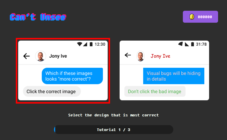
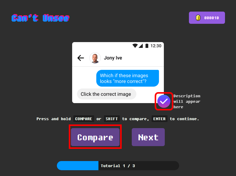
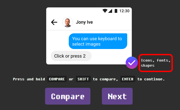
A check mark appeared along with the selected image and taught me that it is the correct answer. Also, when you click "Compare" at the bottom of the screen ... ...
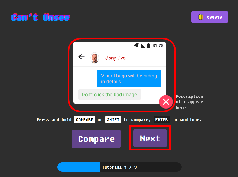
It switches to the one in which the image above was incorrect. Click "Next" to proceed to the next problem.
The following problem is as follows. Compared with the first problem suddenly suddenly the degree of difficulty rises.
The correct answer is on the right. The word "icon, font, shape" appears next to the check mark and tells us what was wrong.
And the final question of the third question tutorial.
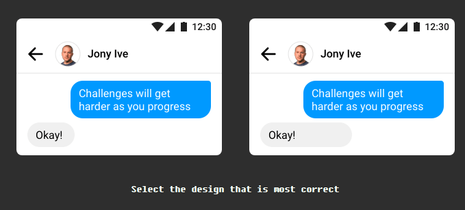
The correct answer is on the left. The right side said that there is too much margin for chatting.

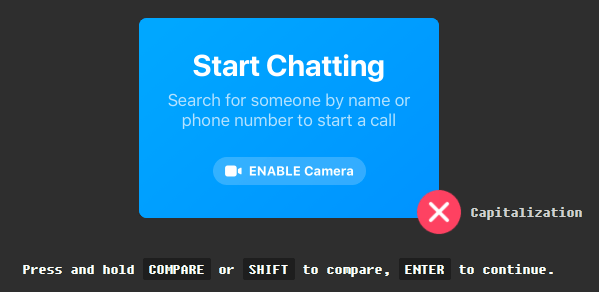
When the tutorial is over, questions of difficulty "Easy" will be asked as many as 18 questions. Easy's first problem is like this.
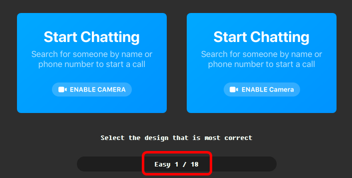
The correct answer is on the left side, and it is a question whether the lower "ENABLE CAMERA" is capitalized or not.
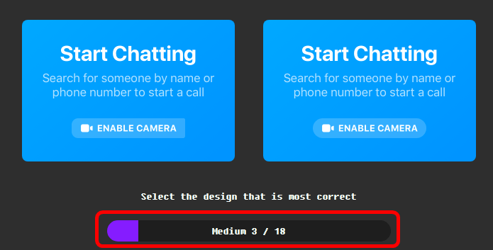
..., and this condition finished solving 18 questions of Easy crisply, when I noticed it was in the zone of difficulty "Medium". It is the same scene as the previous problem, but even in the same scene change hands and change items and appear many times.
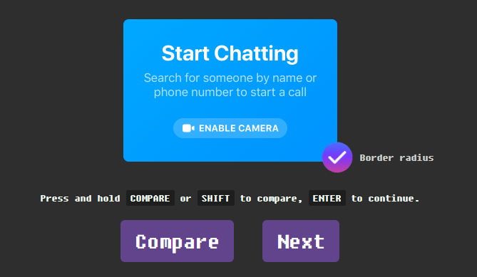
The above problem is correct on the right. It seems that it was questioned whether the corner of the bottom button is round this time.
At the end of difficulty level Medium, "Hard" is finally prepared for 18 questions.
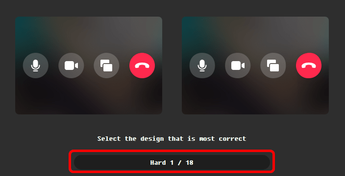
The correct answer for the above problem is on the left side. The shape of the button is subtly different.
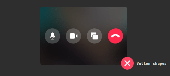
Another problem of Hard is like this.

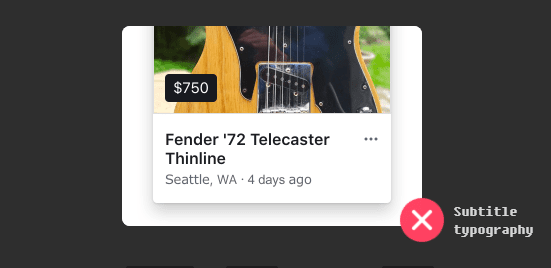
This means that the typography of "Seattle, WA · 4 days ago" is different, right side is correct answer. As a comment that actually solved the problem, difficulty Hard problem is not totally different even if you hear the correct answer. I feel that professional designers are checking up to such a point ... ... and the depth of the design.
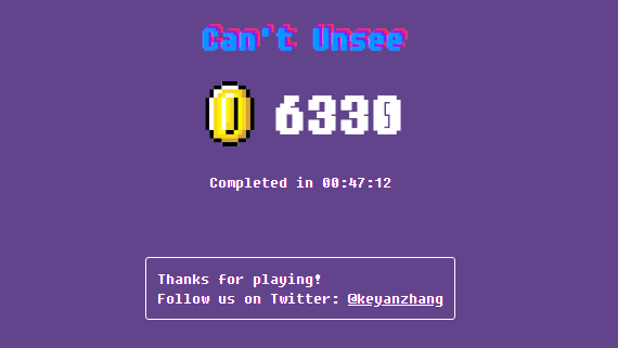
The score will be displayed according to the number of problems that answered correctly after solving up to 18 questions of Hard. Easy and Medium got a right answer so far, Hard was almost 633 points when answering with a can.
Related Posts:


in Review, Web Application, Design, Posted by log1d_ts