A movie you can understand well how "Starbucks coffee logo has been designed"
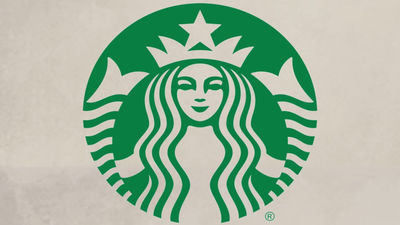
Coffee chain deployed worldwide ·Starbucks CoffeeThe logo is a woman drawn in a green circle. A movie explaining the history of how Starbucks coffee logo has been designed,BloombergIt is published by.
How Starbucks Found Its Mythical Mermaid - YouTube
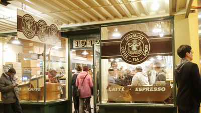
Starbucks coffee in Seattle, Washington State, USAFirst storeIt started business.
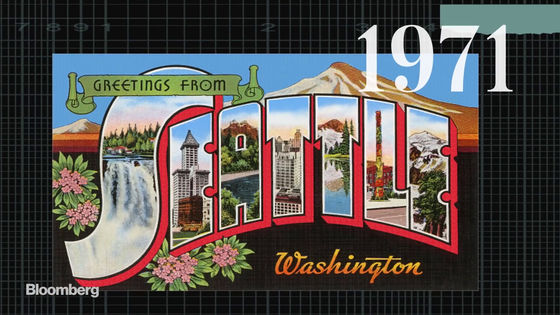
At that time it was a shop that sells roasted coffee beans, not coffee shops.
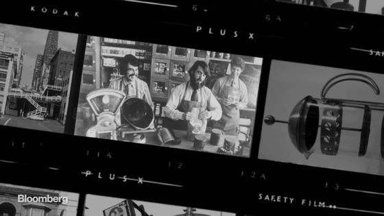
The store name Starbucks is a Herman Melville novel that a founder member likedA white whaleIt is taken from.
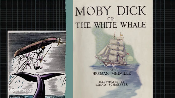
"Pequad" taken from the name of a whaling ship appearing in "whitewater" was raised as the first candidate for the store name. However, Mr. Terry Heckler, who was in charge of publicity, showed a difficulty in putting on the name of the ship sinking in the work, so I decided to adopt the name of the first owner / starback that appears in the same work is.
Mr. Heckler hits various books, in which it was produced in Norway in the 15th centurySirenI caught my eye on the old woodcut prints.

Seiren is not just a mermaid, it is a mythical monster that seduces seafarers with their singing voice and drags them into the sea. The reason why Seiren was adopted as a logo is that the expectation that people are invited by Sirene to buy coffee is included.

The original logo which was founded in 1971 is like this. Unlike now brown is the keynote logo and the illustration of Siren in the center uses the thing of wood print as it is.

At first there was a complaint due to the nakedness of the upper body of Siren, Mr. Heckler will change to a design that hangs his long hair hiding his chest.

In 1987 the logo was renewed and the green color representing freshness and growth became a keynote design.

And in 2011 again the logoRenewalIt will be. The company name was removed and it became only Illustration of Seiren. This change was also pros and cons for fans.

If you look closely at the face of the siren, the nose of the right side (yellow part) is a little different in thickness and length compared to the left side. With this slight difference the logo is no longer line-symmetric, it can be said that humanity is more addicted to Siren's face.

Starbucks is developing in 79 countries with this logo and has built a brand value of more than 8.7 billion dollars (about 960 billion yen).

Related Posts:
