The way to make an excellent game is in "readability on the subway"

The world's largest game developer conferenceGame Developers Conference(GDC) 2018 was held in the US in March, 2018. A lecture by Zach Gage, a game developer, conducted within thatBuilding Games That Can Be Understood at a Glance (How to make games that you can understand at a glance)"Is published on Gage's website.
Building games that can be understood at a glance
http://stfj.net/DesigningForSubwayLegibility/
Zach Gage said "SpellTower"Really Bad Chess"I developed a game application for iOS such as. Mr. Gage frequently checks the contents of the game and how to play by seeing the screen of a game played by smartphones by strangers on the subway, bars and the like. And from that experience, I insisted on the design of the game "Subway-Legibility", that is, "to make the contents and attractiveness of the game convey only by looking at the screen" is important It is.

Mr. Gage explains that by achieving Subway-Legibility the following three merits can be obtained.
1. It will become easier to convey how to play the game
You can save time and effort to prepare complicated tutorial mode which uses sentences and icons frequently, because you can understand how to play the game and rules only by looking at the screen. Also, a better tutorial will allow you to play the same way with good or bad people.
2. More opportunities for people who do not play games to touch the game
YouTube, Twitch, etc. have appeared, now anyone can easily play gameplay. In a game that seems to be interesting only by looking at the game screen, it becomes unnecessary for the players to explain the contents by themselves, which makes it possible to stir more interests of people.
3. Marketing becomes easier
If it is a game in which the content and charm are conveyed by just looking at the screen, you do not have to prepare many screenshots or explanatory texts for the promotion of the game, and spreading on SNS such as Twitter becomes easy.
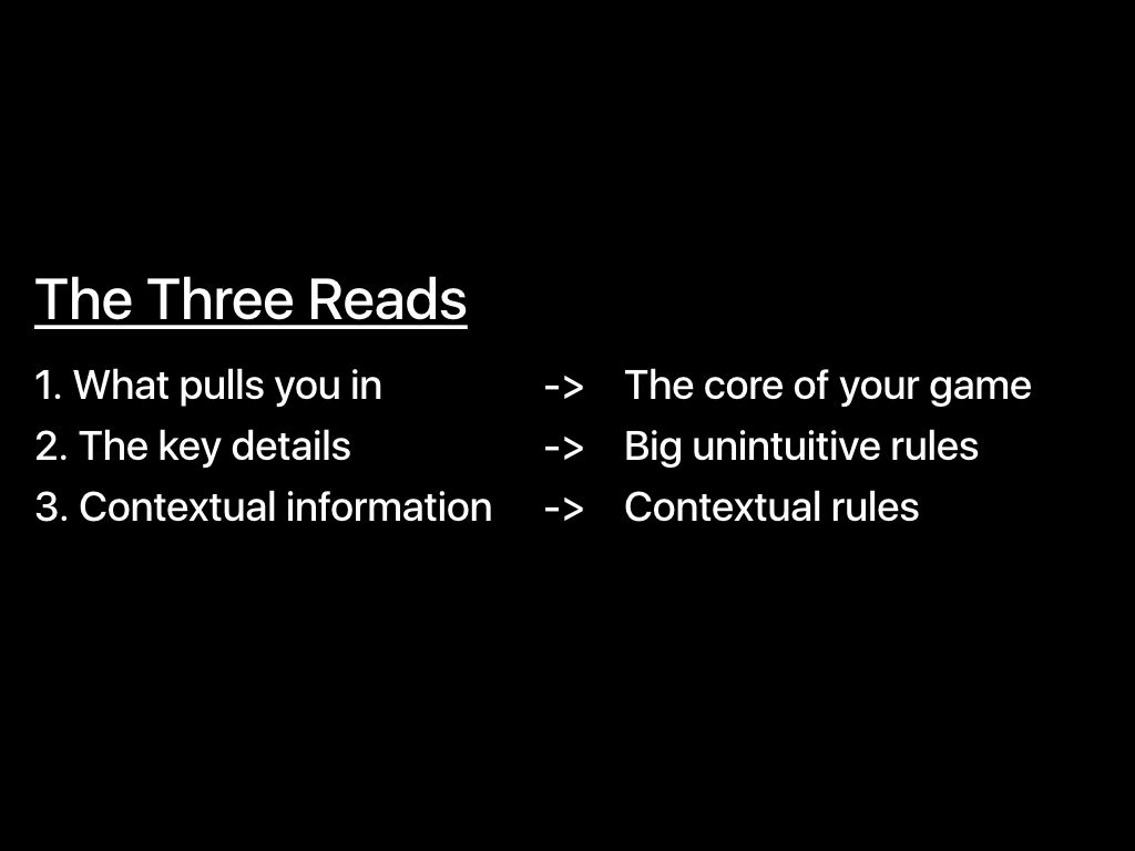
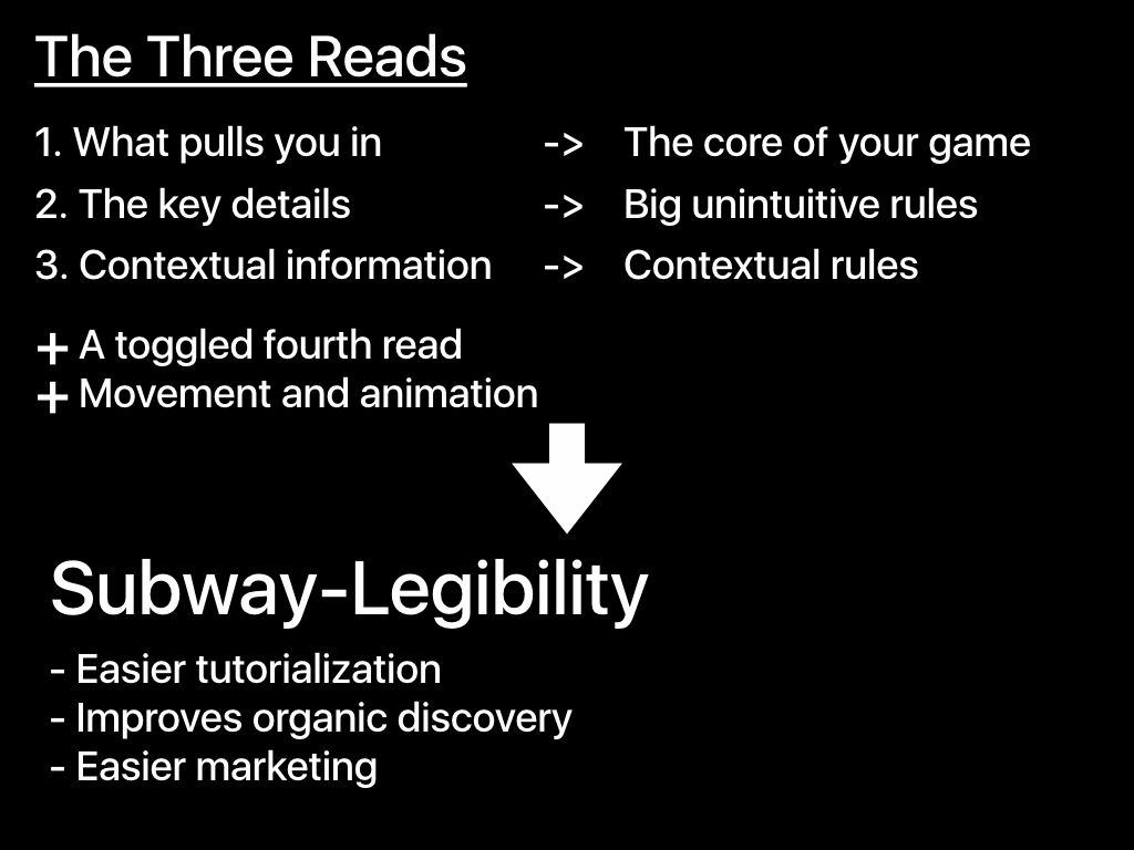
In addition, Gage lists "The Three Reads" as "How to design games to achieve Subway-Legibility". The Three Reads means "1: intuitive information that can be understood intuitively and easily attracted at a glance" "2: intuitively difficult to understand but important information" "3: other detailed information "It is a method of considering the composition based on three stages in which humans pay attention to information.
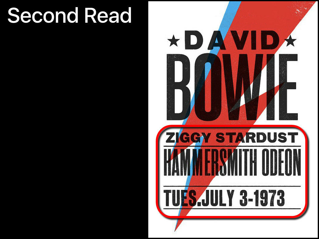
As a specific example grabbing the image of The Three Reads,David BowieThe posters of the concert are introduced. The poster of the concert is designed to draw even the eyes of a passerby from some distance. To do so, you have to enlarge the letters on the poster, but if you enlarge all the letters it will turn into a poster that is hard to see. The first piece of information that attracts attention in the poster is "Who's a concert?" In this case, you should write the name "David Bowie" large.
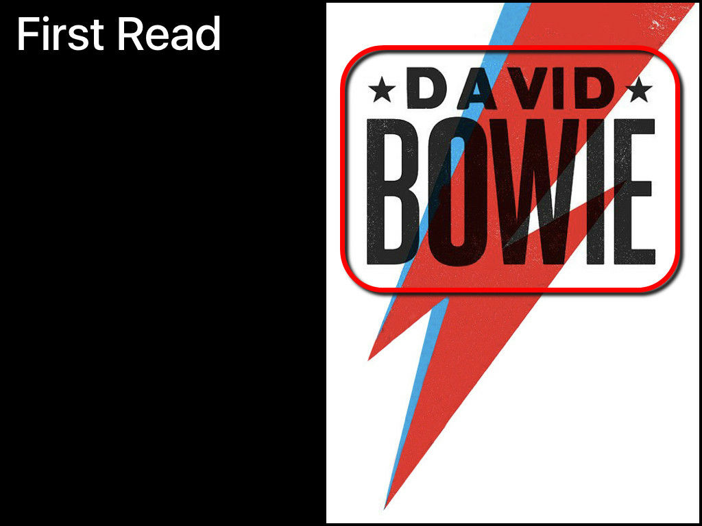
Focusing on the name "David Bowie", the next time people who are interested in the poster are interested in information such as the date and place of the concert. This is a slightly smaller character than the one in the first step.
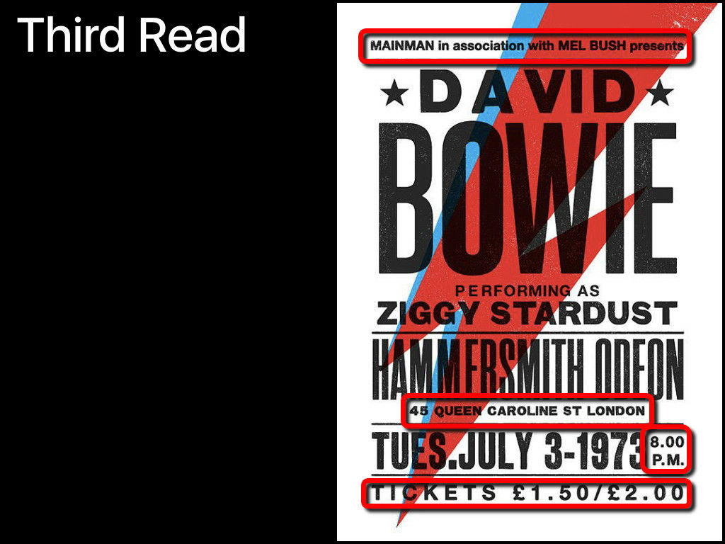
Lastly, I will add detailed information such as organizer name, ticket cost, opening time of the concert, in small letters.
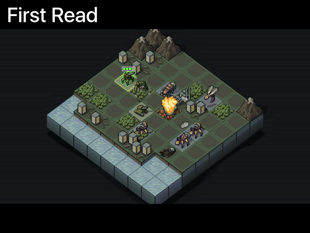
Mr. Gage said that The Three Reads can be applied not only to advertisements but also to game user interface (UI) designsSubset GamesofInto the BreachI will explain it by exemplifying the screenshot.

The first things that you notice when you look at the screenshot are icons such as the face of square grid, giant mecha · insect icon, fire effect. These are the nucleus of the game and draw interest from those who are interested in SF-like worldview and strategy.
The next point of interest is important information that is hard to understand intuitively. If you are familiar with the game, you can understand that you see "End Turn" in the upper left and "4 turns" in the upper right, you can understand that it is a turn-based game, and "Ground Tile Tile) ", you can grasp that" the effect depends on the terrain. "
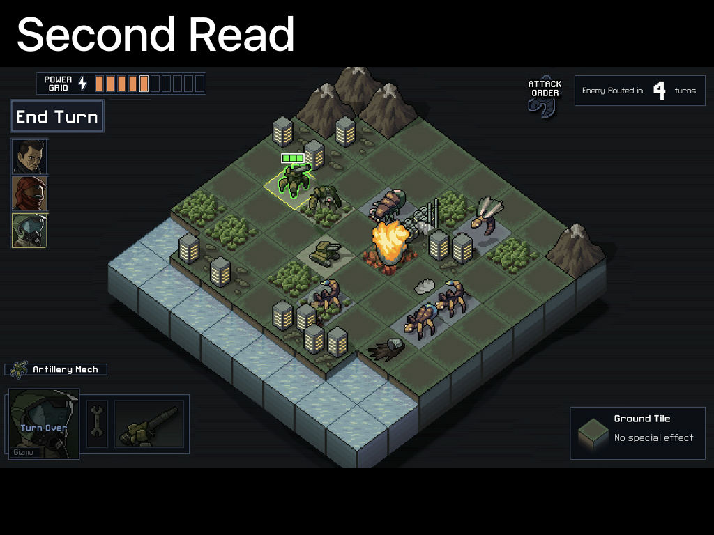
And by reading the detailed information in the third step, you can grab the finer rules and contents of the game. Into the Breach can understand what kind of game it is with one screenshot with a single shot and Gage highly appreciates the high degree of UI completion.

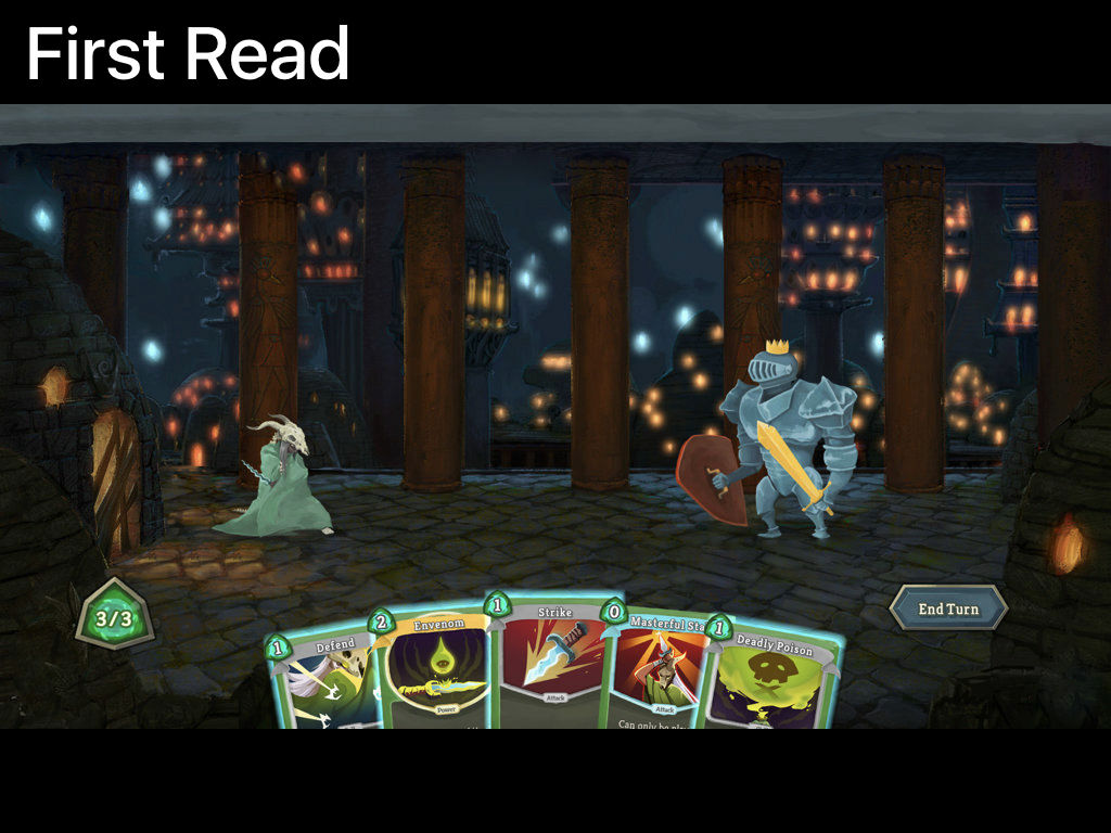
Also, Mr. GageMega Crit GamesofSlay the SpireIt also points out that although Subway-Legibility has been lost, Slay the Spire is not protecting The Three Reads, while giving a preliminary indication that the content of this game is wonderful. The first thing to note when you see the screen shot of Slay the Spire is that you can understand that Slay the Spire is a card game set in the fantasy world with card games on hand and monsters in the back.
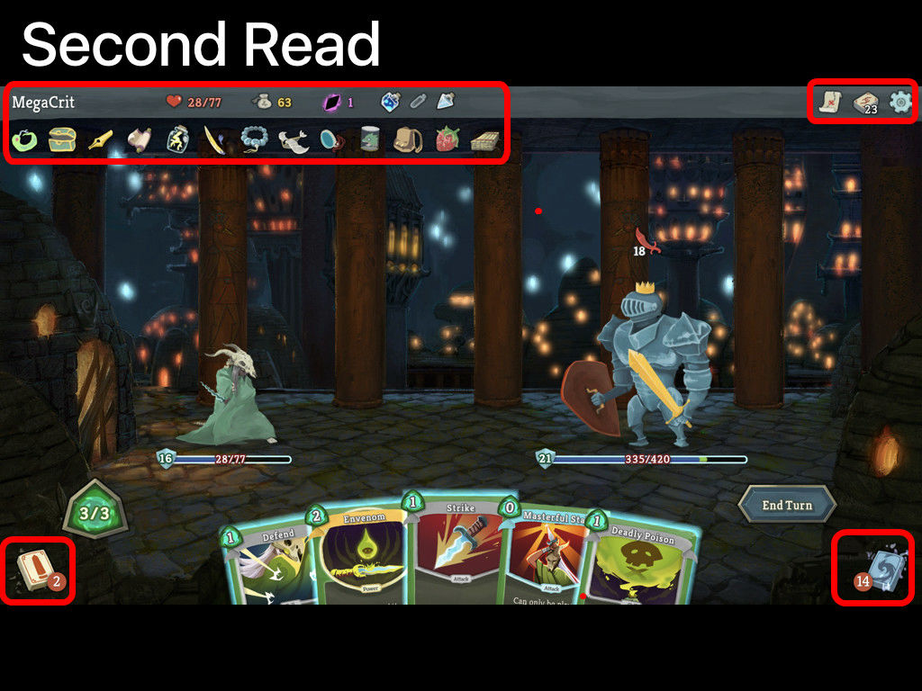
In the second step, attention is drawn to the icon displayed in the upper right. However, if many small icons are lined up as shown in the image below, there are too many pieces of information, so you can not grasp the contents or rules at all.
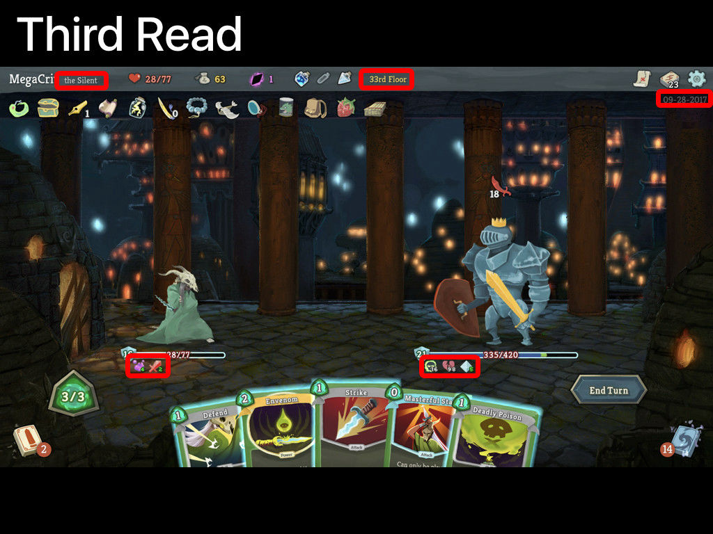
In addition, if you add fine numbers and status icons in the third step, the amount of information will be further increased, making the screen more difficult to understand. If it is a complicated rule game not limited to Slay the Spire, the screen tends to get messy due to excessive information by necessity, "Even if live delivery is done on YouTube or Twitch etc., UI information is many It is hard to have viewers interested only by looking at the screen unless they are too organized, "Gage said.
On the other hand, as a case where Gage solved this problem,HearthstoneWe are introducing. In Haasstone, animation and color change make it necessary to display the necessary information at the required size when necessary, preventing the screen from becoming excessive information. You can tell what kind of UI game the hearthstone is like by following movie.
Hearthstone Japan Winter Championship: Highlights - YouTube
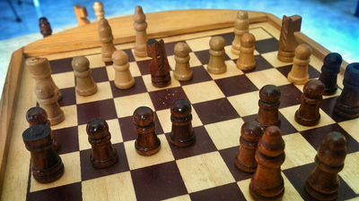
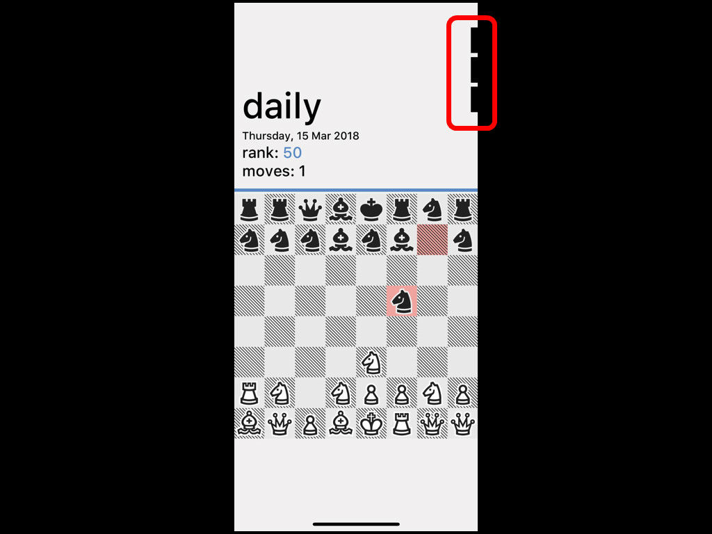
This idea is applied also to "Really Bad Chess" created by Gage. "Really Bad Chess" uses the menu on the upper right frequently, such as checking the redo command and the score, but if it is displayed all the time in the screen, the design of the chess board is made simple, so when playing I get distracted.
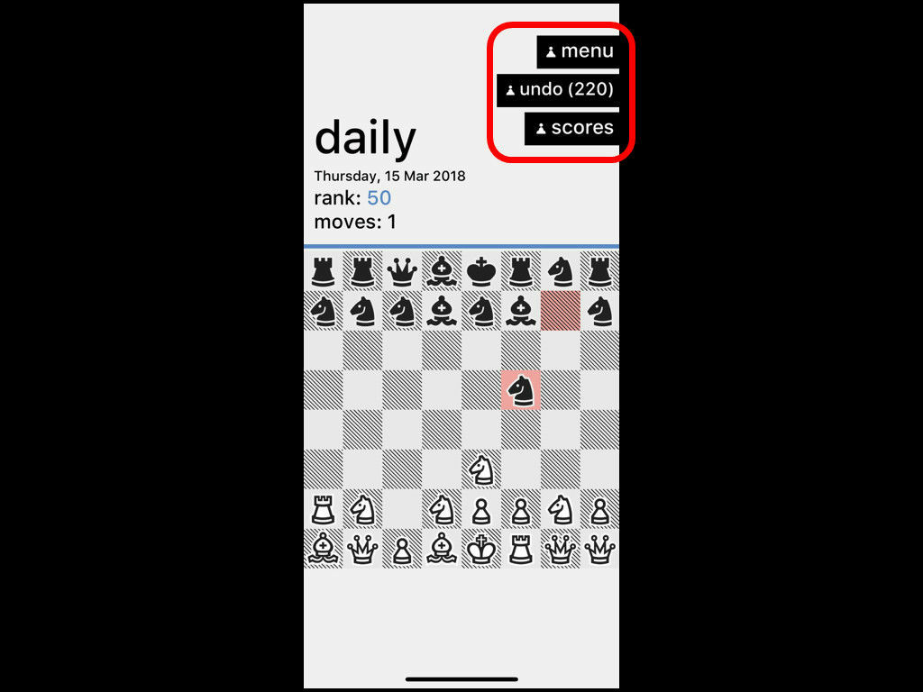
So Gage adopts a design that hides it at the edge of the screen so that it can not read letters unless you tap the menu.
In order to design such a screen that the contents and fun of the game are transmitted at a glance, it is important to design UI while conscious of The Three Reads, and to switch information to be displayed with full use of animation and movement Gage said that if the game's Subway-Legibility is achieved, the game will become easier to play and will be easier for many people to take.
Related Posts: