The UI design of Twitter is rounded and changed simple, while on the net "21.46% of information was lost"
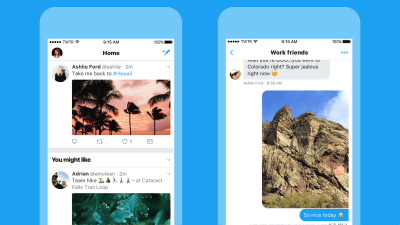
We announced that Twitter renewed the design of the site and the application. Suddenly app screen is simple, although the form of an icon than what should many people were surprised that has changed to a round from the square, while improving usability is achieved in the re-design, including the UI Some people say that it is a little worried that "21.46% of information has been lost from Twitter" on the net.
It became a new design
https://blog.twitter.com/official/ja_jp/topics/product/2017/TwitteJP1.html
On June 15, 2017, TwitterOfficial blogAnnounced the design update of the site and the application. The purpose of this change is "to make it lighter, faster, and easier to use", and GIF animation showing the change points in an easy-to-understand manner is released.
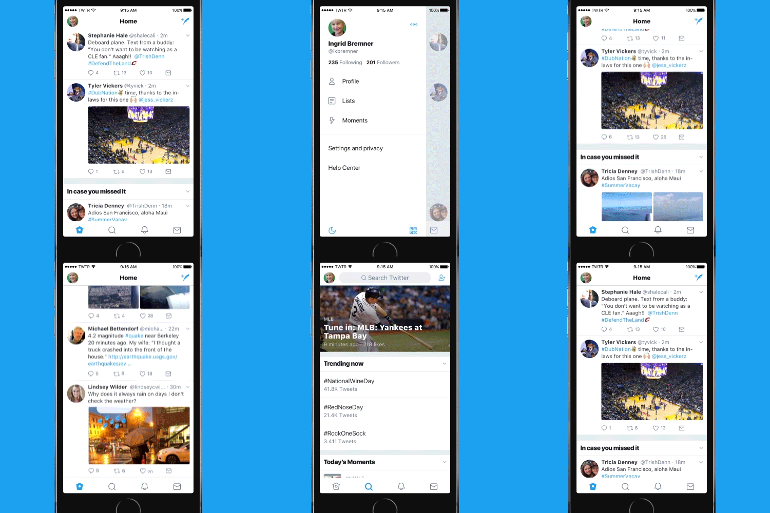
Also,Official Japanese blogBut the changes are described as follows.
We've compiled a profile, switching to another account, settings, privacy in one place. Beside, a new side navigation menu is added, and the lower tab is made clearer than before, making browsing easier by decreasing the number. For the first time we offered it last year we introduced Android's specifications that were well received by everyone to iOS.
Clicking on the link in the tweet will display the corresponding page in Safari on the Twitter application. This makes it easy to access the site you are already signed in to. This function is available on iOS.
By making the headline part bold it has made it clear what you are doing. Also, by changing the profile icon from the previous square shape to the round shape, the difference from the attached image is also clear, making it easier to understand who talks.
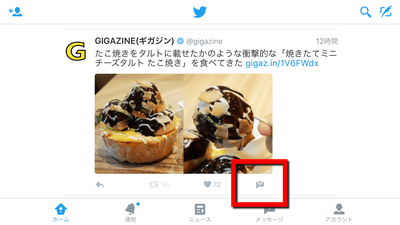
By incorporating intuitive icons that are easy to understand, we made Tweets easier for everyone, as well as those who are using Twitter for the first time. Some people who are thought that reply tweet arrow icons to "delete" or "return to previous" have changed to "balloon" icons that many people knew as familiar and familiar did.
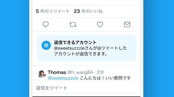
In order to make the conversation on Twitter feel more "live", the number of "Reply" "Retweet" and "Like" was also instantly updated. This feature will be offered sequentially on iOS and Android.
Increasing the accessibility options, such as increasing the color contrast, making it possible to always use Safari's "Reader Display" when clicking on the link. This is available on iOS.
You can see how Twitter's design changed in a single shot when you watch the following movie.
Video for Twink UI change in a moment
- Furukonbo (@ fullcombo 5500)15th June 2017
I accidentally opened it on another tab so I took a movie of reloadingPic.twitter.com/qgH81kse1x
As a result of this change, various things are getting exciting at the (?) Net at once.
【And everything got rounded up】 TL became a big mess because the Twitter icon suddenly rounded up! → Also, the icon you got ...? "That day, 21.46% of information was lost from Twitter" - Togetter Summary
https://togetter.com/li/1120561
With this modification, there is also a voice saying "Twitter information amount has decreased". To give the circle the same area as the square, a larger diameter than the side of the original square is required, but since the diameter of one side of the square and the diameter of the circle are the same length, the amount of information is reduced as a result, That's my tweet.
It is truly regrettable that the amount of information has been lost to π / 4 from the icons of Gods who are good at pictures and photographs due to becoming round icons I really want to protestPic.twitter.com/mQTZPih 4 B 7
- Soda (@ jade_gesugao)15th June 2017
People are misled by dissatisfaction from usual, some people murmuring pilly and dry content.
Do not improve the essential part Does not the head of management knock off?
- The day after the birthday is tomorrow! (@ Jaksha 110)15th June 2017
Also, various tweets have been posted.
Twitter design, Twitter UI change imagePic.twitter.com/EkAdt 1 d 0 NJ
- Nisen 【Official】 03 incoming calls at the smartphone × extension (@itallinc)15th June 2017
I was hungry to change the UI specification on Twitter, so I further rounded the layoutPic.twitter.com/7 kFEpdvSqN
- kebin (@ kebin 628)15th June 2017
Corporate official accounts you see well are influenced by UI change on Twitter ....
- Sneak into Empress 鬼 ㌠ @ MGS concert (@ brabham BT 46 B)15th June 2017
Tanita - kun, Imuraya - san have no problem though ....
Your work tomorrow Asahi has been decided (^ ^;Pic.twitter.com/NhYyacQarO
However, there are also cases where it is possible to make positive use of this change as an opportunity.
like thisPic.twitter.com/pliIaR0biI
- Mother Earth (@ hiduki_ 9)15th June 2017
However, the official Twitter account of "The Kirby's 25th anniversary" that seems to have said the most benefit is being made.
I found the account that I got most by changing the shape of Twitter's iconPic.twitter.com/nzdi7wS19E
- Mimi Rin (@ 33 linn)15th June 2017
Related Posts:
in Web Service, Design, Posted by darkhorse_log
