What is the dramatic simple design that the new "iTunes" aimed for?
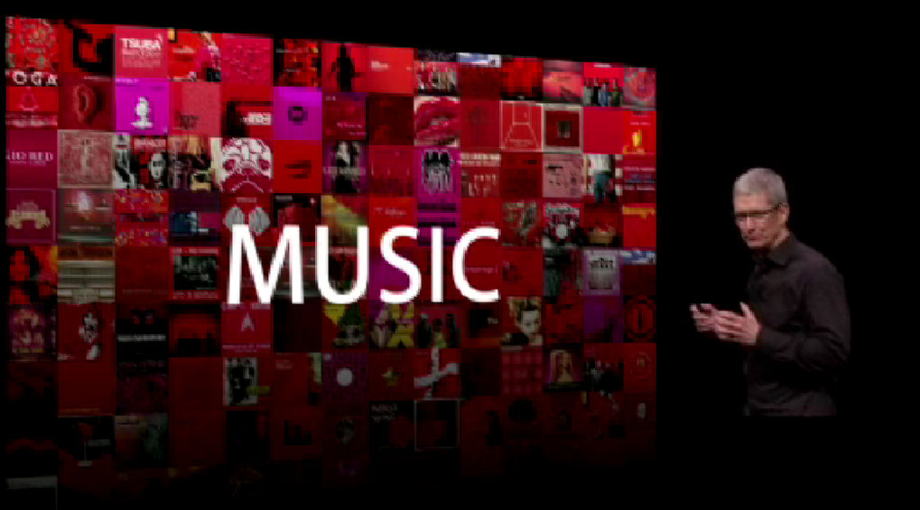
The new "iTunes" redesigned its appearance and implemented Facebook's "Like" button etc. Also on the design that aimed to "make it simple to dramatic", details were revealed at the announcement event of "iPhone 5" held on September 13, 2012.
Apple - Event - Apple Special Event September 2012
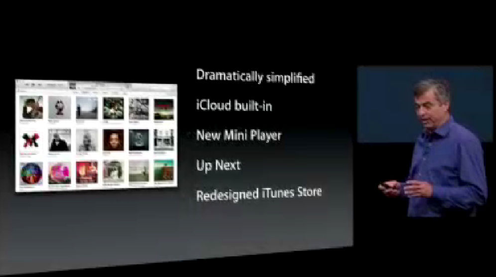
The points of this update are as follows. "Dramatically simplified" is listed as the leading item of the slide.
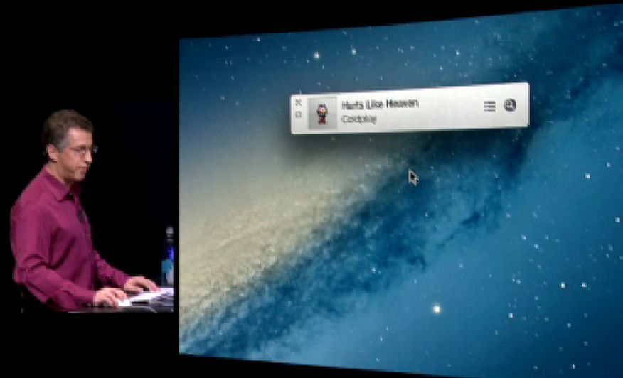
The new desktop version of mini players are as follows. Compact and simple design that only small icons except album artwork, song title, and artist name letters.
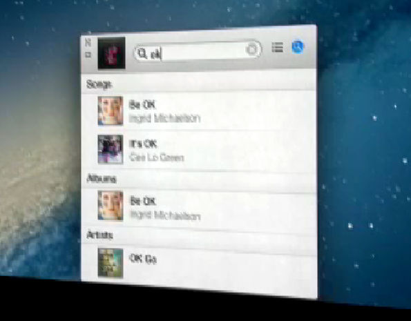
Clicking on the magnifying glass icon in the upper right will open a search window and you can find the songs and artists you want in one shot.
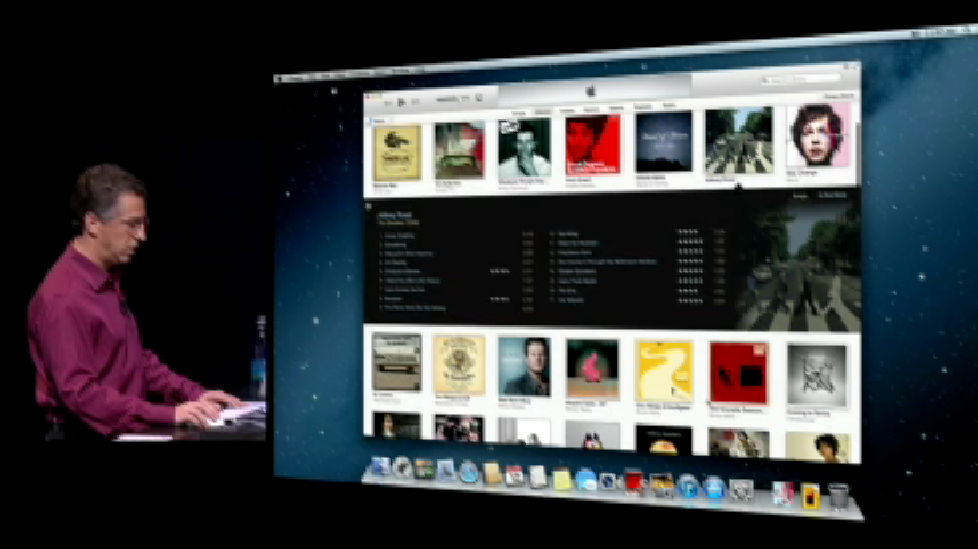
It is like this if you enlarge the player. The artwork of the album is arranged in a tile ... ...
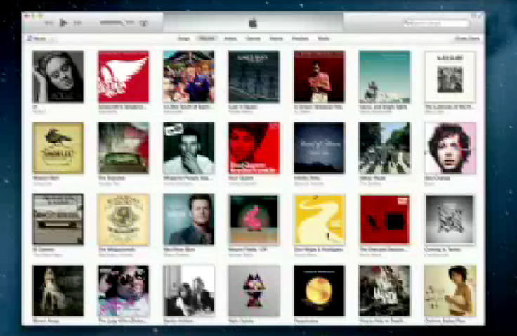
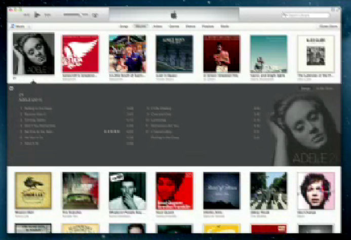
When you click on an album, songs etc. are spread out in strips and displayed.
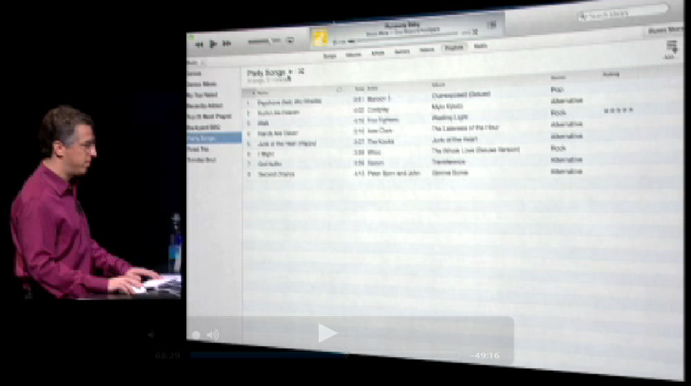
Furthermore, it seems that it can also be displayed with a layout like the old version.
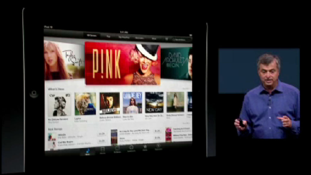
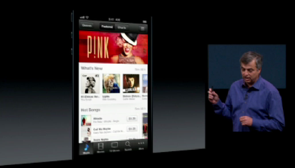
The iOS version is as follows. Both have widely adopted a margin and use an unobtrusive font, so that it is not impressive to make it impressive even if a lot of information is lined up.
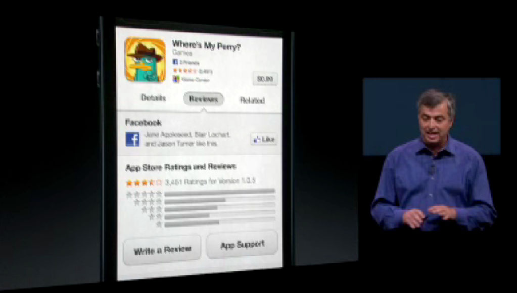
Integration with Facebook also advances and the "Like" button can be used.
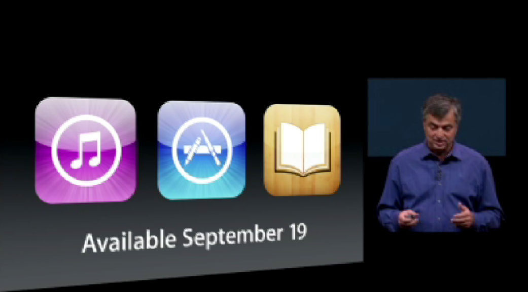
The iOS version will be available from September 19th.
· Previous article
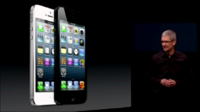
"IPhone 5" is 4 inches screen with LTE compatibility, Apple announced adoption of miniaturized "Lightning" connector
· Next article
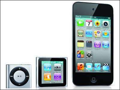
"IPod nano" newly equipped with multi-touch compliant 2.5-inch display, "iPod touch" appeared in 5 color variations
 >
>
Related Posts:


in Software, Posted by darkhorse_log