"IPhone 7/7 Plus" Quick hit actual machine photo review, how has the details of the design changed?
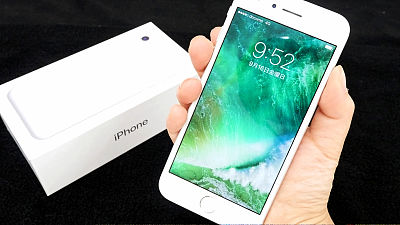
On 16th September 2016, Apple's new terminal "IPhone 7/7 Plus"Was released. The elimination of earphone jack etc. are taken up largely, but how is the other appearance changed? So I quickly reviewed the appearance of the iPhone 7/7 Plus photo review.
First off from iPhone 7. IPhone 7 purchased 128GB silver.
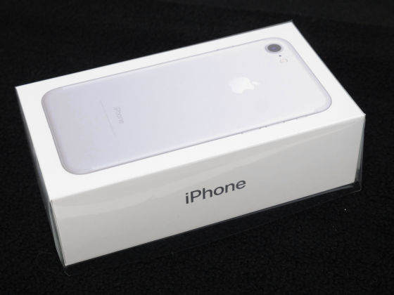
Opened.
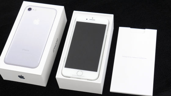
Try out all the contents and it is like this. At the place where the charging cable, earphone, charging adapter, instructions, main body etc. came out, it was "There is no conversion adapter ......?" ... ....

Discovered on the back side of the earphone.

So when you arrange the contents again, it looks like this.

I will take a closer look at the exterior of iPhone 7. First of all, front.
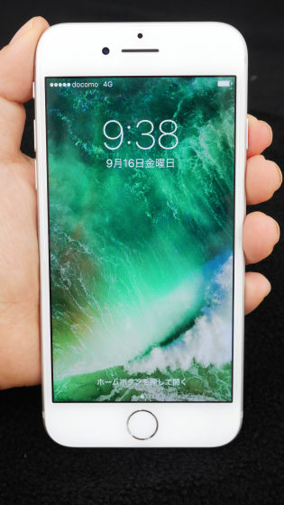
On the right side is only SIM card slot and sleep / wake button.

On the left side are incoming / silent switches, volume buttons.

Nothing is on the top. I am doing it.

And the bottom of the design which changed greatly is like this. Since the earphone jack has been eliminated, it is the symmetry design.

back.

IPhone 7 has become one lens.

This lens part also changed from iPhone 6s. The iPhone 6s had a lens popped out with a pointer, but the iPhone 7 has a seamless design although it has irregularities.

Moreover, the white line of the antenna band which was under the character of "iPhone" has also disappeared, and as a whole, it is the impression that it becomes a simpler appearance which excluded extra elements on the design. Also, when looking closely, the notation of "Ministry of Internal Affairs and Communications" is included under the word "iPhone".

In addition, although the appearance of the home button did not feel a change in particular, when pushing it, the response was quite different from what we had before. The home button of the previous iPhone 7 corresponding to Taptic Engine pushes the button to the fingers that support the back though the home button was pressed with the thumb only when the thumb pressed. Actually, the buttons themselves are not moving physically, but there is a sense that "pressing a button" is unnoticed that you are not moving.

Next, I will look at the iPhone 7 Plus.

Like the contents of iPhone 7, charging cable, earphone, conversion adapter for earphone, charge adapter, instructions, body.

The front is like this.

IPhone 7 is 4.7 inches, iPhone 7 Plus is 5.5 inches Retina HD display and the hugeness of the iPhone 7 Plus is conspicuous as a comparison.

And the biggest difference between the two terminals is this camera lens. IPhone 7 Plus had two lenses with different aperture. Unlike iPhone 6 etc., the lens protrusion is seamless.

There is no antenna band line here as well.

SIM card slot and sleep / wake button on the right side.

On the left side are incoming / silent switches, volume buttons.

Ceiling.

This is also the bottom symmetrical design that was eliminated earphone jack.

Because the earphone jack was eliminated, the earphone "EarPods" that was included was on the lightning terminal.


Therefore, it is possible to connect the bundled earphone directly to the terminal ... ...

The earphone of the 35 mm earphone jack used until now must use the conversion adapter.

The conversion adapter is about 8 cm in length, and even if connected to the earphone jack, it does not feel the presence there.

With this, you can connect to iPhone 7 even with the earphone you used until now.

· Continued
IPhone 7/7 Plus 」compared with the past iPhone 4s · 5s · 6s · 6sP etc - GIGAZINE
Related Posts:
