"Smartmockups" that can create downloadable images of applications and site screens for free and download them
When designing a site or an application, there are times when it is necessary to create an inset image that is displayed on the terminal as an actual use scene, but when you work it, prepare the material and open it in Photoshop It is found that trimming and matching the shape ... ... is a work that is really troublesome. "Smartmockups"Is a site that takes care of almost all such work, you can also create high quality images by creating an image fitted in the template just by uploading the captured image.
Smartmockups - Create product screenshots with just a few clicks, for free!
http://smartmockups.com/
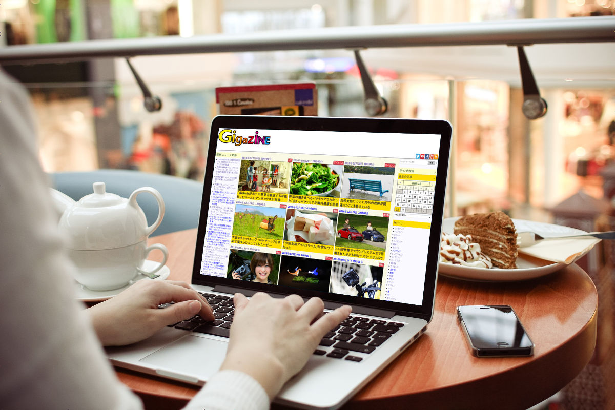
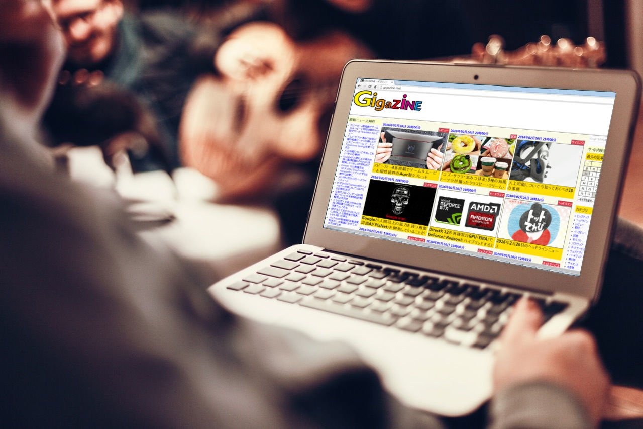
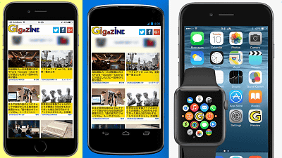
When I tried to display the top page of GIGAZINE on the prepared template, it became this feeling. I do not prepare anything except screen capture, but I can see that it is a very natural finish.
When opening the site, the template image is displayed as follows as shown below. This screen is the one that cut out only a part to the last, and in fact the template continues to further down.
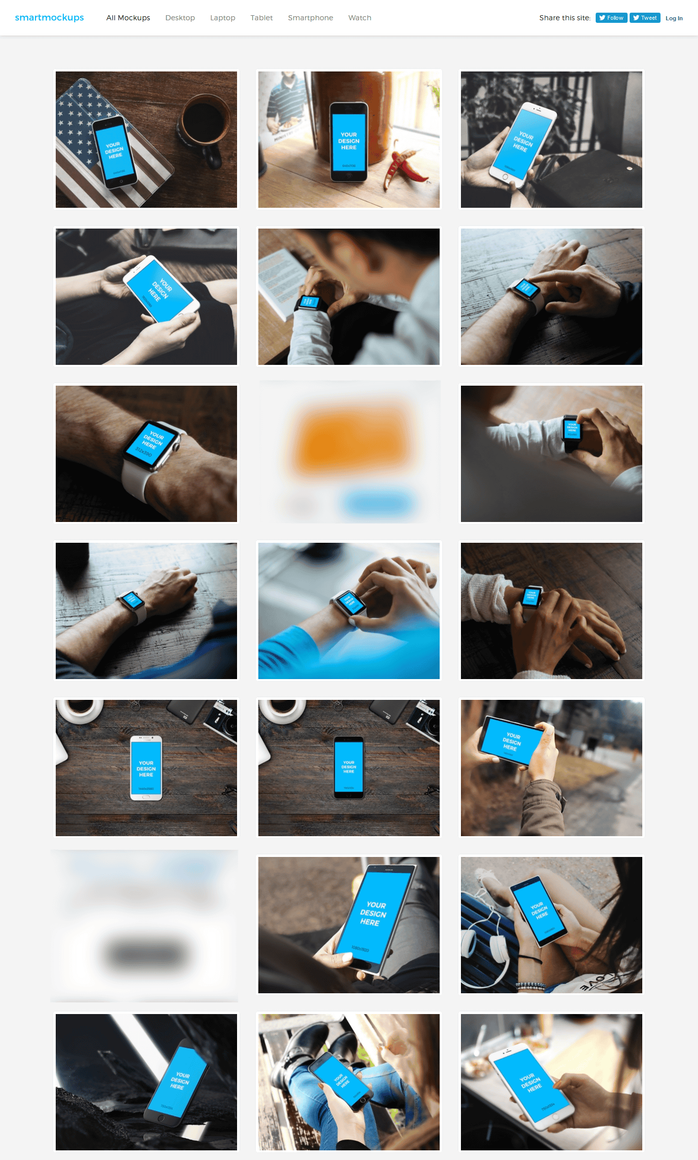
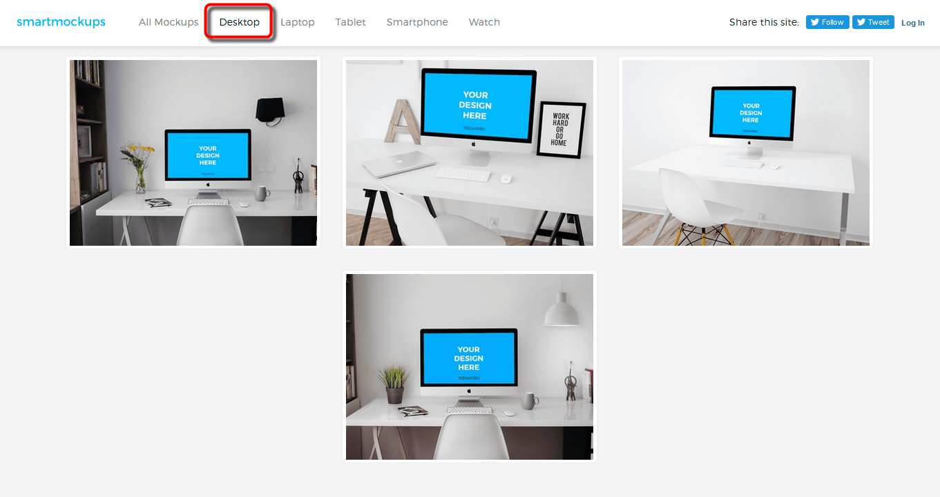
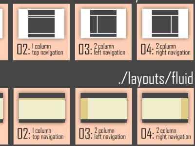
Templates are classified into five categories: Desktop, Laptop, Tablet, Smartphone, and Watch. At the time of article creationDesktopThere were four types of templates available. Furthermore, why everything is used is Mac.
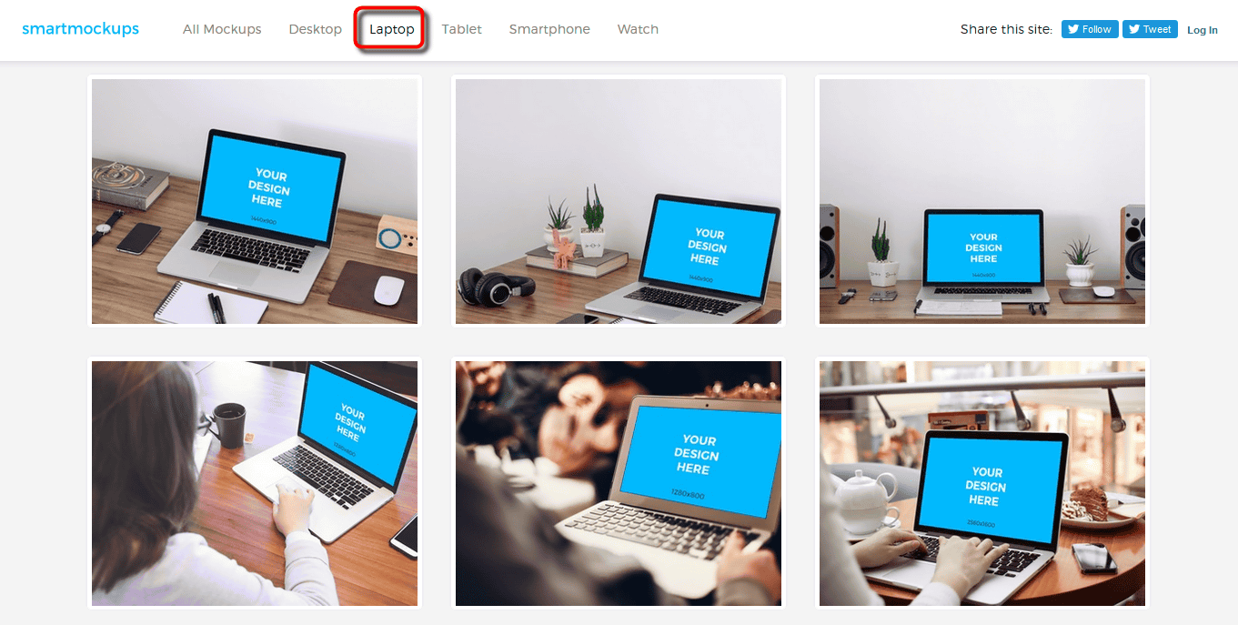
LaptopIs a template using laptop PC. This is all Mac.
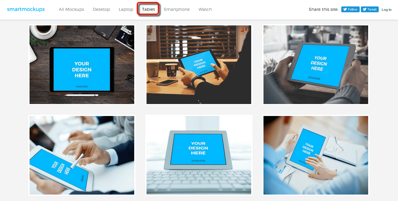
TabletAlso, as I said, templates of iPad, iPad Pro, iPad mini are lining up.
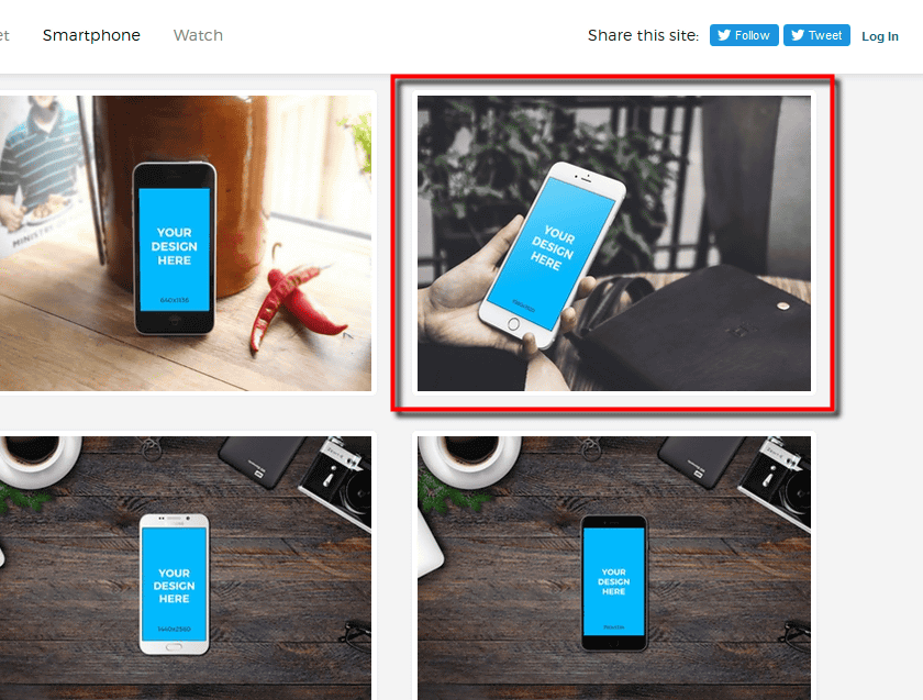
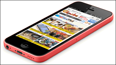
SmartphoneOf course iPhone, and surprisingly, terminals such as Samsung and Nexus and terminals such as Nokia Lumia were lined up in variations.

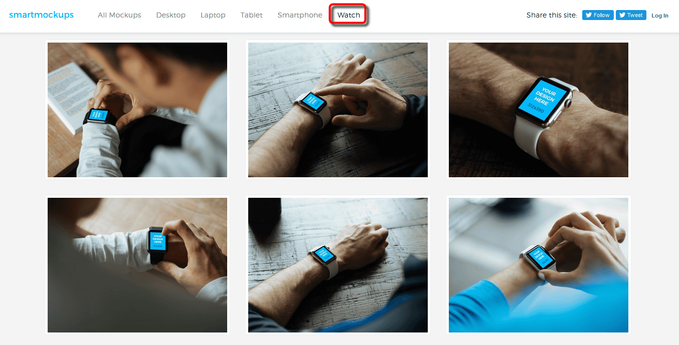
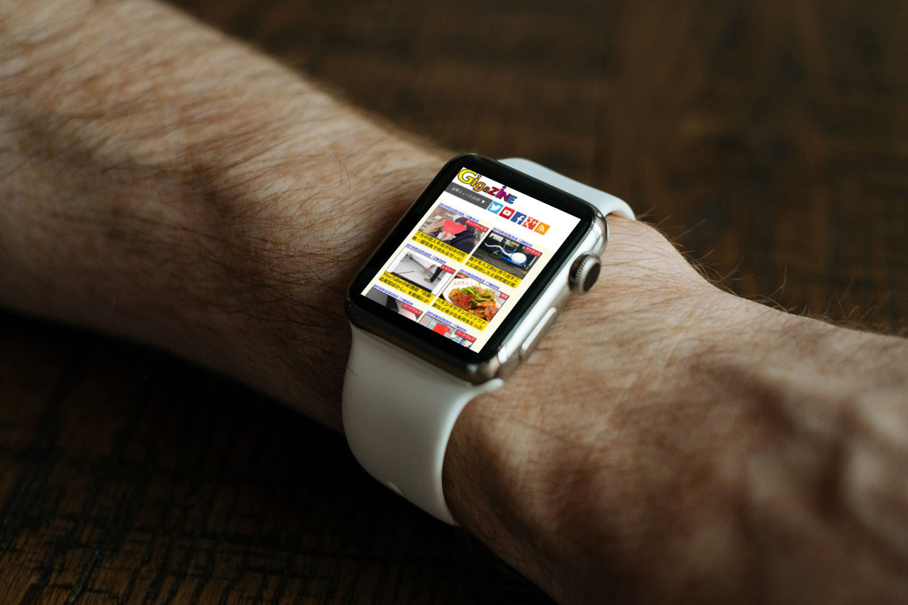
WatchApple Watch was lined with Zurari.
◆ Step to incorporate images into templates
It is very easy to put the screen in. First, click on a template photo to select it.
Click "Upload your image" on the page of each template and select the capture image that you obtained in advance. This time, I captured the display of the top page of GIGAZINE on iPhone 6.
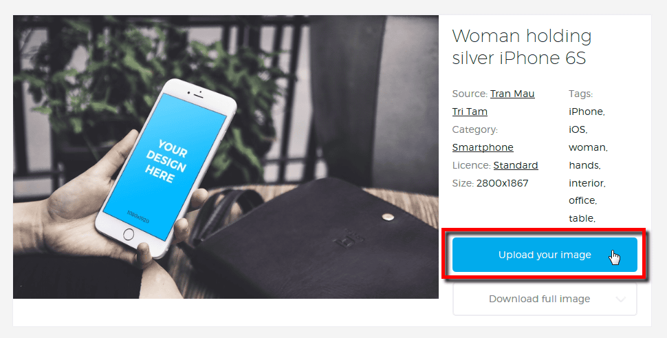
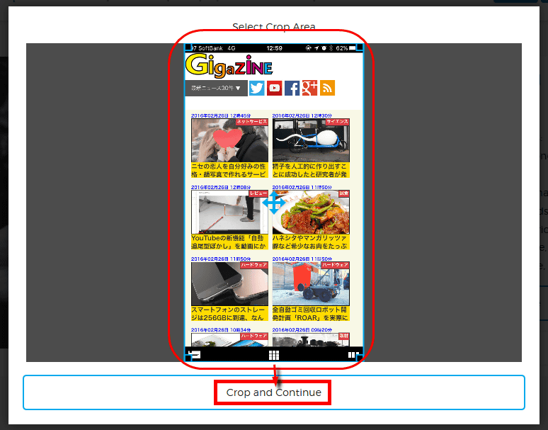
When the upload is completed, a screen for trimming the image is displayed. The display size is set for each template, but it is convenient because trimming can be done according to the screen ratio. Once you have done the trimming, click "Crop and Continue" at the end and the image will be snapped into the template.
A preview screen was displayed when processing was completed in a moment. You can download the created image by clicking "Download full image" in the lower right.
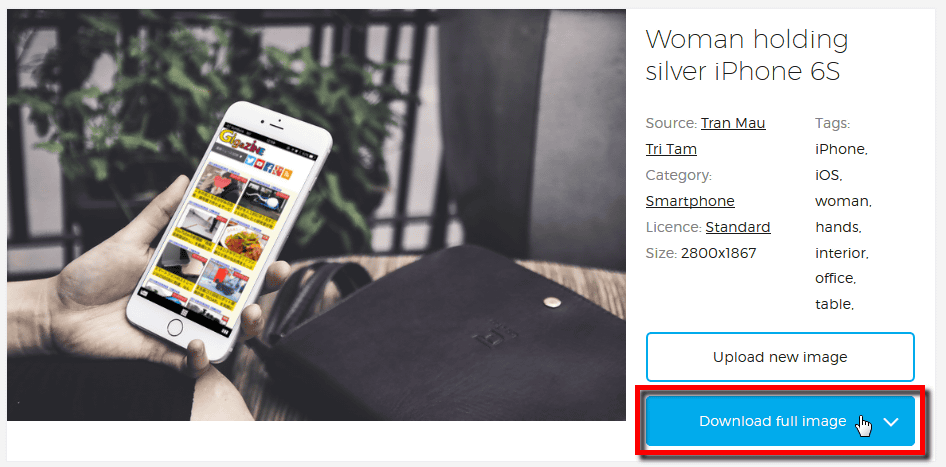
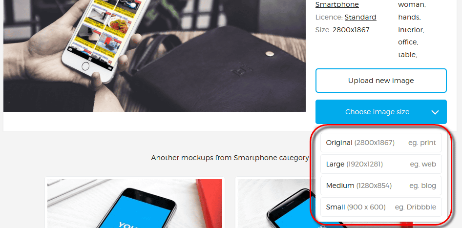
Image size can be selected from multiple. Since there are also 2800 × 1867 pixels if it is big, it seems to be able to use it without problems even on a professional site.
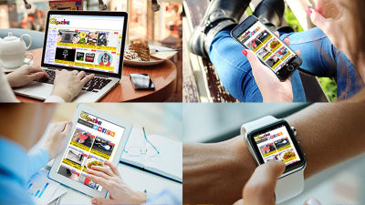
So, the actual downloaded screen looks something like this. It was a service that you can make image images of the scenes in just a few minutes.
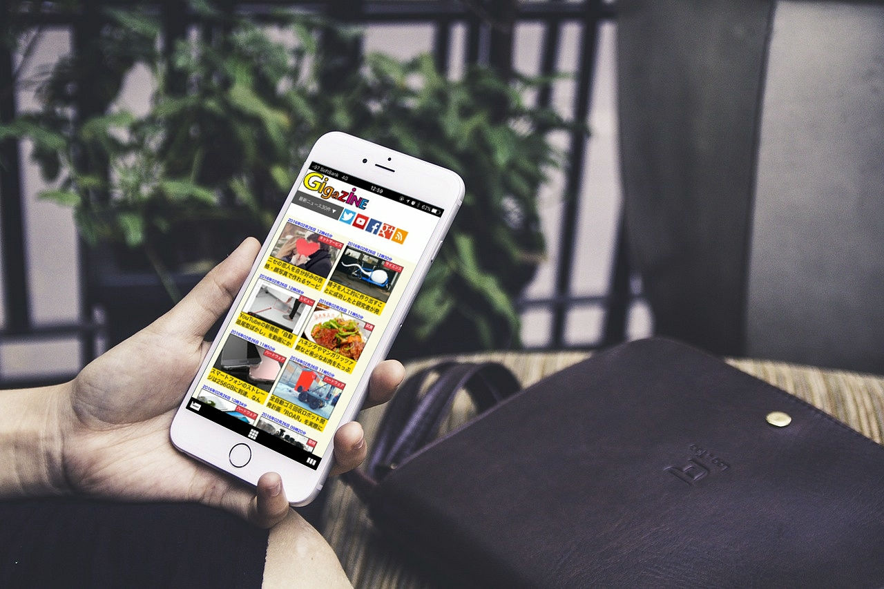
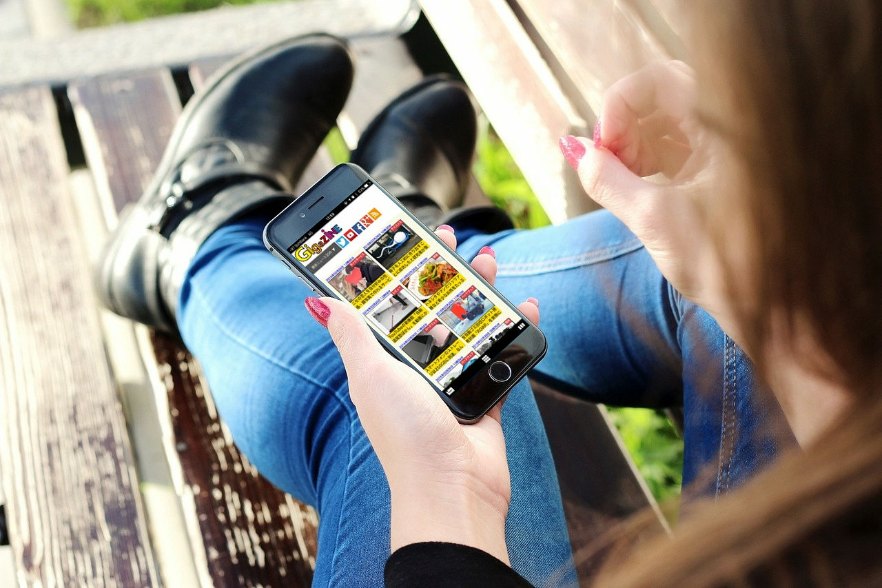
Scenes sitting on the bench and ... ...
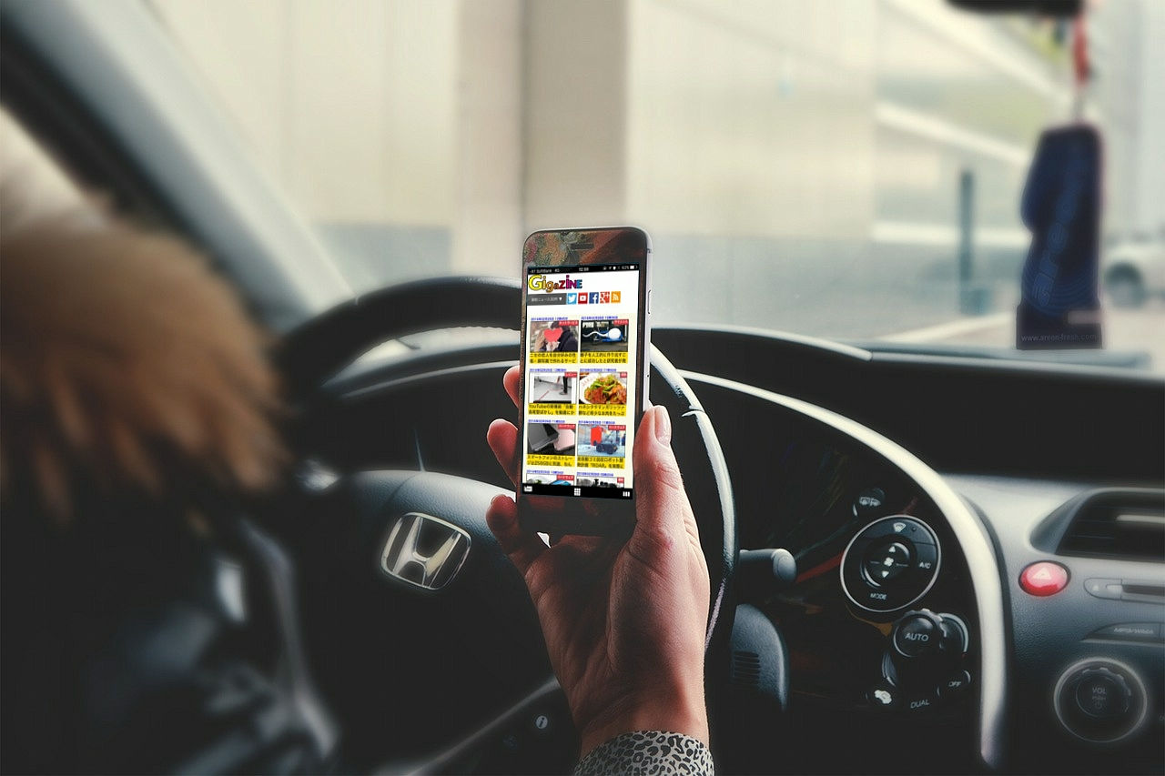
Also scenes in the car. But please do not look at GIGAZINE while driving.
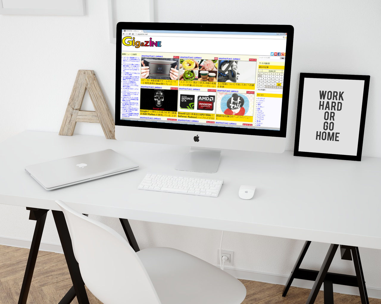
The image displayed on the Mac looks something like this.
It was a moment to try to display on MacBook.
It is also possible to display GIGAZINE with Apple Watch, which should not be able to display web pages. It is actually a template to use to check the operation image of the app for Apple Watch.
Related Posts:
in Review, Design, Web Application, Posted by darkhorse_log