Pepsi Cola's unknown design strategy that takes into account the golden ratio and universal gravitation
by
Pepsi Cola , now sold worldwide, is known for redesigning its logo in 2008 at a $ 1 million design fee. It's a design change that makes you think 'It hasn't changed much from the old logo ...', but in fact, it is carefully calculated by considering the golden ratio and universal gravitation by the strategy of 'BREATHTAKING'. It is said that it has a unique design.
(PDF file) BREATHTAKING Design Strategy
https://people.mozilla.org/~faaborg/files/20090521-firefoxIconQA/pepsi_gravitational_field.pdf
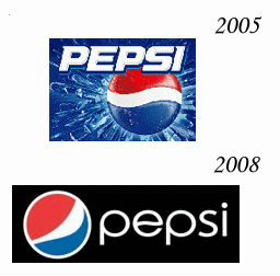
It's a simple Pepsi logo that's now quite familiar, but it was announced in 2008. From 2005 to 2008, a flashy logo was used with a little decoration. In addition, the shape of the red, white, and blue parts that occupy the circle has changed slightly.
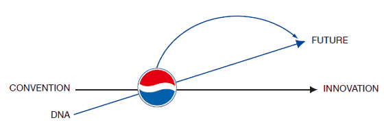
First, the image below shows how Pepsi Cola's history and climate, or DNA, goes from CONVENTION to INNOVATION.

Pepsi Cola's investment in DNA promises innovation in the future.
That's why in 2008 we were in a position to rebuild our resources.
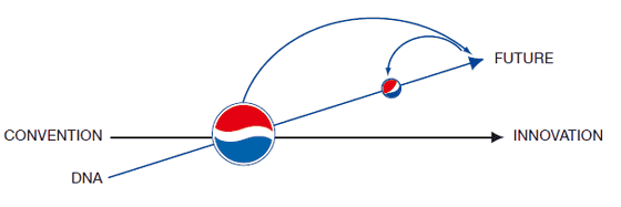
So, various design reconstructions were done. Pepsi Cola has improved the design of logos and bottles many times in the past, and since 'true innovation is derived from the past trajectory', it seems that he made a new design while reconfirming the history of design. is.
The BREATHTAKING strategy is based on the wisdom of design over the last 5000 years. The figure below summarizes the 'aesthetic design' property left over from 3000 BC to 2008.

From the left, the ancient Indian study '

The changes in the Pepsi Cola bottle are as follows. The Pepsi Cola, which was released in 1898, was in a chunky bottle, but from there it became slimmer and slightly thicker, and finally settled in the shape of the current PET bottle.

It was necessary to design a new bottle while retaining the essence of the bottle, which was one of the best in history.

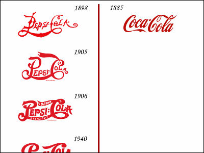
Next, the transition of the logo mark. It is said that the Pepsi Cola logo mark is based on the beauty of geometry, so let's start with the 1898 logo mark. The logo mark is on the top, and the form is extracted from it on the bottom. The rough logo shape is shaped by a calculated ellipse.

When only the form is completely extracted, it looks like this, and it has a fairly complicated shape.

The 1905 logo is also a complicated design with many circles stacked on top of each other.

1906

1929

1930

1962. Suddenly the design became simple and obvious.

1971

1991

It can be seen that 1998 has evolved into a simpler design while being based on geometry like this.

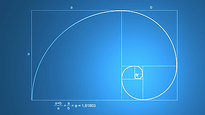
There is a view that the 'golden ratio' that humans feel the ratio of '1: 1.618' beautifully is

Book format, nautilus inner spiral, etc.

The new Pepsi Cola logo was also designed based on the golden ratio. The process on the left is to draw a

If you apply the golden ratio 'a: b = 1.618: 1' to the circle that is the base of Pepsi Cola, you can make many small circles like this.

Let's put them side by side.

It fits comfortably in a golden rectangle like this.

The new logo was designed using these circles.

In addition, the Pepsi Cola logo is related to power. According to

The magnetic field is generated by the south pole in the north pole and the north pole in the south pole, and the same thing can be said for the Pepsi Cola logo, and it seems that it is designed to have an energy field.

The Earth's magnetic field affects the heat of the sun and the movement of the wind, while the Pepsi Cola logo works on a person's 'emotions.'

In addition, the logo design can even express human emotions depending on the movement and appearance.

Gradually, the logo appeared on the character's face.
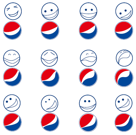
In addition, you can show different movements by converting the 2D logo to 3D.

Also, colors are based on science and are chosen to affect human emotions. The color of the image of 'cold' is Pepsi Cola, the color of the image of 'cold and fresh' is Pepsi Max, the yellowish color that emphasizes the balance of energy is Pepsi, which is caffeine-free, and the silver color that corresponds to 'cold, rich and fresh'. Is a diet Pepsi, and the bright silver 'cold, light, fresh' has been applied to a caffeine-free diet Pepsi.

At this point, it's hard to understand, but the new logo also has the meaning of 'attraction' that attracts customers.

The world of Pepsi Cola will expand like the expanding universe.

Some people have shown the meaning of the new Pepsi Cola logo in a single figure.
blow at life: Pepsi Logo --a response
http://blowatlife.blogspot.jp/2009/02/pepsi-logo-response.html

Related Posts:
in Design, Posted by darkhorse_log
