Six questions to ask yourself to design a memorable logo
Important as one of the branding is a logo which can be said as a symbol of a company. Min Ming Lo who has designed the logo which is the first point of contact between the company and the user has released six questions to ask himself to design logos that are remembered by people.
The Makings of a Great Logo - BOLD by Pixelapse
https://bold.pixelapse.com/minming/the-makings-of-a-great-logo
◆ 01: What kind of emotions are evoked by the logo?
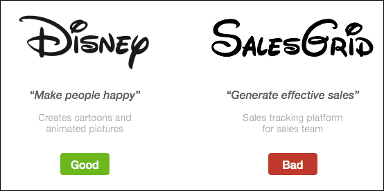
The most important thing in designing the logo is whether the logo reflects the characteristics of the company. The emotions evoked by the user who saw the logo must be appropriate for corporate value. For example, the Disney logo is designed so that the viewer feels "happiness". Characteristic curves and fun fonts are perfect for companies producing children's animation. However, companies in completely different fields such as software development and pharmaceutical companies can not succeed even if they make a logo with the same design as Disney. Designers need to think firmly what kinds of emotions are evoked by colors and fonts.
◆ 02: What is the meaning hidden in the logo?

There is a story hidden in the design in the logo which is considered to be wonderful. For example, the Amazon logo arrow points from 'a' to 'z', which implies that Amazon has every product from a to z. Also, the smile when the user purchased the item is represented by an arrow. When designing the logo, you should understand corporate culture and direction and tackle it.
◆ 03: Does the logo last long?
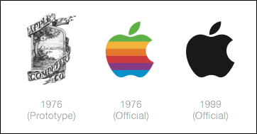
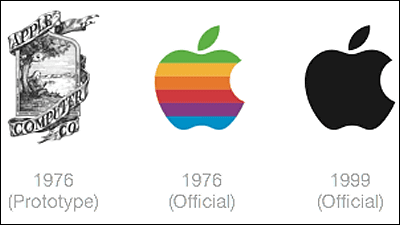
Mr. Lo suggests that the designed brand logo should be considered valid even in ten or twenty years. Designers are not allowed to get swept by fashionable designs. Simple designs are easy to remember in people's memory, and they should also pass in 20 years. After completing the final design of the logo, you should observe the logo thoroughly every day for at least 2 weeks, and if you feel "getting bored" you need to review it again.
◆ 04: Are you trying to be unique?
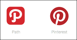
One of the features of the wonderful logo is that it is full of identity and has a completely different design from other logos. If you look at the designed logo and feel like "I've seen somewhere ...", you need to change the design.
◆ 05: How does it look like in black and white?

When Mr. Lo designs the logo, first think about black and white logo instead of color. By excluding colors from the initial design, it seems that you can focus on the shape of the logo. To the right of the above image isNational GeographicLogo, if you turn yellow to black, you will not know whether the logo belongs to National Geographic. Even if expressing the colored logo in black and white, if you can recall a company with only a logo shape, you can say that it is a high-quality logo.
◆ 06: Can you identify what logo is small?

The above image was reduced to 16 x 16 px size with the corporate logo in black and white. Nike · MacDonald · Twitter · WWF logo on the left side is small, you can identify the company of the logo from that shape, but on the right sideGEAnd the Starbucks logo is obscure. As you can see, the logo is the best that you can see at a glance, no matter how small the logo is. If it is a simple design, it can be distinguished even in a considerably reduced state.
Related Posts:
in Design, Posted by darkhorse_log
