Validate six effective rules that are often mentioned in marketing with 48 kinds of advertisements

There are plural points that you should be careful when you advertise advertisements such as "Human photos are better than objects pictures" and "Smiley women are better than anything else". Design company says that they were concerned whether these are really effectiveSketchDeck, By advertising 48 different designs, we are verifying whether or not the six most famous rules are really effective.
We Tested 48 Facebook Ads To Bust 6 Marketing Myths
http://www.sketchdeck.com/blog/we-tested-48-facebook-ads-to-bust-6-marketing-myths/
Facebook, one of the major SNSs,Facebook advertisementThere is an advertising tool called "Facebook Ads". The same ability to advertise on Facebook used by more than 1.4 billion people worldwide is also a tool that makes it easy to measure advertising results, such as new customers increased, new followers increased, and so on.
SketchDeck, a design company, has entered 48 individual advertisements on easy-to-measure Facebook advertisements for advertisement results, and it is said that the advertisement and images are related to each other in the marketing strategy " There are six rules of "arranging people's photos better than photos," "better women than men," "not using their own logo," "better as possible a simple image" It is verifying whether it is really correct.

All six rules concern "images" used for advertisements. Therefore, in order not to influence elements other than the image at the time of measurement, all elements other than the image such as text, title, demographics, budget, etc. used for advertisement were made the same.
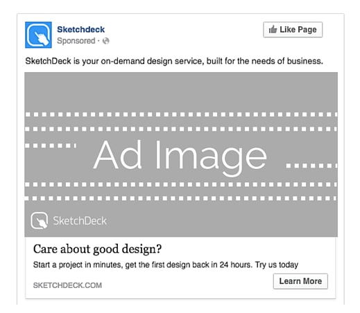
The "non-image part" of the advertisement completed in this way is as follows. Individual images are placed in the gray area labeled "Ad Image", and all other elements are the same.
Further, SketchDeck indicates "unit price per click in internet advertisement"Cost per click(CPC) "as one index when seeing the result of advertisement. For this reason SketchDeck says, "If CPC is low, we will be able to direct more users to the site with the same advertising budget."
SketchDeck creates images of eight different designs for each of the six rules and compares which one is best for the image of the advertisement based on the cost of clicking the ad once. Analysis shows that all ads have 80% statistical significance.
◆ It is better for ads and images to be associated
In the Facebook advertisement guidelines, it says "to use images related to advertisements." For example, if Sketchdeck advertises it, it is better to use an image that makes the image of the design because it is a design company. So, Sketchdeck will deliver ads with 4 images that are related to the design and 4 irrelevant images.
The images related to the design used for advertising are the following four.

And the images which are unrelated to the design used for advertising are the following four.

Measuring the effectiveness of the eight ads showed that ads using irrelevant images were lower by only 6% than ads using related images. Clearly the advertisement using irrelevant images is lower cost per click, that the dogma that "advertisement and images are better related" is not the case.
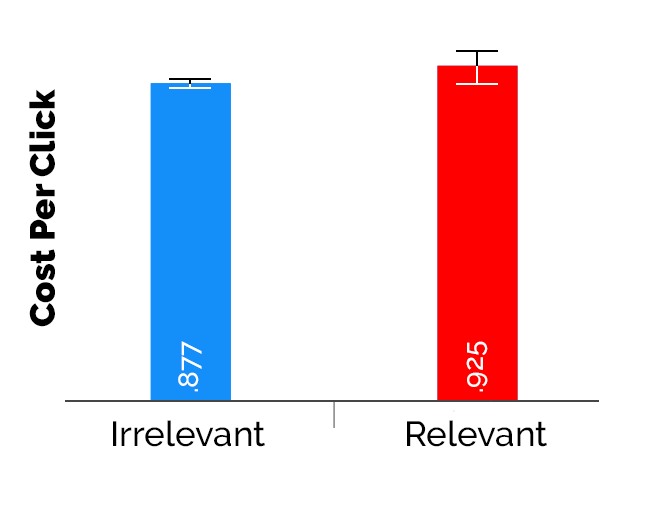
About this reason Sketchdeck says, "As a result of the beauty and identity of the image winning irrelevantness" "High contrast and bright colors have attracted the attention of users" "Sketchdeck's advertising target He seems to be a user familiar with technology, and there are possibilities that many images and feeds related to it are displayed. "
◆ Arrange letters in images
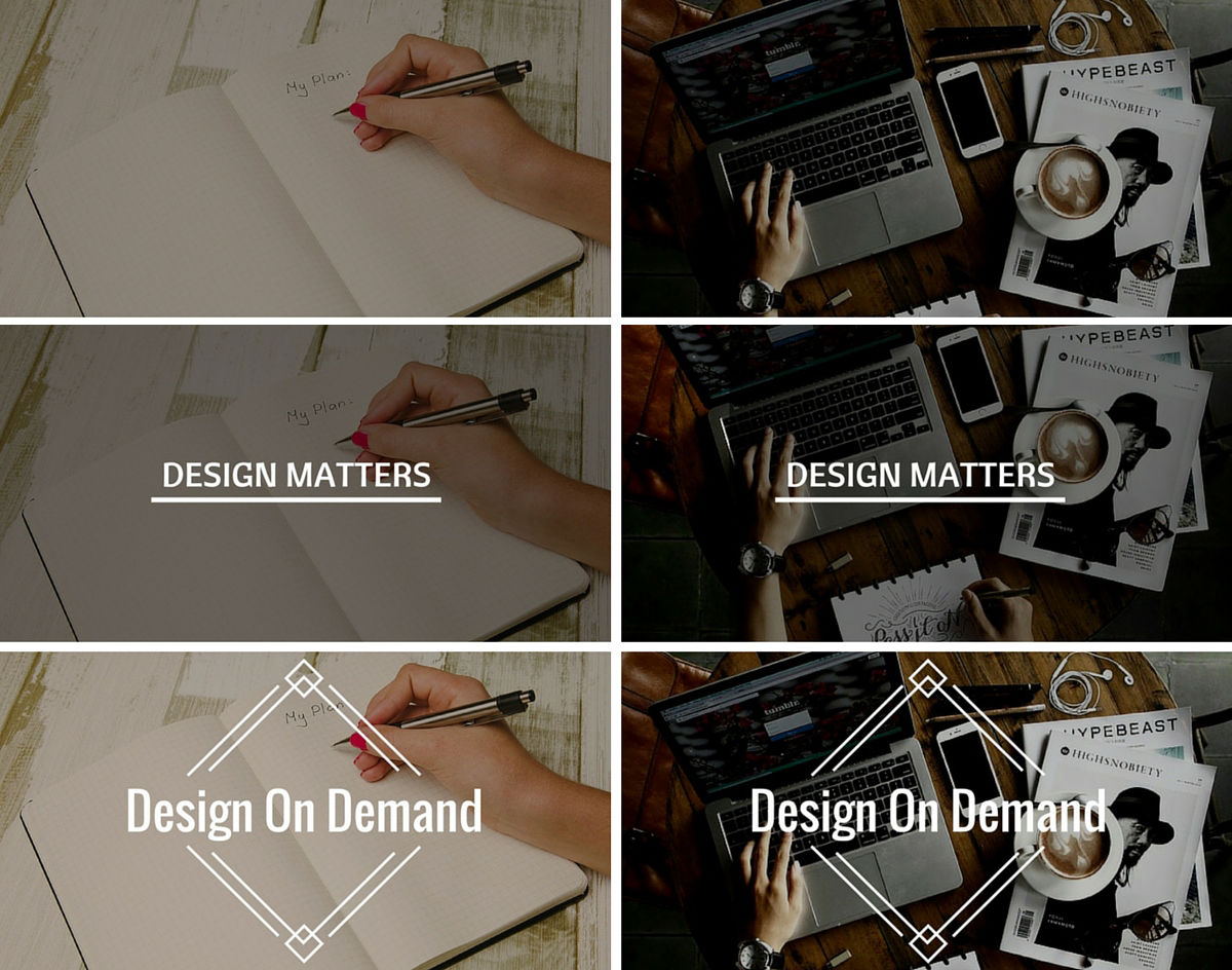
The second rule is "letters should be placed in the image". Sketchdeck distributes the following six images as advertisements in order to confirm whether it is better to arrange letters really.
The results are as follows. The lowest cost per click is an image with no text, and the CPC is lower by 6 to 7% than the version with text.
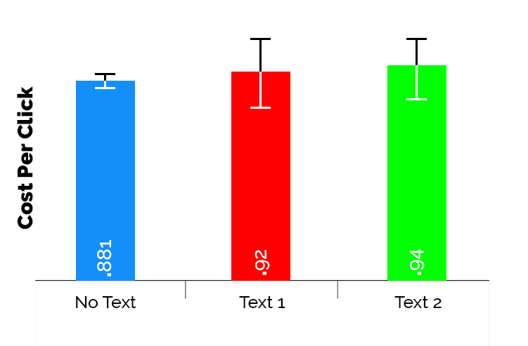
Sketchdeck says, "Images with texts are visible to advertisements" "Images without texts were able to convey messages more effectively" "CPC will increase as text size increases" "stronger calling text You can insert it, but it is confused by Facebook's text placement rules "" It is written that "Free" or "50% off" is written that is successful with text with text " It is said that there is a possibility that it can become a superior advertisement even with images with texts arranged, but in the case of Facebook advertisement it is more effective without text.
◆ Human photos are better than objects photos
The guideline on Facebook's brand advertisement states that "images using people by brand products are better than images of products only".
So, with pictures of only things ......

Measure the cost of a thing + a person 's photograph taken per click.

The results are as follows, and it became clear that the unit price is slightly lower than the unit price. However, there was no big difference between the two kinds of advertisements, and it could be said that they showed almost similar effects.
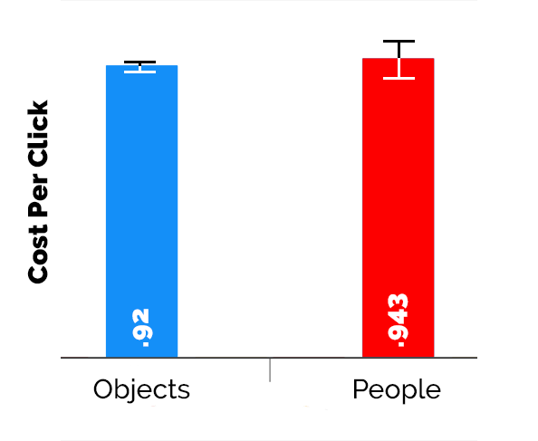
For the reason why such a result came, Sketchdeck considers that "simple matter adapts to the message of the entire advertisement", "simplicity tended to improve CPC".
◆ Women's pictures are better than men
In marketing it is said that "a woman with a smile earns more clicks than anything else", but since it is too ambiguous in "anything else", CPC is measured with various images using male and female models doing.
Four photos of men ... ...

Measure the effect with 4 pictures of women. The facial expressions vary from smiley ones to painful ones.

The result was that women 's photos were less expensive per click than cheaper male pictures.
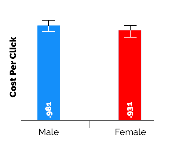
According to Sketchdeck, there is only one advertisement with a good result and it is not understood well except that "female pictures are better than male pictures after all".
◆ It is better not to use your company's logo
The fifth one is "you should not use logos in advertisements".
This is so easy to measure, compare CPC with images with no logo in addition to the following large size logo and small size logo.
The results are as follows. What is the best advertising with the lowest CPC was "what put a small logo on the image", then "no logo", the one with the poorest grades was "placed a large logo on the image". "The one with the small logo in the image" seems that the average CPC was 8% lower than "the large logo placed in the image".
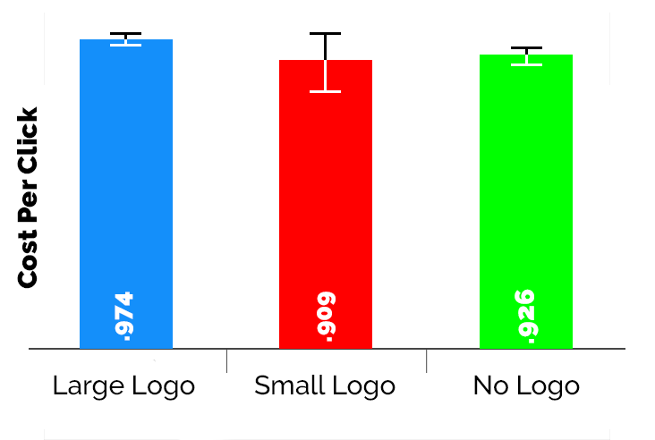
Based on the test results, Sketchdeck analyzes "The big logo looks like an advertisement" "The small logo was treated as if there is no logo".
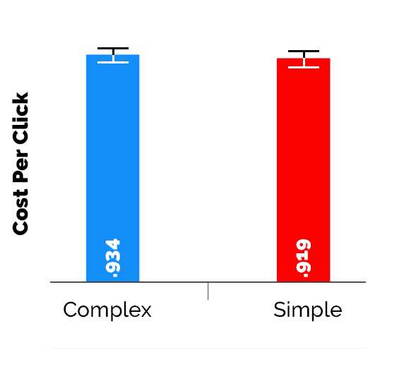
◆ It is better to have a simple image as possible
The last rule is that "it is better to have a simple image as possible".
The following four are used as complicated images ......

The following four were used as simple images.

The results are as follows, and all the expenses required per click were the same degree.
Following these results Sketchdeck, when advertising Facebook advertisements, "avoid popular images, use unique pictures," "to be as simple as possible but more eye-catching design" "messages are targeted for advertising Make sure that it is obvious to all users. "" Use products or objects that have relevance in place of people "" Avoid text in images, but small logos are effective "" Make a long-term investment Before you test every element, I recommend that you take care of the six elements.
Related Posts:


in Design, Posted by logu_ii