Thorough comparison of differences in UX design ideas seen in Apple and Google map apps
Maps on iOS: Design Explosions # 1
http://uxlaunchpad.com/designexplosions/1-mapping-on-ios.html
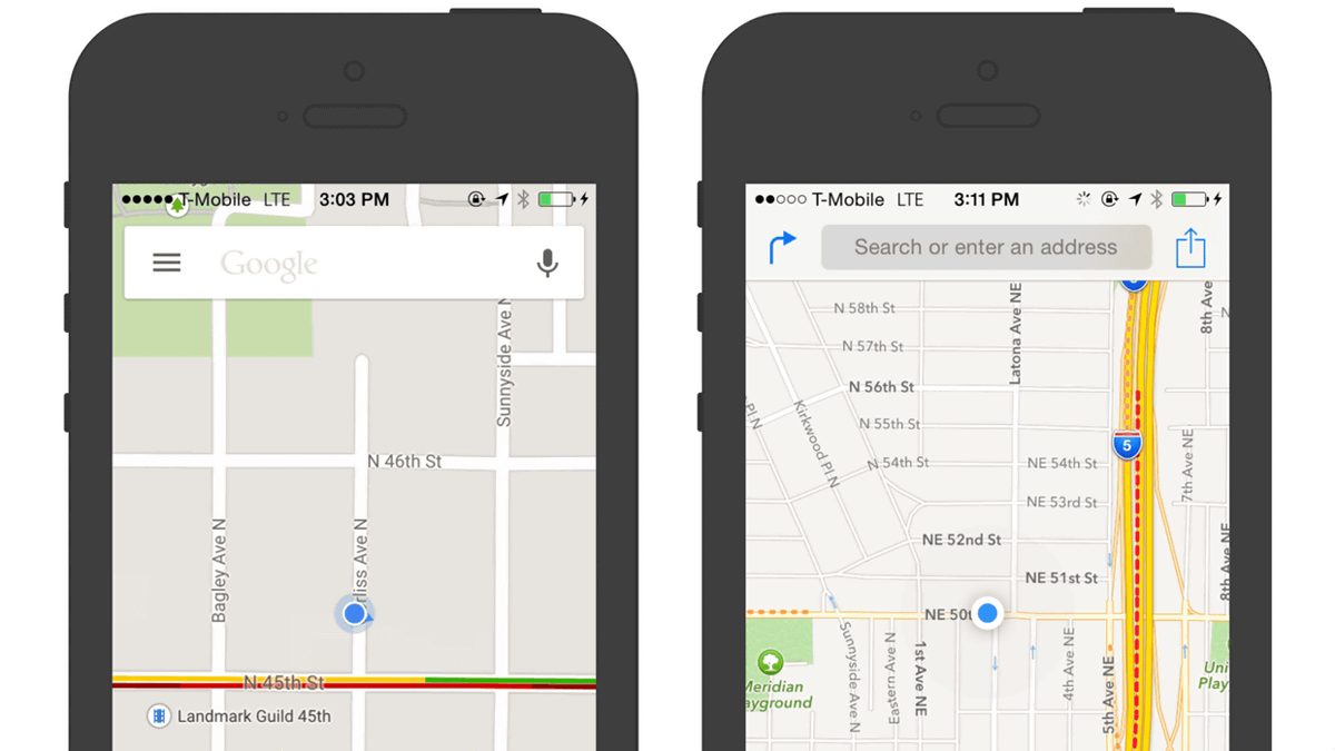
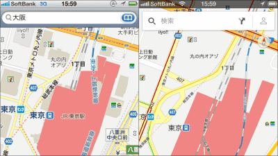
The left is Google's map application 'Google Maps' and the right is Apple's map application 'Apple Maps'. At first glance, the designs are very similar, but the idea of UX design is very different.
◆ Map display and tool layout
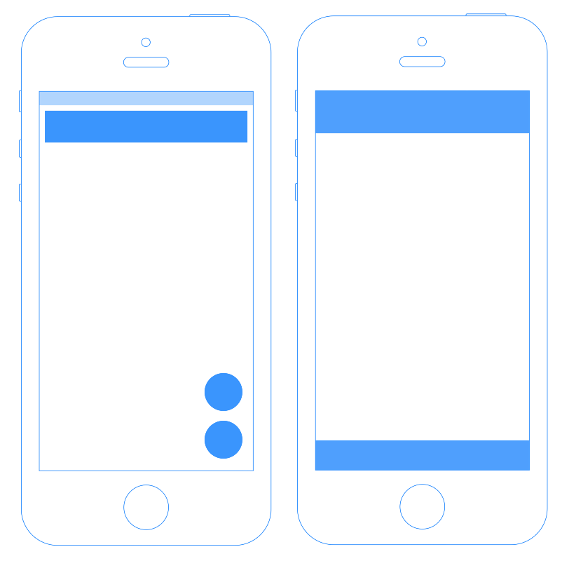
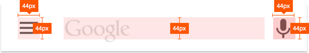
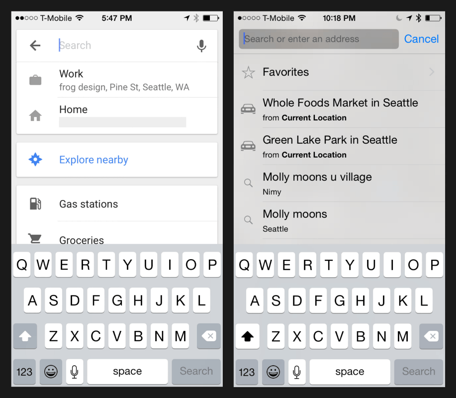
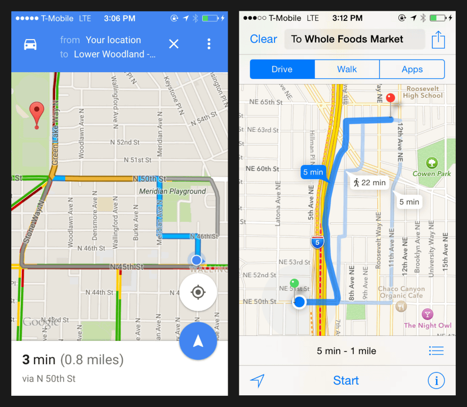
This is the layout of Google Maps. In the figure on the right, the 'input tool' that triggers the user to obtain UX is shown in blue, and in Google Maps, a search window is placed at the top of the screen, two location information icons and a route search icon are placed at the bottom right of the screen. It has been.
On the other hand, Apple Maps looks like this. The search window at the top of the screen is the same as Google Maps, but the icons are placed at the bottom of the screen to the full width.
Looking only at the silhouette of the input tool, it looks like this. In addition to placement, Google Maps uses transparent parts to place icons on the map, while Apple Maps does not dare to place icons on the map, but places them outside the map.
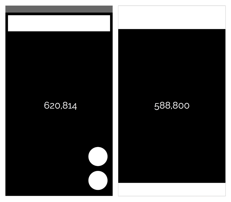
Comparing the amount of information in the pure 'map' part by the number of pixels, Google Maps is 628,814 pixels, Apple Maps is 588,800 pixels, and the amount of information is 7% more in Google Maps. While Google Maps prioritizes the amount of information, Apple Maps seems to prioritize visibility and simplicity.
◆ Affordance
The ability of users to intuitively understand 'where to operate (tap) next to take action?' Is
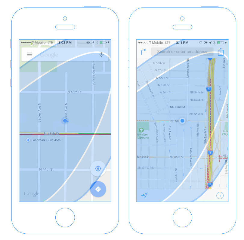
The similarities are that the search window for finding the location is located at the top, and that the user's current location is in the center of the map. You can see the difference in the input tools to be placed, such as the microphone icon to search by voice input in Google Maps and the share button in Apple Maps.
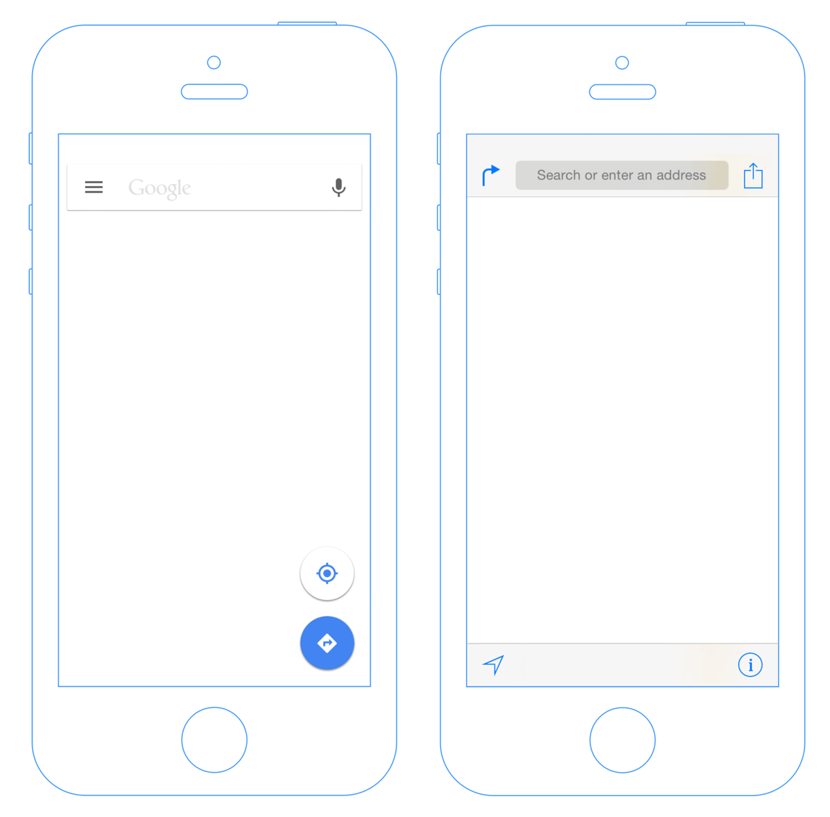
·search window
The microphone icon is on the right side of the search window of Google Maps. Google always puts a microphone icon on the 'right side' of many Android apps. It is considered that this arrangement is used to prevent erroneous operation by tapping the selection of text input and voice input. The reason for placing the voice input icon may be that Google thinks that voice input should be convenient for map search on the move.
On the other hand, the search window of Apple Map has a clear design with a gray background. In addition, there is a display saying 'Search or enter an address', so it seems that you will not be confused about how to search by text input more than Google Maps.

Looking at the search window of Google Maps again, the 'Google' logo is in the text input part. Since this is 'Google is a search', it may be Google's idea that 'Google's simple logo does not need explanation, right?'
・ Place of affordance
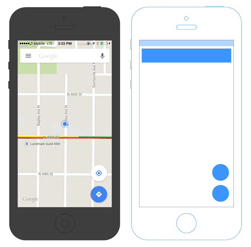
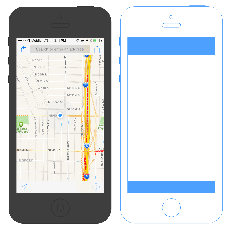
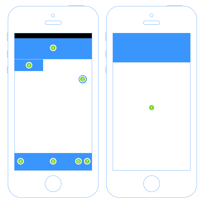
Where to place affordance tools that guide user behavior, such as icons and search windows, is a major factor in the usability of the app. This shows the area that is easy for right-handed people to operate with their thumbs. In order to achieve comfortable one-handed operation, it is necessary to arrange affordance tools such as icons according to the movement of the thumb.
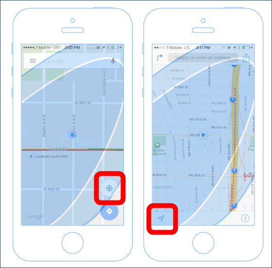
So, if you overlay this easy-to-operate area of your thumb on Google Maps (left) and Apple Maps (right), it will look like this. The area at the bottom right of the screen cannot be tapped unless the thumb is bent tightly, so it is considered that the possibility of erroneous tapping is low, so to speak, a 'blind spot'. Google Maps has a route search icon, and Apple Maps has an information icon.
In the map app, the work of 'returning to your current location and re-examining' is often repeated, so the operability for returning to your current location becomes very important. Google Maps places the current location icon in a place where the thumb can easily reach at the bottom right of the screen, and Apple Maps places the current location icon in a place where the thumb can easily reach at the bottom left of the screen. Apple can adopt a unified layout for all products such as iPhone, iPad, iPod touch, but Google Maps is expected to be used not only on Android terminals but also on various terminals such as Windows Phone terminals, so use it There is a possibility that we are aiming for a unified layout that does not depend on the OS by intentionally embedding the frequently used current location icon in the map.
・ Destination search
The most important function of the map app is 'destination search'. The design of this destination search function has also been devised to improve UX.
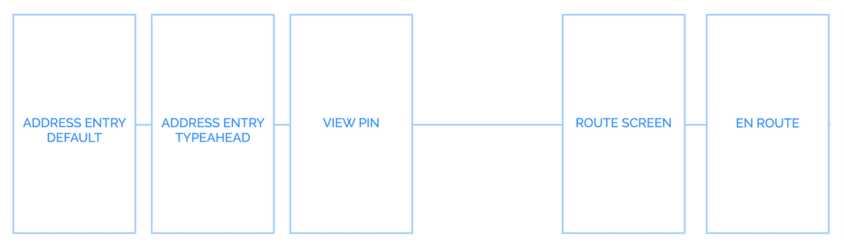
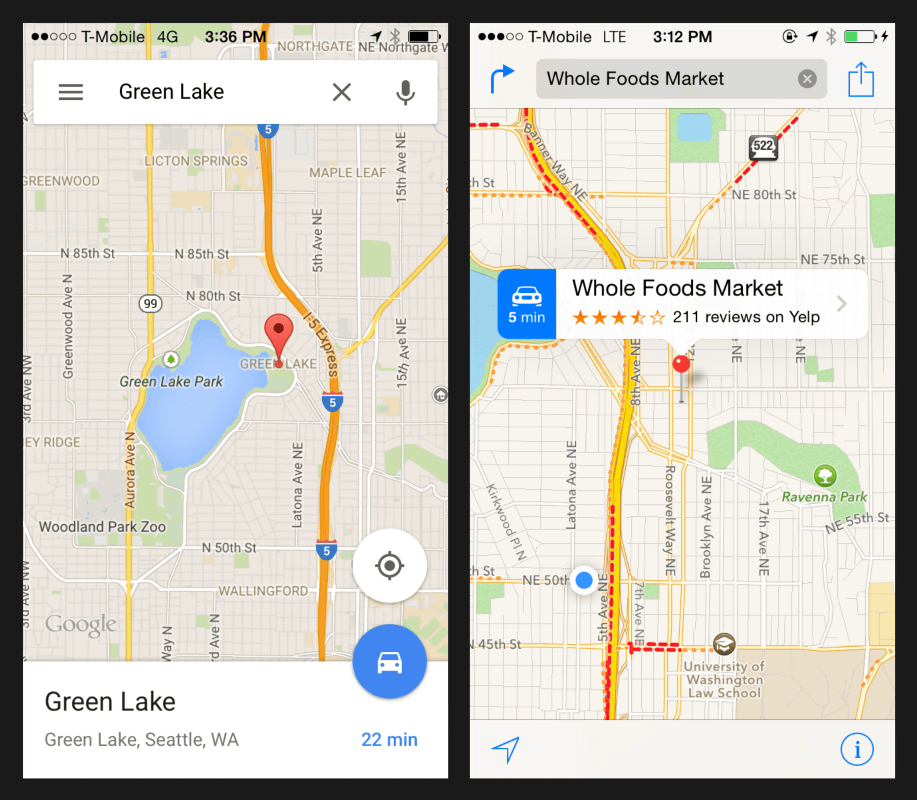
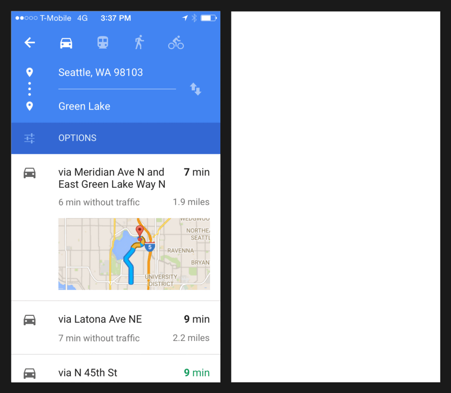
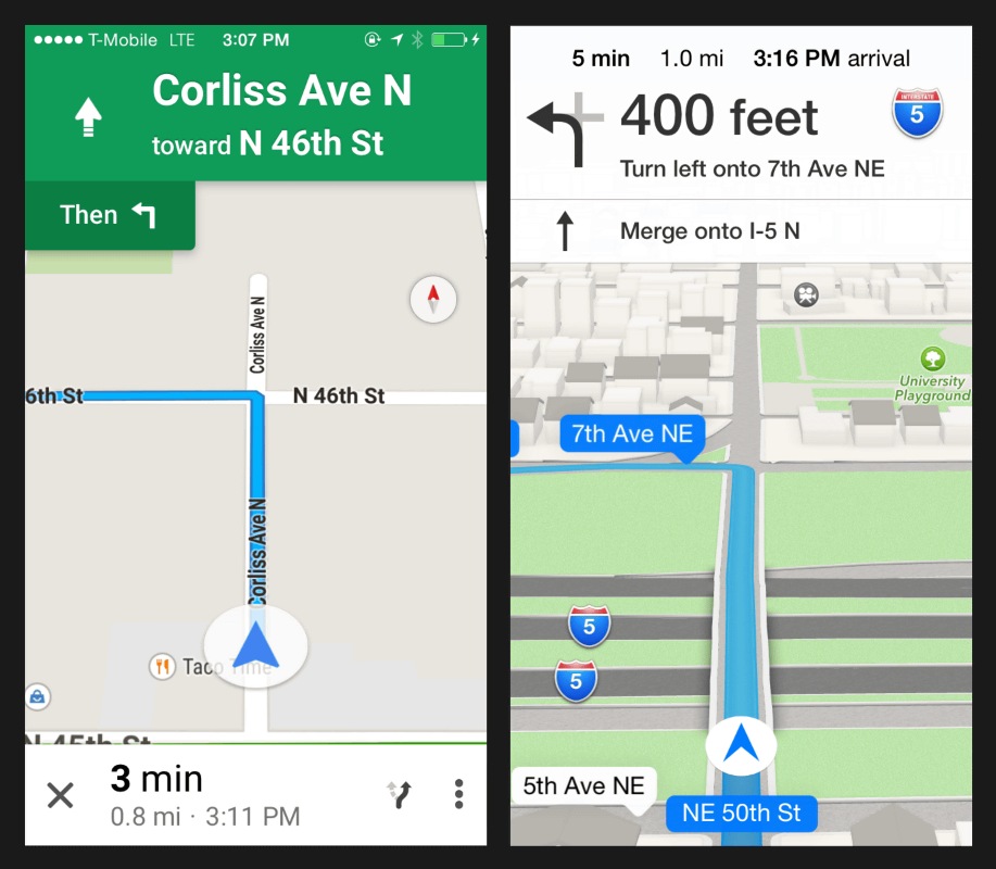
This is a diagram showing the screen flow in the destination search of Google Maps. From left to right, the screen changes in the order of 'Address Search'-> 'Address Typing'-> 'Pin Display'-> 'Overview Function'-> 'Route Display'-> 'Start Route Guidance'.
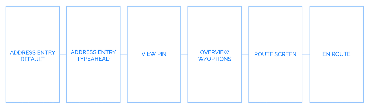
Apple Maps is exactly the same except for the 'overview feature'.
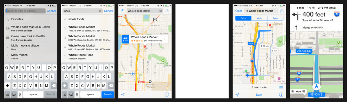
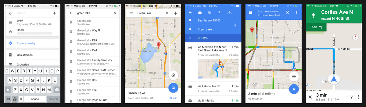
The address typing screen of Google Maps (left) and Apple Maps (right) looks like this. It's very similar, such as placing the keyboard at the bottom of the screen and displaying the search history behind the keyboard.
The 'pin display screen' looks like this.
Google Maps has an overview screen where you can change transportation, check timetables, and search for routes again. The overview screen seems to be a function unique to Google, which is good at searching.
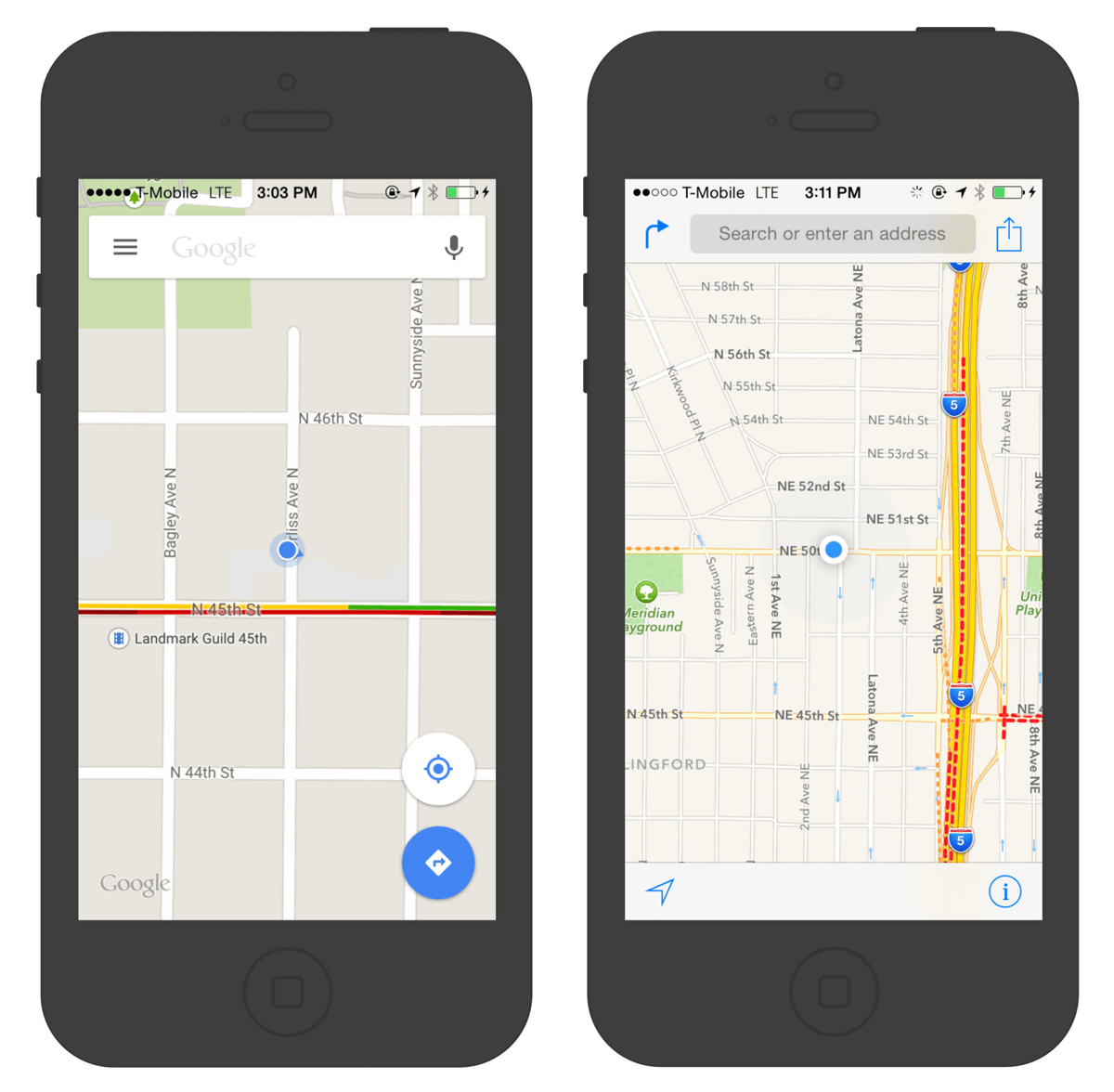
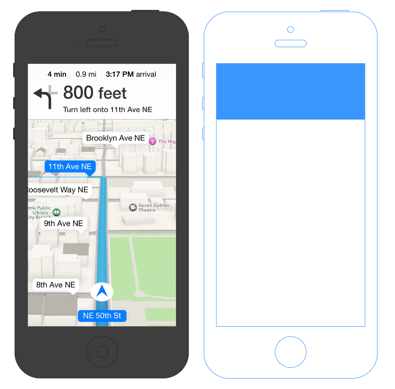
The route display function looks like this. In Apple Maps (right), alternative routes are shadowed and annotations are also displayed, but in Google Maps (left), the routes are only grayed out and there are no annotations.
The start of route guidance is like this. Compared to simple Google Maps (left), 3D display is also possible and the features of Apple Maps (right) with high visuality are appearing, but both necessary and sufficient map information is displayed on the screen.
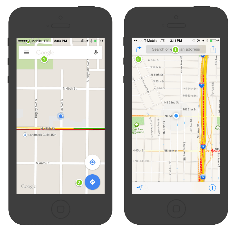
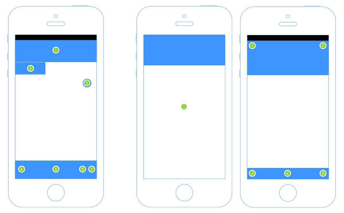
Let's take a closer look at the route guidance screen. The affordance parts (blue) are arranged like this on Google Maps.

On the other hand, Apple Maps looks like this.
The difference is clear when compared side by side. While Apple Maps has succeeded in displaying maps and affordance tools in a rectangular and orderly manner, Google Maps is undeniably cluttered.
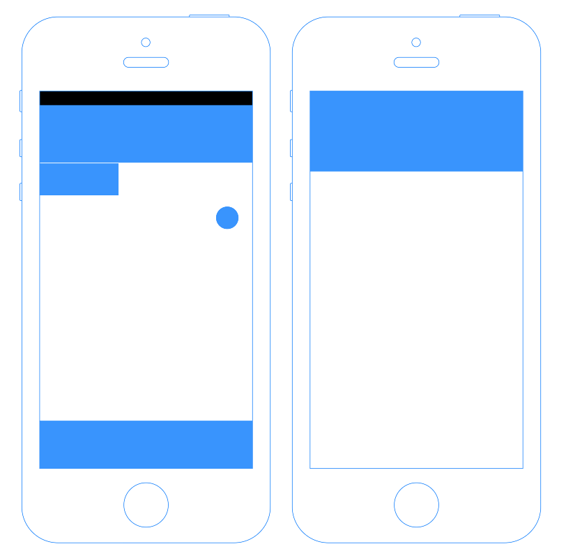
The number of affordances is more contrasting. Seven Google Maps are displayed on the screen, while only one Apple Maps. This is because Apple Maps is designed so that affordance tools appear when you tap the screen.
It looks like this when comparing including the affordance that appears by tapping the map of Apple Maps. Apple Maps maintains symmetry by placing tap points at the corners and centers of the rectangles. It seems that Apple's aesthetics are hidden in the placement of the icons. On the other hand, it can be seen that Google Maps emphasizes 'providing more choices' than the beauty of placement.
Comparing the UX of the map app, Google tries to give users many choices by incorporating a lot of functions, and Apple tries to eliminate operational hesitation by narrowing down the functions and simplifying the design. , You can see that the way of thinking of UX design of Google and Apple is very different. Google Maps and Apple Maps, the two biggest map apps, have almost no superiority or inferiority in functionality. However, apart from the problem of functionality, the accumulation of small differences in UX design makes the difference in user's 'preference' such as 'this app is easier to use' and 'I like this app'. It may be producing.
Related Posts:


in Software, Smartphone, Design, Posted by darkhorse_log