A heat map that shows that the user does not read the explanatory text too much and countermeasures
Web designers and web app developers tend to rely too much on "letters" when sending messages or instructions to users who use them. Descriptions by letters are simple, but if you make a mistake in approach, the user side will not read and ignore it, and it will be messed up.
thereInvitelyMichael Woloszynowicz, Vice President and Development Director, explains how to do it with a heat map in an easy-to-understand manner.
Web 2.0 Development and Business Lessons: Your Users Will not Read
http://www.w2lessons.com/2012/01/your-users-wont-read.html
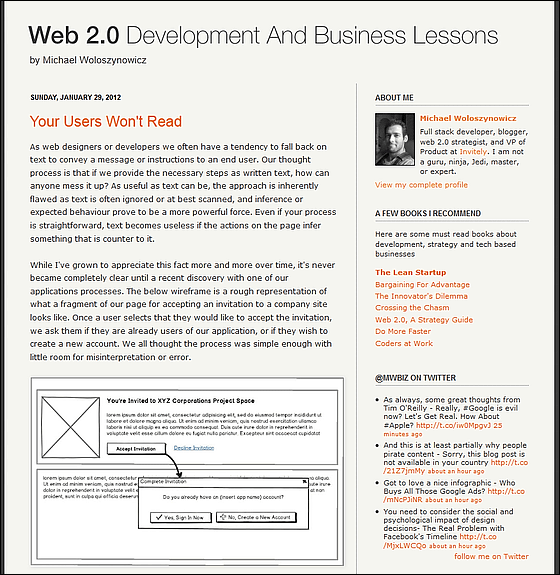
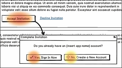
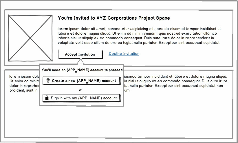
First of all, the web service itself called Invitely itself invites users for collaborative work such as document sharing, and inevitably has been doing "whether it is a new user or an existing user?" It begins by asking the user. Wireframe of the interface when inviting users who often tend to be: The user first clicks the button labeled "Accept Invitation", then a dialog appears asking "Do you have an account already?", "Yes, sign up now I do "" No, I will create a new account "is two.
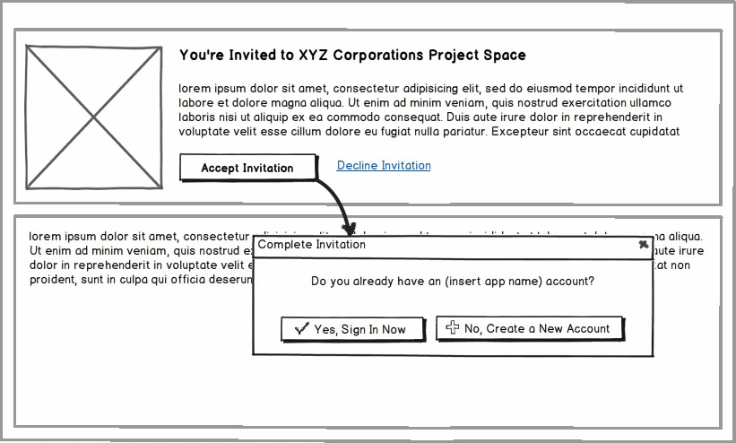
It certainly tends to be quite common about the above approach and it seems to be OK at first sight that "We all thought that this process is simple and there is no room to mistake" I will.
When I began to observe how users actually are using it, I discovered that there are two problems with this approach.
◆ First question: relying too much on letters
It is assumed that you are reading the sentence "Do you have an account already?", But in fact the user did not read the sentence.
◆ Second issue: I have not chosen the expected option
As a creator, sending this invitation in the first place is highly probable that the "new user", that is, the possibility of not having an account is much higher, so "Yes, I will sign in now" Not, "No,I will create a new accountThat's why I wanted to click on it.
But what actually happened is that attention to "I will create a new account" is low, as the following heat map shows.
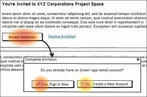
As a result, the user completely ignored without reading "Do you already have an account?" And simply assume that there is "Yes" or "No" as confirmation for the first "Accept Invitation" , Clicking on the "yes" side, a login page appears in which you enter "user name" "password", but because most users do not have accounts etc., they become "?", Users confused, It was frustrating, and there were a lot of people leaving.
The following approach is improved there. By removing the dialog box, it will be interpreted that the user is not "yes" or "no" for confirmation. Then I delete the letters "yes" and "no" and highlight it by displaying the words "Create new" and "Sign in". Furthermore, since the expected action is "new creation", bring "new creation" to the beginning, that is, "above" to be preferentially read, move "sign in" to "down" We are replacing them.
The conclusion is summarized in the following three points.
1: In the association and reasoning too much overestimate the sentence which the user instructs
2: The user reads the sentence, but only the first one or two written on the button
3: Always confirm by usability test is essential!
Practically, I am thinking "Why is this kind of operation method?" I think that it is a screen structure and built-in, and I adopt a user interface and design different from what I thought only in the mind intuitively There is a case, but on the other side of it there is such a trial and error, and it may be that it has become like that as a result.
Related Posts:


in Design, Posted by darkhorse