Is "UI like this" in "Firefox 8"? Confirm the latest screen pictures from the presentation materials

ByFocusoft
The material that the presentation about the mockup of the browser which the Firefox UX team is currently producing is uploaded to the net, and it became clear how the appearance of UX channel build (Firefox 8.0 a 1) became.
Mozilla, which develops Firefox, has already announced that it will accelerate the release cycle, Firefox 6 will be released in June, Firefox 6 will be released in 8 weeks later, then a new version will be released at 6 week intervals It is scheduled, and Firefox 8 is expected to be released within 2011 or early 2012.
UX Presentation Mockups
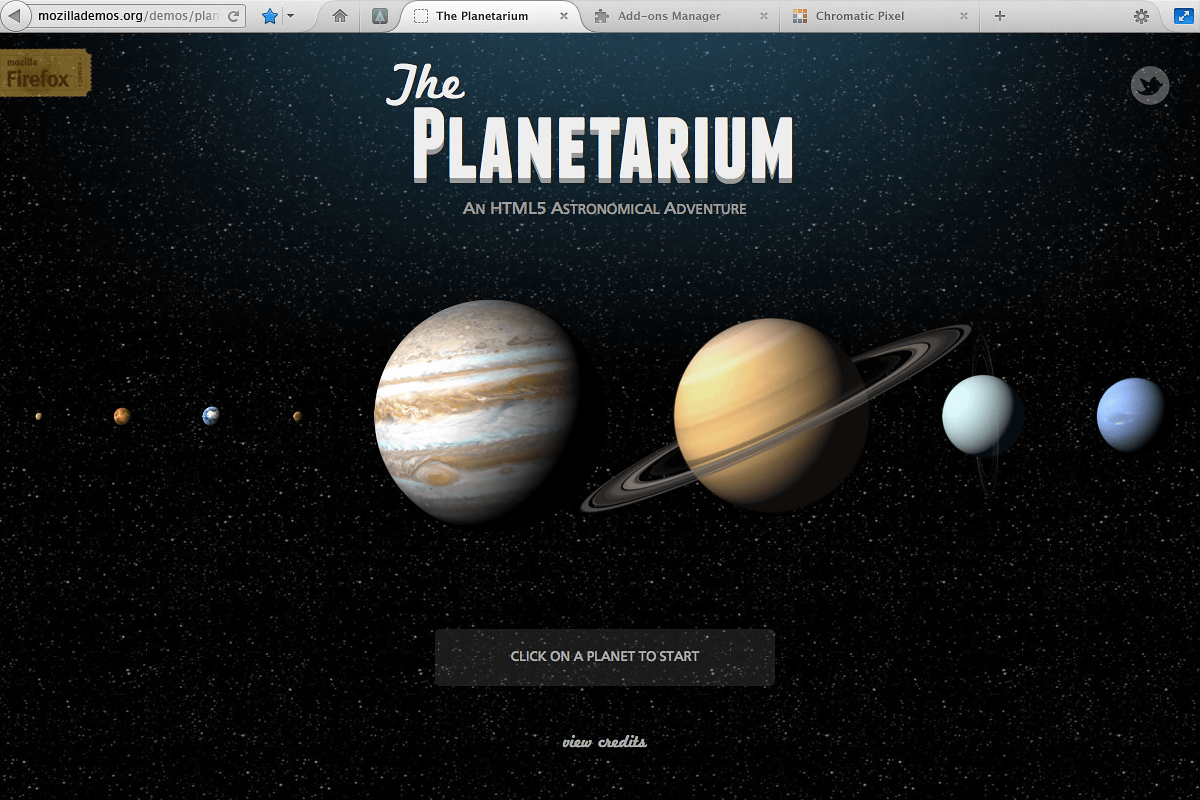
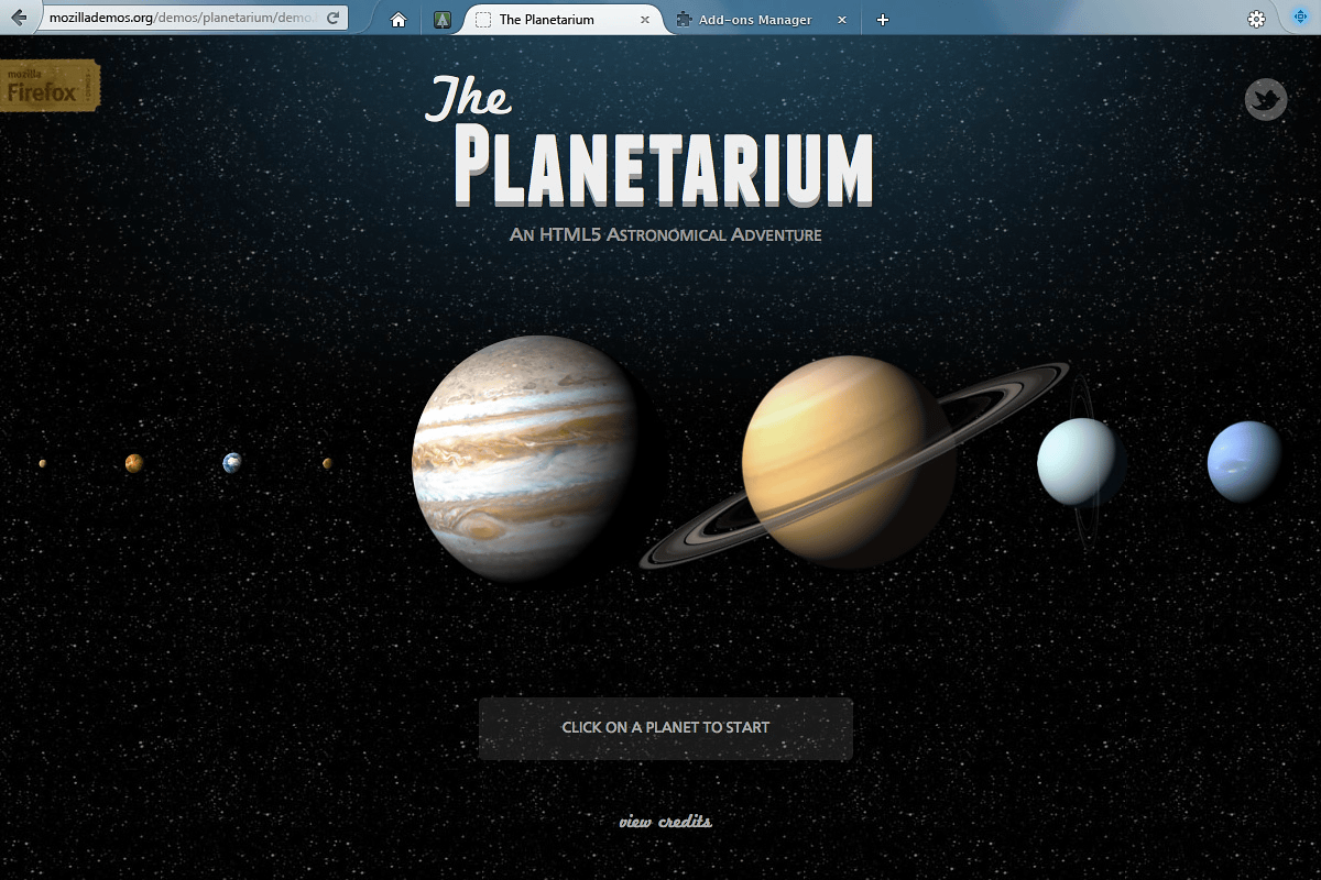
Screenshot of Mac version first.
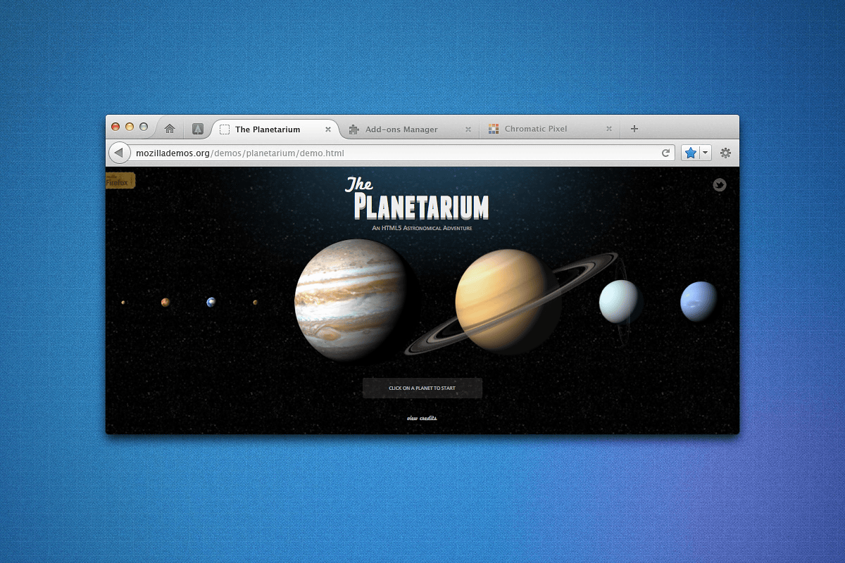
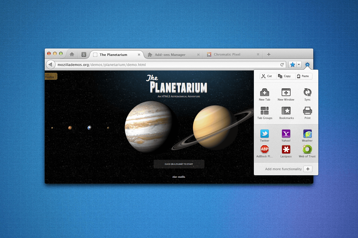
The appearance around the tab has been changed.
This is the add - on screen. In Firefox 5, the item is displayed in the tab in the add-on, but it seems that it returned to the form in which a dedicated window is prepared.

For adding an addon ......
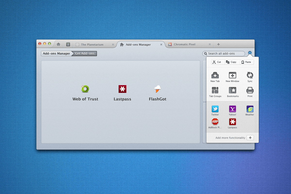
Just drag and drop it to the add-on window.
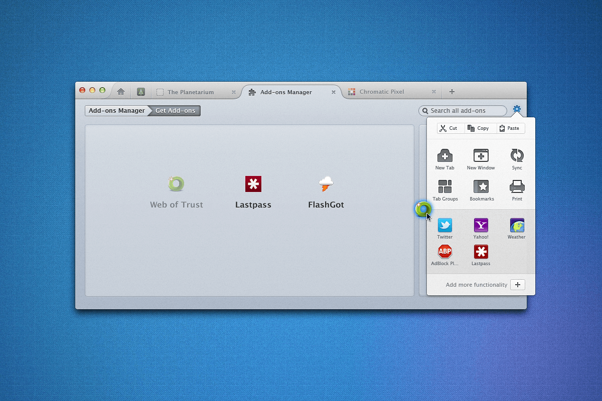
The addition of the addon is completed with this. Is it more intuitive?
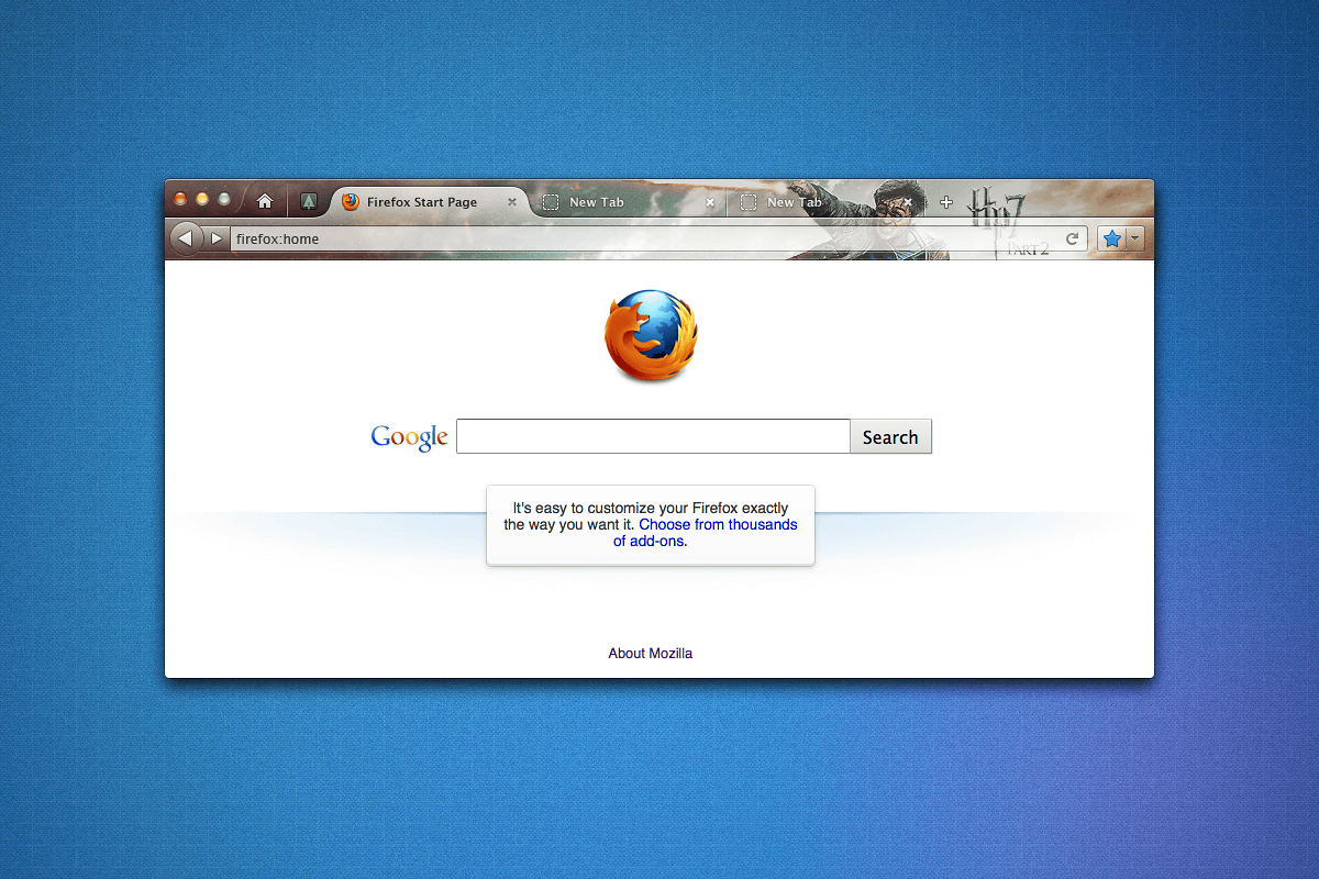
This is when using Persona with Harry Potter specification.
When it is Windows version, it looks like this.
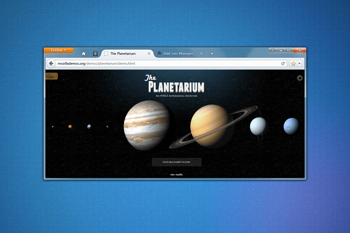
Again the appearance around the tab has changed a lot.

And the number of buttons in the upper right is increasing.

Related Posts:


in Software, Posted by logc_nt