Microsoft uses a logo very similar to Apple's universal logo
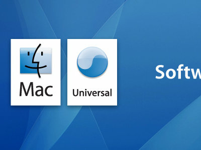
The logo used by the campaign that Microsoft last year was doing is acknowledging that Apple is an application designed to operate on both Intel CPU-equipped Macs and conventional PowerPC-equipped Macs "Universal It seems that it looked like a logo.
There are evidence images which are actually comparing, but it may be said only that it is very similar.
Details are as follows.
WTF? Microsoft steals Apple Universal Logo on Flickr - Photo Sharing!
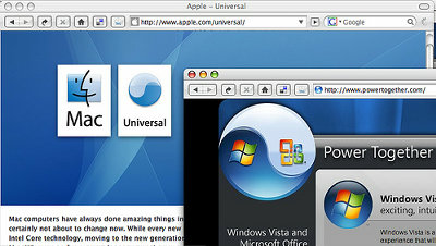
This is a campaign that Microsoft opened last year, a campaign that allows you to receive Windows Vista Business or Office 2007 just by viewing advertisement videosPowerTogether.com"(For the end of the campaign, the link is out now) site (right)A page that explained about Apple's universal logo(Left), but the logo which is widely posted on PowerTogether.com surely reversed Apple 's universal logo (the one below the universal logo) and the color also It looks almost the same.
As the campaign ended already and the page itself was closed, we can not actually check it, but how was the truth? In addition, there is a detailed explanation about the campaign which Microsoft had done to the following link.
Campaign to get Windows Vista / Office 2007 Pro just by watching the video - Engadget Japanese
Related Posts:
in Note, Posted by darkhorse_log
