How to design with gradation
As a design element of Web 2.0 "To apply a gradationThere is an important thing, but it is really difficult to apply this gradation method actually. If you examine various things on the net, you can find various methods and tutorials on how to apply gradations themselves, but you can not find "What is the right answer?" That is, I do not know what is the best way at that time.
Also, when choosing a template for blogs, it is difficult to understand without having basic knowledge what kind of gradation is suitable for blog of theme they aim for.
So, this time on how to design with gradation. I tried to write which designs should be chosen even for those who do not design.
■ There is no wrong gradation, etc.
First of all, the misunderstanding about the most obvious gradation is this, the idea that dirty gradations and gradations exist.
9rules Blog: The latest news, member announcements, and dance videos from the 9rules Team.
The Japanese translation is below. The latter half has become the way of making this person's own gradation.
Jmblog.jp - The tightest gradient tips like Web 2.0
Looking at the English article of the original article, it is supposed that "No. 1" is the worst, "No. 2" still is Mashi, "No. 3" is the best gradation, but in fact it is all right answers. The important point is to use properly according to the scene to use. Therefore, it is meaningless to compare each alone. It is important to know where and how to use it and what effect to use.
Let's look at each pattern in detail.
■ "Muddy gradation"
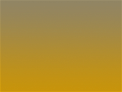
First of all, the gradation of "No. 1" in the "Web 2.0 gradient tips" is slightly mixed with gray, which is called "muddy gradation". The sample above is a sample. Muddy color is the color that mixed gray with pure color. At first glance it is dirty, you may think that it is a type of gradation pattern that you do not see much in Web 2.0, but that is the opposite. Rather it is a gradation that can be said to be essential in Web 2.0. Let's take a look at the following sites which are frequently referred to overseas as Web 2.0 design, as they are easy to understand.
IconBuffet | Free Icons, Stock Icons, and a Taipei Monkey
http://www.iconbuffet.com/
The noteworthy is the background gradation. This part is cloudy. By doing this, it has the effect of pushing the middle content part to the front. Looking at the state of the gradation, the upper is brighter and the lower it goes, the darker it is. By doing this, the header part above will come out in front. Because important content, titles, or menus are concentrated on the top, the effect of concentrating the user's eyes on this part naturally lies in the background gradation.
■ "Gradient of the color"

Clear color is the color of pure color mixed with white or black only. The clear color obtained by mixing only white with white color is referred to as Ming-Qing color tone, and the color obtained by mixing only black with pure color is called dark-water color tone. Even if it is white and black and combined with any color, it becomes easy to use because it becomes a "band" in the center part of the gradation and a discolored part can not be formed. The second gradation mentioned in "Web 2.0 gradient tips" becomes this "gradation of the color".
On the site of "IconBuffet" shown as a sample, the gradation of the icon set "KYOTO" in the middle is "a gradation of the color". In order to create contrast with the black header part right above the right, this uses the "Qing color gradation" of Ming Qing color which starts from white on the top.
"Hue gradation of approximate value"

This "gradation of hue of approximate value" is the gradation of "3" whose production example is shown in the latter half of "Web 2.0 gradient tips". "Hue of approximate value" is not a complementary color, it is a gradation that is not a simple combination of two colors. By arranging the hues, "band" will not come out in the center part.
If it is complementary color of pure colors, a band appears clearly in the center, so it does not look smooth

When the pure colors are most powerfully generated, the band becomes somewhat better if it is not a pure color as in the image below, but still a "band" in the central part occurs and it stands out

It does not come out as clearly as the figure above, but if there are not all hues, it will be in the form of a belt
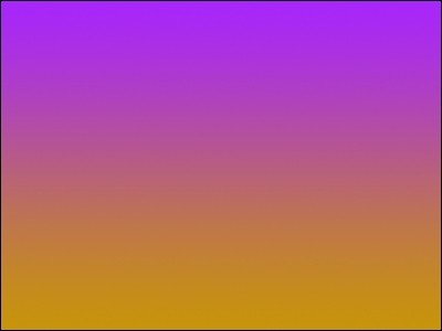
"Gradation of approximate value hue" is a gradation pattern which looks smooth as it does not get in the middle like a good band and is easy to be brought up by saying that it is a Web 2.0 element. In the site of "IconBuffet", it is used with the orange and red gradation on the upper left. It is best for one point accent.
■ The combination of each gradation is important
The site of "IconBuffet" effectively combines these three patterns of gradations. The starting point is the upper left logo. The design is made starting from here.
First of all, it consists of "gradation of hue of approximate value" so that the logo part at the upper left stands out. The reason why the menu put on the right of this logo is black is that red has high saturation and black has low saturation. In other words, the most visible color that comes next to red is black. To bring white to the bottom of this black menu is to make each other stand out by bringing the white with the highest lightness under the black with the lowest lightness. This is the same reason as writing a black character on a white background. Starting with this white color is the "Ming Qing gradation" of the Ming Qing color of the central content part. In order to put the central part thus constructed on the front, the background is summarized with "muddy gradation".
In short, there is not a "good gradation" or "bad gradation" in the gradation itself, but there is an optimal solution for that combination. Since this combination sells the item called "KYOTO", which is an icon set, it is designed to bring the line of sight to this "KYOTO".
Not limited to this way of combining the gradations, when deciding the design, thinking of the end point "Where will you make it stand out for what?", Thinking backward from that point completes the "design not to collapse" . please refer.
Related Posts:


