Can the web design complex be overcome?

The true identity of a ghost or the dead tail flowers. This is the conclusion.
Design sense and technical ability can reach up to 90% with effort alone. Ten percent after the problem is the talent and sense problem born with that person, afterwards likes. Or, the living environment and various things that were born and raised. Anyway, what we can not change with effort accounts for 10% remaining.
However, if it reaches 90% reachable by effort alone, it is a level that can pass as a top professional. If you refine this technology from now on, it will be established as a single art, and your old age will be rosy. To do that, it is necessary to make efforts with the Mukuro advance. What on earth is the current state of design? I will talk about it below. And let's tell you how to overcome the web design complex.
Somehow, the visible art environment is poor in the postwar Japan. The uniform design is filled with mass production. The school education is coming from where the country of rebellious nature such as "everyone will do" in the custom of Japanese customs comes from that school. It is awful for an elementary school teacher to teach all the subjects. People who have eyes properly do not teach art or such. Under the easy idea that "Painting can be drawn by children", people with leadership have not hit their duties. Also, the paintings that are selected and overhanging have become "something like this is generally praised by the teacher". Like posters and others everyone will be similar. Instead of extending the personality of the child, the teacher gives priority to his preference that "this kind of picture is nice".
For example, it says strange things, but if you say that design power is outstanding because you are at the National Public Arts Center (the top schools in effect), you can not say that absolutely. The reason is that the weight of doing photorealistic drawing in the examinations course is too large, we do not spend much time in the direction to cultivate design power, and excellent lecturers instructing it Things not so much. Because it is why the excellent people with such design skills are in the design room of top companies, so they can not go to lecturers such as Geijyo preparatory school. There is no choice. Looking at the design rooms throughout Japan, there are nearly first-class people in the design room of the top companies, that is, people in the design department have gone, and the members of the design room with a slight rank drop are oil paintings and Japanese paintings There are people like craft and crafts. Among them, only special crafts are still involved in the design. Oil painting, Japanese painting, craftwork, these three are university 4 years, how many pieces of commercial design did you say, there is not this at all. This is the same in any field art. So, if you try to design it, it is meaningless unless you are a designer. Otherwise, consciousness is low.
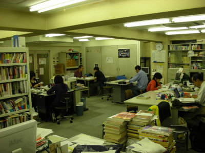
It may seem that anyone can do such things, but how long the four years when young occupy the weight accounts for the language. There is nothing to be changed from the general public if having spent without consciousness of commercial design for the last four years, although it is possible that almost 25 years old will be able to become something that will be the basis of that person. It does not pass. I actually came to face the design room of the company and faced so much as we could. Everyone in the other department is frustrated about seeing the design room and saying, "Why are they slowly doing work slowly?" It takes time to understand whether he is playing or working. In other words, "art is such, you know what you can understand", but they are rebellious, but it is just a good reason and a covert. I hold an artist, or art, like a seal of Mito Komon. But that is different. completely different. Design and art are different. In Japan, "art" is nothing to live and as a Japanese individual up to the area of art, people who are self-assertive will not grow up. Let's see how the altruistic artists grow up in the world as all salaried workers like the current Japanese society. Just drawing a picture is only a large illustrator. With that kind of thing, everything can be nodded. If you look at a famous public exhibition, you can see clearly how many people are unrelated to sense and design, how loudly no one doubts the sense of the great writer's teacher, the story of the naked king itself. If you look for it with your own eyes, you know well how well there are pictures with excellent design in those days.
So, if you think about designing somewhere, there is no need to embrace the complex and consider things like Takamine 's flowers. Japanese tend to be confident if people do not recognize them. So, desperately seeing blogs and homepages written by people who went to vocational schools, acquired the qualifications of color coordinators desperately, nor did they study designs or the like, but that is an effort The directionality to do is wrong.
What kind of effort should be taken? First of all, the theory of "sense" with art is infested because we do not know what to try. In the West, we start with classical techniques at art universities and taught thoroughly the studies of the foundation. On the other hand, in Japan, we assume that it is over at the entrance examination stage, we will not teach anything. So who is in the higher level arts college is excellent, is not it. If you want to check it yourself, go to see a graduation work exhibition at National Geographic Show. It may be good to check with the eye how much it is in the height difference of hurdle with yourself.
So what do we do? Quality improvement starts with quantity. Anyway, to try a number. People who can not do that number are not suitable. It is not suitable for feeling it is painful, so you should hit another job. If you can do that number, it is very suitable for that person, there is nothing to be afraid of. For example, when designing one page, how many patterns can be considered in shape, color and composition is the person's ability itself. If you repeat that, the quality will naturally rise. It is the same as getting a driver 's license for a car, but if you are young you can achieve it sooner but it will take a while if you are having a year. The rest is personal difference.
The problem is that you can not do numbers, it is not suitable for design, but you can not avoid doing it. Overseas, we tend to tell you basic things up to the high school, so there is a strong tendency not to fail too much. So there are a lot of sites to distribute templates with design. Even amateurs have reached a certain level, so if you want to do, you can do without complex. To begin with, I do not have complexes. We do not have anything we do not have to have, that is because the idea of things is reasonable. So, when a person who can not do is in a position to do, the first thing you should do is never have a complex. If you do not do it, you can not go forward anything.
First of all, specializing only on the design of the website, gathering all kinds of data centering on it, anyway to see, first of all it is to fertilize eyes. Also be sure to recognize yourself clearly what your preferences are. Otherwise it will snap into the crucible. My preference is that there are many things that are reflected in minor, such as husbandry, accent, prejudice, and others. So, because the website is not what you see, it is what you show to people, so you need to get out of the narrow world of your own preferences. For that, I must know my taste properly. If the design of that site is bad, then you have to be able to judge how you can improve with objective viewpoint rather than subjectivity preference.
In short, no matter what color or placement you can use freely, there is no problem. At a minimum, the composition should be repeated based on golden section. Color is to make bright / dark contrast clear. In order to emphasize the readability of the information and the information, the design and placement of the letter should be chosen so that it can be understood well even if it sees it a little. When you are done, show it to various people and listen to your impressions. Repeat these.
Also, if your desk is messed up, you can not do it. Horizontal, vertical, parallel, it is useless to always keep this in mind. The reason is that if the person who draws a picture hits horizontal, vertical, parallel with a ruler, it is because it is not visible. The horizontal line drags out where there is nothing and you know the angle. And memory of color. The color memory is to say that "yellow" is yellow at that time. Even though it is yellow, there are many kinds of mountains. Things such as smell and color can not be memorized unless they are trained. Instead of placing a good web design on my computer, I need training to put it in my visual memory. And training to bring out that memory. This is the basis. It is almost 90% if this can be done. Things that I remember so far should have been characters, even in design know-how. You must impose on yourself training to memorize such things as shape, placement and color. It is necessary to train memories of wonderful designs in their own brains. But memories get thinner. So you need to output it again. Therefore, it is necessary to replicate and make the same thing by myself from scratch again. It is possible to re-experience the person who designed it in that course. If you do, then you become yours.
Perhaps you may think who will be able to make this effort. If there is a goal, speed does not matter. You can do with a turtle wax advancing. If there is a goal, it will not retreat. There is only advance.
Then you will be comparable to a professional.
2007/03/05 0:02 Addendum
Every time I am annoying, but as I hear the inquiries and e-mails worried by e-mails so much, there is no excuse for my excuse so I supplemented the above story.
This is an example of a dictation by an anonymous hope who has long worked in the design related industry as in the example as it is (the same person who put a comment in the dark system color scheme of the following link). Therefore, the style is different from usual. I'm never a double personality ... .... Since there are many things that do not convey as they are shaped and edited, they are left as it is. That's why it is hard to say and it's redundant.
In addition, since GIGAZINE is always recruiting various stuff like things, it can not be said in real names and can not write in blogs, but if you want to say something via GIGAZINE contact us. There is no guarantee that 100% will be adopted, but we are waiting.
Related Posts:


