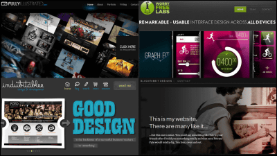
Various sites adopting dark color scheme design
When the background color is black, how much to make the proportion of white, and how effectively it is to express it, that is to say, as a functional beauty, do not use highlights for places that are not noticeable, such as background It seems that it is a point to be careful about such points whether it is used to focus eyes exactly on the part you do not want.
So, it seems there are examples of good sites that you should have looked at when using dark color schemes in design, so let's see. Needless to say, although everything is not a good design, it is not necessarily a good design, since it ranges from what is becoming hard to see with design top priority, but also what is secured up to designability while giving priority to so-called functionality. I wonder if it will become.
30 Dark Designs You Should've Seen | Smashing Magazine
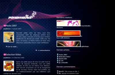
It is said that it is excellent as the most functional beauty in design once, the following site. She seems to be excellent in that it brings white to the part that I want to make it stand out. And because the letter is still easier to read. Also, the surface division is beautiful.
Ronemedia.com, Site / Portfolio de Gilk
http://www.ronemedia.com/
Below, there are various other design sites. For comments that can be commented, insert a comment.
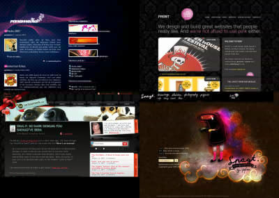
First of all, this site is a design office, but a fatal design. Despite the back, the white triangle that is visible to the left is coming in front. For some reason it is black back. This is a reverse vision effect, which is an example that this fails spectacularly.
FRONT - Web Design Belfast, Northern Ireland (UK) - web designers - website development - rich internet applications
http://www.designbyfront.com/

Although it is a website of a web designer, the part of the pictures of the dog at the top causes inconsistency with each part, so we do not know what we are trying to claim on the main, so the impression of imaichi I can not wipe it. In short, the relationship between dogs' impact and other parts is getting thinner. Therefore, it is not gathered in total.
Larissa Meek
http://www.larissameek.com/
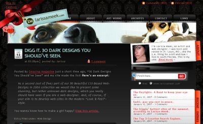
You can see that you have not mastered basic skills, basic knowledge to draw pictures at the stage of bringing even darker behind dark parts and bringing even brighter parts to bright parts.
Snagt
http://snagt.net/
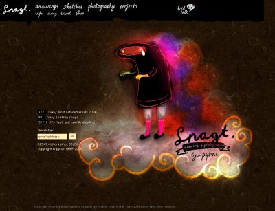
This is still a collection. Especially this is not a good thing, but I can not see any particular point of failure. Honorable performance of the class. If you increase the saturation of the letter "shatutuck" close to the orange color and the background of "CATEGORIES" also has the same saturation, it should be more impressive.
Justin Shattuck
http://www.justinshattuck.com/

GLINGGLO(Currently, it is impossible to display due to breakthrough amount)
http://www.glingglo.net/
The character of "BROKEN KODE" logo portion should be a sign, but the decoration part of the central decoration has become so conspicuous that it is buried. Therefore, if you do not make it the character of "Habari" in the lower right, it will hide behind the character in the middle and the impression will become thin. In other words, it is a kind of toppling over. However, it has not failed otherwise. A good one as a design. That's why the pattern of the horse's falling over.
Broken Kode | by Khaled Abou Alfa. No added preservatives.
http://www.brokenkode.com/

The combination of the color scheme of the three primary colors in the middle is bad. Make the central red closer to a brick color and make the color of the right edge yellow to the ocher system. Clearly this is an example of failure caused by color tone. I give a terribly minor image to this human being. An image of "x" has also been given.
John Dahlback
http://www.johndahlback.com/

The gradation of the image part at the bottom left is reversed. Although the icon part in the foreground is "bright → dark" from the top, it is also "bright to dark" from the top up to the background, which is causing causes of discomfort. Put on the background part by inverted gradation. In other words, the core of the design has fallen down. The whole design of the blog has been pulled on this one-point design.
Fusionfox: new media design
http://fusionfox.com/

Because the blue part above is gloomy color, more white is necessary. Other than that, because the impact of the photograph is better than it is, it is a nice feeling, but there are two pictures meaning the same face, so either one needs a face photo from the other direction or a whole picture etc . Richness is realized by bringing something of a different kind.
Serco TransArctic Expedition - Solo across the North Pole: One man. 1,240 miles. Alone in the Arctic.
http://sercotransarctic.com/

※ Since I said that the design analyst got tired at this point, no comment below. I hear that it will come again next week.
Lodowski.EU - Portfolio of Mi? Osz A. Lodowski - New Media Designer
http://www.lodowski.eu/

Soulshaker House Music Norwich | Soulful, Deep, Disco, Funky, Jackin, US House Music
http://www.soulshaker.co.uk/

Merix - Internet Technologies
http://www.merix.com.pl/

Coda.coza
http://coda.co.za/

Ebon music | electro | dance | rock | band | remixes
http://ebonmusic.com/

Torneo de Empresas VLP 2006
http://www.vlp2005.com.ar/futbol7/

Welcome to Verdure Thought
http://www.verdurethought.com/

Jordi Romkema :: Developer & Designer :: Home
http://www.jor-on.com/

Bloklantis - Artlantis' Blog
http://www.artlantis.nl/blog/

Dragon Armory Creative - The personal portfolio of Finbarr Notte
http://www.dacreate.co.uk/

Magnitude | Web Activists | Harrogate
http://www.magnitude.co.uk/

ZINDUSTRY | Portfolio of Dustin Evans
http://www.zindustry.com/

Online Portfolio of Stefan Asemota - Web Standards & CSS based design >> Welcome
http://www.asemota.de/stenog/welcome

OBeattie
http://www.obeattie.com/

Badboy.media.design :: graphic design portfolio
http://www.badboy.ro/

Viscusi Design - Freelance Web & Print Print
http://www.cviscusi.com/

Prblogger.com
http://prblogger.com/

Deardorff Communications
http://www.deardorffinc.com/

SATO Krefeld << Restaurant ? Cafe ? Lounge ? Bar >> Krefeld
http://www.sato-krefeld.de/

BARANDA TEQUILA
http://www.baranda-tequila.com/welcome.html

Satsu Design - Creative Solutions for Web Design in the Isle of Man and Graphic Design in the Isle of Man
http://www.satsu.co.uk/

Backbeat Media - Beyond the Click
http://www.backbeatmedia.com/

Related Posts:
in Design, Posted by darkhorse_log
