Why were so many control rooms painted in 'seafoam green'?
If you look at the control rooms of old factories or nuclear reactor facilities, you'll often see that the walls and some of the equipment are painted in a uniform pale blue-green color (seafoam green). Designer Beth Matthews investigated the origin of this 'seafoam green' that is so commonly seen in such facilities.
Why So Many Control Rooms Were Seafoam Green
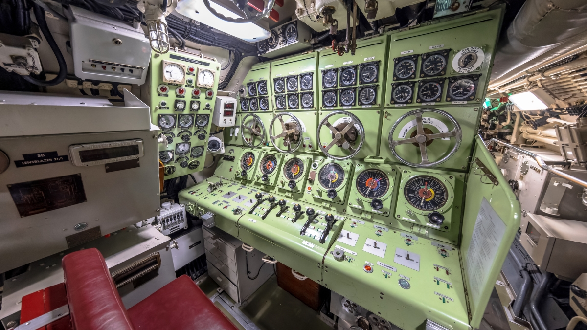
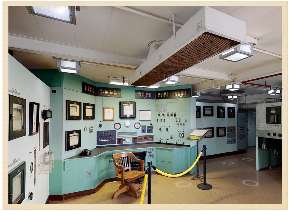
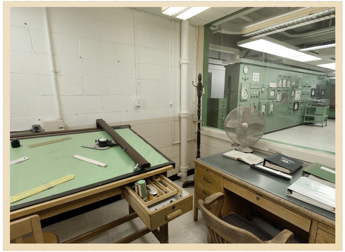
Matthews' inspiration for considering the origin of seafoam green came from a control room at a Manhattan Project -related facility in Oak Ridge, Tennessee. While the control panel with its rows of knobs, levers, and buttons was striking, what also caught his eye was the distinctive 'seafoam green' color widely used on the walls and throughout the room. It's a pale bluish-green reminiscent of sea foam, a color often seen in factories and control rooms at the time.
In his search for the reason behind the widespread use of this color in control rooms, Matthews traced his lead to Faber Biren, a color theorist and color consultant who worked in the first half of the 20th century and advised companies on color usage. After entering the University of Chicago's School of Art in 1919, Biren, lacking a formal curriculum for studying color, continued his research on color through self-study, consulting with psychologists and physicists.
After moving to New York in 1933, Mr. Viren believed that the use of color could improve sales and the working environment, and he pitched this idea to companies. He reportedly told a Chicago meat wholesaler that 'meat doesn't look appetizing against white walls,' and suggested that a blue-green background would make beef appear redder. These suggestions were well-received, and several industries began to hire Mr. Viren, including DuPont, one of the world's largest chemical manufacturers, which became one of his clients.
As wartime production expanded in the United States during World War II, Mr. Viren and DuPont created color-coding rules for their factories with the aim of reducing accidents and improving work efficiency. The rules are as follows:
• Fire Red: Fire safety equipment, emergency stop buttons, flammable liquids
Solar Yellow: Indicates areas requiring caution or physical hazards such as falls.
• Alert Orange: Dangerous parts of the machine
• Safety Green: Safety equipment such as first-aid supplies, emergency exits, and eyewash facilities.
・Caution Blue: Information, notices, and malfunction indicators that are not directly related to safety.
• Light Green: Used on walls to reduce visual fatigue.
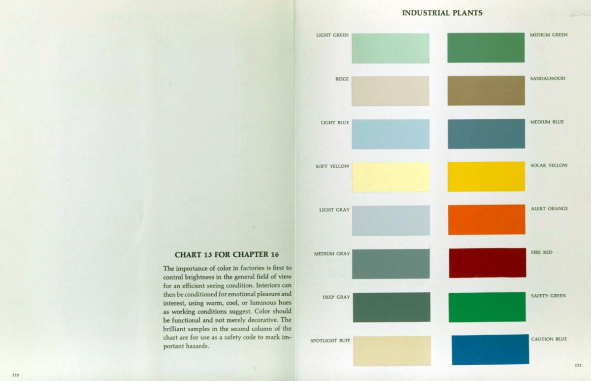
This color-coding system was approved by
Matthews believes that Viren's idea of 'light green on the walls' provides a clue to understanding why seafoam green is so often used in control rooms. In fact, the control rooms and offices of the B reactor at the Hanford site , which was responsible for plutonium production during the Manhattan Project in World War II, also featured a color scheme reminiscent of the light green and medium green recommended by Viren.
In his 1963 book, 'Color for Interiors: Historical and Modern,' Viren wrote that factories should consider eye strain and the impact of interior colors on work efficiency and psychological state. He further argued that color should not be merely decorative but used to improve visibility, and that people's emotional well-being should also be taken into consideration depending on the working conditions.
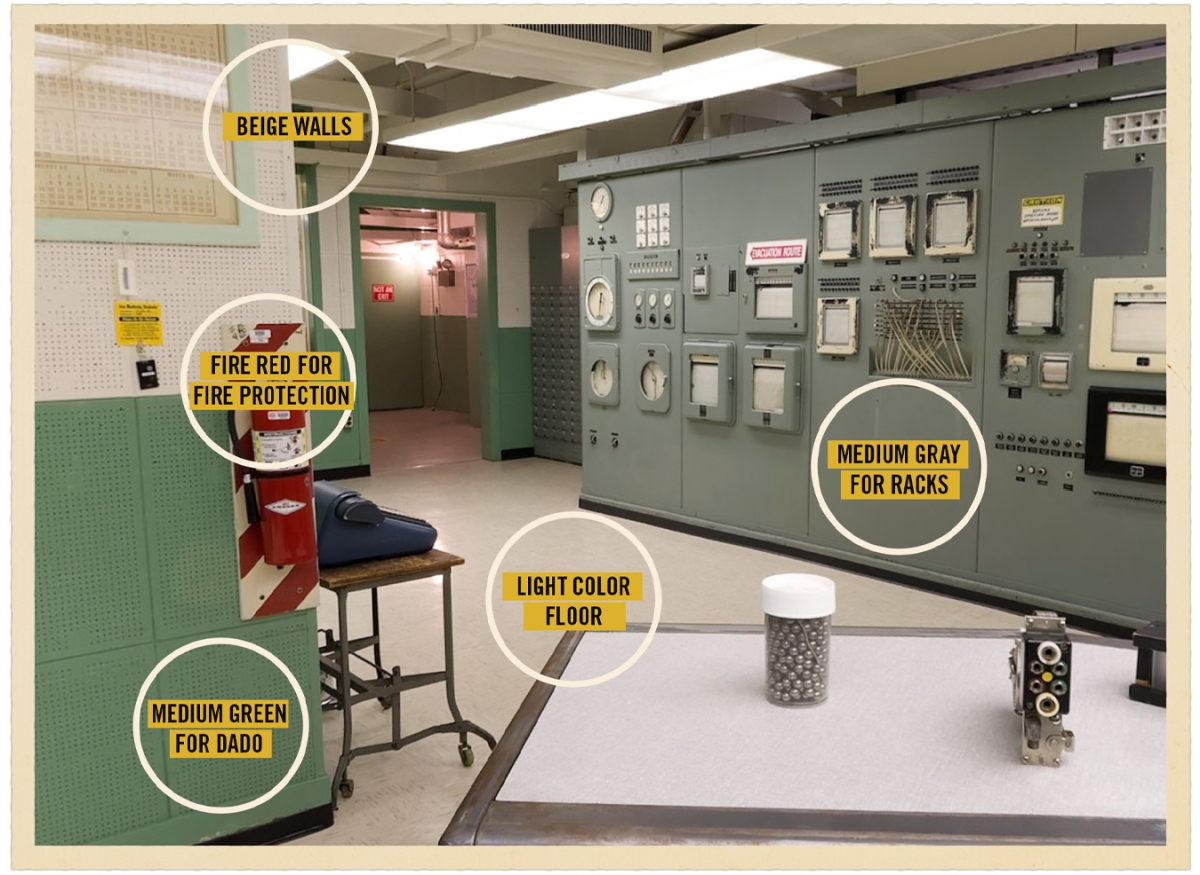
Matthews cited the color scheme guidelines for small industrial spaces described in the book, such as 'medium green for the lower part of walls,' 'medium gray for machinery and equipment,' 'red for fire protection equipment,' 'beige walls in areas with little sunlight,' and 'light-colored floors are preferable,' and stated that 'there is a lot of overlap with these guidelines in the B reactor control room.'
Matthews sees the seafoam green used in the control room not merely as a trendy color, but as a practical color designed to reduce distractions for workers, make hazard indicators more visible, and lessen fatigue during long periods of monitoring.
This post has also been featured on the social news site Hacker News , with some praising its design philosophy that emphasizes functional color theory, while others suggest that the same color scheme has spread outside government facilities, possibly due to leftover paint.
Related Posts:


in Design, Posted by log1b_ok