Making of the title logo for 'Let Me Make It! Ejima-san' that is full of cuteness, pop and refreshing
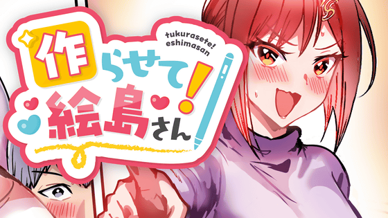
A full-color manga called '
You can read 'Let me make it! Ejima-san' from the first episode to the latest episode below.
[Free Manga] 'Let me make it! Ejima-san' Episode 1 'Let me make a love game!' If you make a love game with your favorite person as the main character... - GIGAZINE
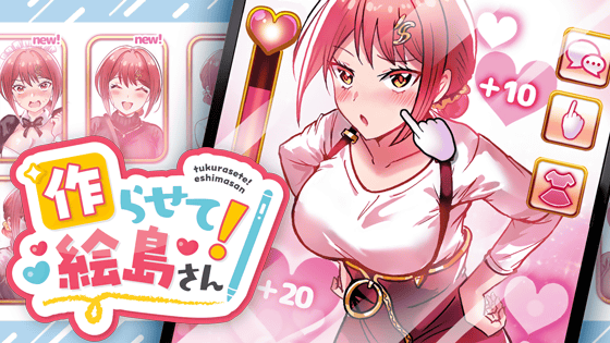
When creating the title logo, the creator, Benea, first created the image she wanted to match the header. The main characters, Kaido and Eshima, have blue as their image colors, and red and pink, so she created the logo image with blue and pink as the base. On top of that, she wanted a design that would stand out a little more and not get lost in the header image, as well as a rounded font image.
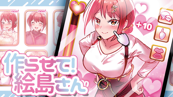
After compiling the desired image and the main manuscript in production, we asked graphic designer
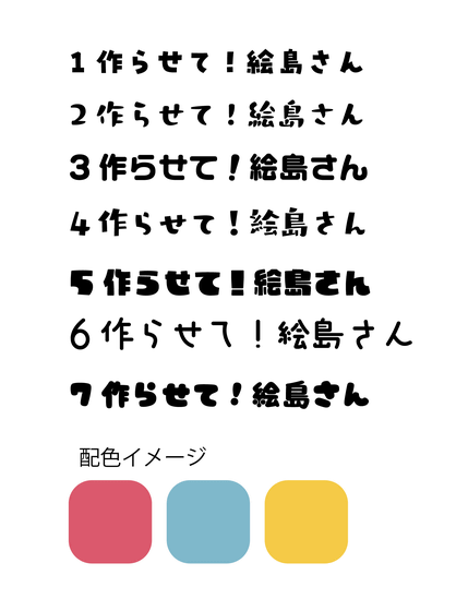
Below is the logo proposal that was created based on the desired image. Kaji Design: 'I used the pen motif from the work to create a clean and cute design that would bring out the illustrations. I moved the letters to create a slapstick romantic comedy atmosphere. The square under the character '作' is inspired by an app icon. The color scheme is cute pastel colors, with Ejima's pink as the main focus, to create a pop look.'
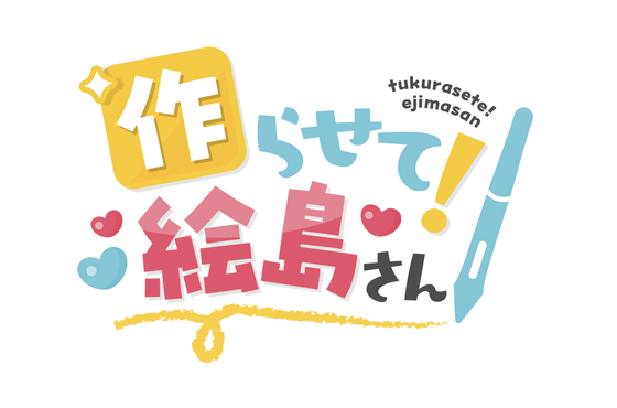
Based on the proposed logo, the author's wishes were reflected in the design, such as 'I want a border to make the '作' and '!' stand out more,' and 'The pen in the logo is very colorful and has a great color, so I want to match the design to the pen that Kaido uses in the work.' Based on that, two designs were proposed: one with a thin border (left image below) and one with a thick border (right image).

The final design, including minor adjustments, is below. The designer, Benea, commented, 'The design is gorgeous, and the balance of colors and shapes is amazing. It's exactly as I imagined it, and I'm really impressed!'
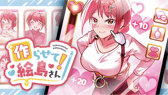
In the end, we received three patterns, one with a border and one without a border, so that the logo could be used on a wider variety of pages and for a wider range of purposes. Below is the basic title logo with a pink border. The black background was added by us to make the logo easier to see.
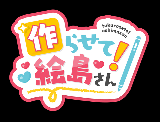
Below is the title logo with only a white border, without the pink border around it.
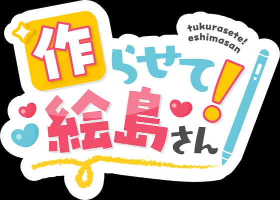
The following is borderless and just has text and a motif.
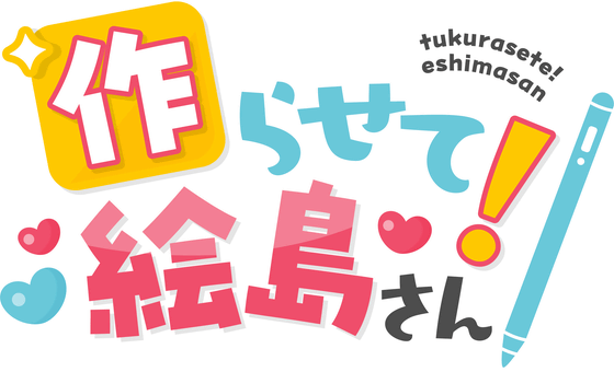
In fact, the logo has been used since the top image of episode 1. You can read 'Let me make it! Ejima-san' below!
[Free Manga] 'Let me make it! Ejima-san' Episode 1 'Let me make a love game!' If you make a love game with your favorite person as the main character... - GIGAZINE

Related Posts:
