A professional designer explains what 'density' is in user interfaces
When you open a website, text and images are usually displayed, and visual information can be obtained from various places on the page. Some sites only display text, while others arrange text and images in a balanced way to guide the user's gaze. When such information overload and balance are considered as a measure of 'density,' Matthew Strom, who leads the design team at payment service
UI Density || Matthew Ström, designer-leader
https://matthewstrom.com/writing/ui-density/
When users open a website, they usually first receive information with their eyes. Strom defines 'visual density' as 'how much you can see in a space,' and writes about visual density in UI as follows:
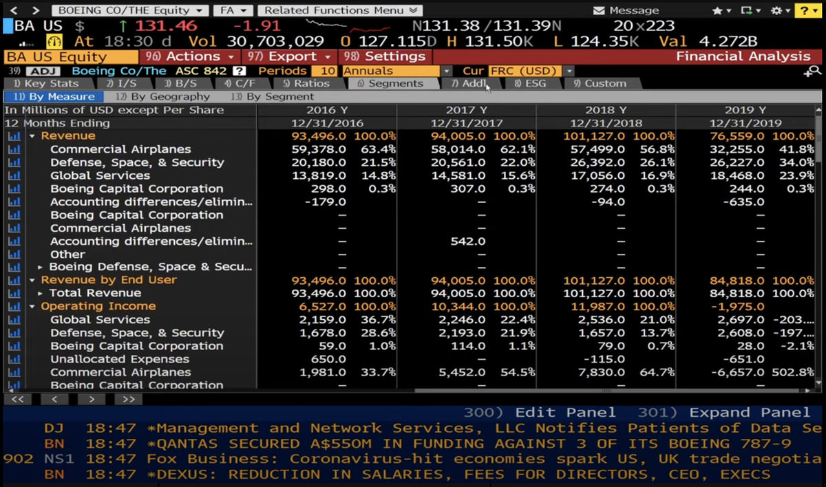
'High visual density' simply means that there is a lot of information on a screen. The Bloomberg Terminal , an information terminal distributed by the financial newspaper Bloomberg to companies around the world, is a good example of high visual density, as shown below. On a single screen, it displays major market indexes, a breakdown of trading volume, scrolling headlines containing the latest news from around the world, and shortcut icons.
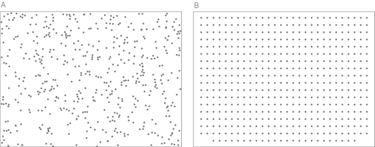
It is relatively easy to judge whether a single piece of information has high or low visual density, but humans become confused when multiple similar pieces of visual information are lined up next to each other.
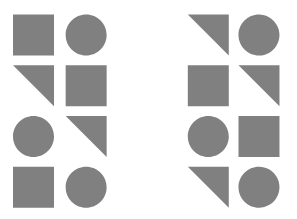
For example, in the image below, the size and number of dots shown are exactly the same in A and B. However, because the arrangement of the dots is completely different, some people may interpret it differently, saying that 'A has a lower density' or 'B has a lower density.'
In the following images, the size and number of dots are the same between A and B, but the impression they give is different.
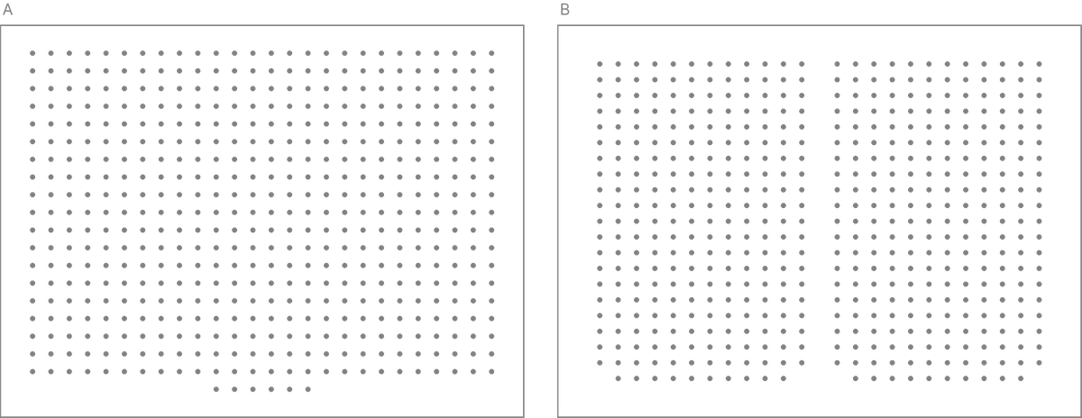
In this way, visual density can easily change with a slight change in the design of visual information. Strohm says, 'Visual density is inherently unpredictable,' and argues that a different scale is needed to get a more quantitative view.
The next thing Strom proposed was 'information density.'
Information density refers to the ratio between the amount of 'ink' used to display a certain piece of information and the value of the information itself. If a large amount of ink is used to write various things, but little is gained from that information, it is judged to have 'low information density.' Conversely, if valuable information can be written with a small amount of ink, that information is considered to have high information density.
Information density is a concept based on the theory of 'data ink' used by statistician
For example, in the two images below, the left one has a mark at the intersection of the vertical and horizontal axes, while the right one has no markings. In some cases, the left one may be perceived as easier to understand, but according to Tufte, the right one gives the impression of being 'easier to read.'
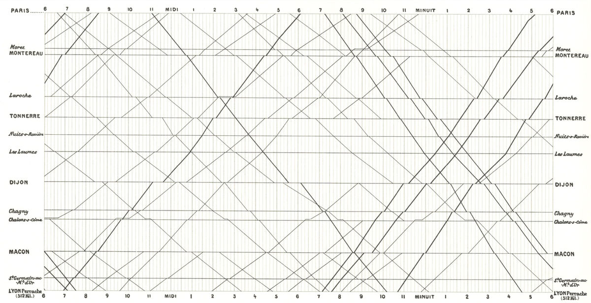
The image below is a train timetable from Paris to Lyon, written by photographer Etienne-Jules Marey in 1885. This timetable contains a huge amount of information, including train arrival and departure times, in a small space, but Strom evaluates this timetable as having a 'data to ink ratio close to 1 (no unnecessary information)'.
Thus, while information density is a clear and quantifiable measure for information such as graphs and charts, it is somewhat difficult to apply to multiple pieces of information such as websites. Strohm said, 'While information density is a useful starting point, it is clearly only part of the picture. How can we incorporate design into a more objective, quantitative view?' He pointed out that design decisions must use both intuition and standards.
The question here is, where does the line end? Where does the line end? Where does the line end? Strom says these questions prompted 20th-century German psychologists to explore how humans understand shapes and patterns. German psychologists called this field 'Gestalt,' which means 'shape' in German. In the course of their exploration, psychologists discovered the basic laws of how humans see things.
The eight rules are as follows:
1. Proximity: Humans tend to perceive things that are close to each other as a group.
2. Similarity: Things that are similar in shape, size, color, etc. appear to be related to each other.
3. Closedness: The human mind fills in the gaps in a design, so we may see shapes that aren’t there.

4. Symmetry: When humans see shapes that are symmetrical to each other, they perceive them as a group formed around a central point.
5. Common Fate: When objects move, humans tend to group things that move in the same way.
6. Continuity: Even when objects overlap, humans can still perceive them as separate.
7. Past Experience: Humans recognize familiar shapes and patterns in unfamiliar contexts because of their past experiences with those shapes and patterns.
8. Figure-ground relationships: Humans interpret what they see in three dimensions, so even in flat, two-dimensional images, they can recognize foreground and background.
Strom argued that these principles can also be applied to UI design:
-The law of contiguity tells us that if a heading is near a figure or table, it tells us that the heading describes the figure or table.
The law of similarity helps users understand that text of the same size, font, and color serves the same purpose within an interface.
Using the Gestalt principle, we can see things in a completely different way than visual density or information density. Strom says that we can compare the amount of decision-making required to design a design with the amount of decision-making required to look at a design and interpret information, and he calls the measure that relates the two 'design density.'
Design density has two main criteria: time and space.
An example of time is the load time of a website: when a user clicks on a link or some other interface, they get frustrated when they have to wait forever for it to load.
According to Strom, if the time from click to response is kept to less than 100 milliseconds, humans will feel as if no time has passed between the two actions. If it takes 100 milliseconds to 1 second, humans will perceive a gap between the two actions. If you click a link and nothing happens for a second, you may wonder if you really clicked something or worry that the website is broken. Strom points out that such gaps can be filled by inserting short animations, etc.
If the time between two actions is between 1 and 10 seconds, animations won't cut it. Research shows that users are most likely to leave a page within 10 seconds of the first action, so it's a bad idea for a website to not respond for 10 seconds. If you can't shorten the time between these actions from a technical standpoint, it's a good idea to display a loading icon or something that tells the user that the system is working properly.
If it's between 10 seconds and a minute, users may see the icon as 'static, not dynamic' and think the page isn't working as expected. If it takes that long, you may be able to address it by showing an indicator like a progress bar. If it's longer, over a minute, animations and icons are no longer enough to keep users engaged. The best thing websites can do is to have users leave the page or do something else, and notify them when the next action has occurred.
As for space, a questionnaire form can be given as an example. Rather than lining up a long questionnaire form from top to bottom, it is said that a system in which several items are displayed together and the user is asked to save the information they have entered one by one, and then proceeds to the next page after saving, is less stressful for the user.
This may force users to view similar pages over and over again before completing the survey, but it's fine as long as it ultimately increases response rates and gives users a response that's worth the time they spend on it. Similarly, you can increase visual density by making forms more compact, loading faster, and reducing errors. These examples can be applied not only to websites, but also to application design.
Finally, Strom cites pages from Google and Yahoo as good examples of measuring visual density, information density, and design density.
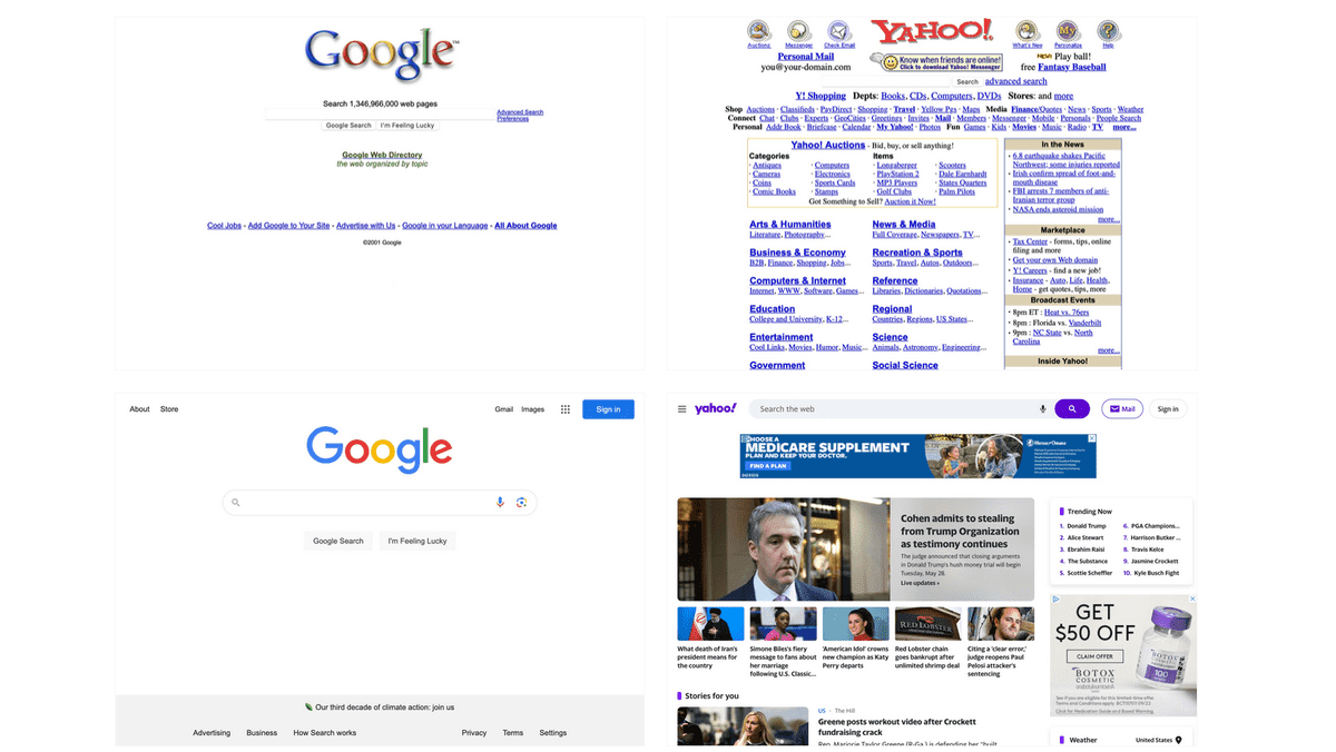
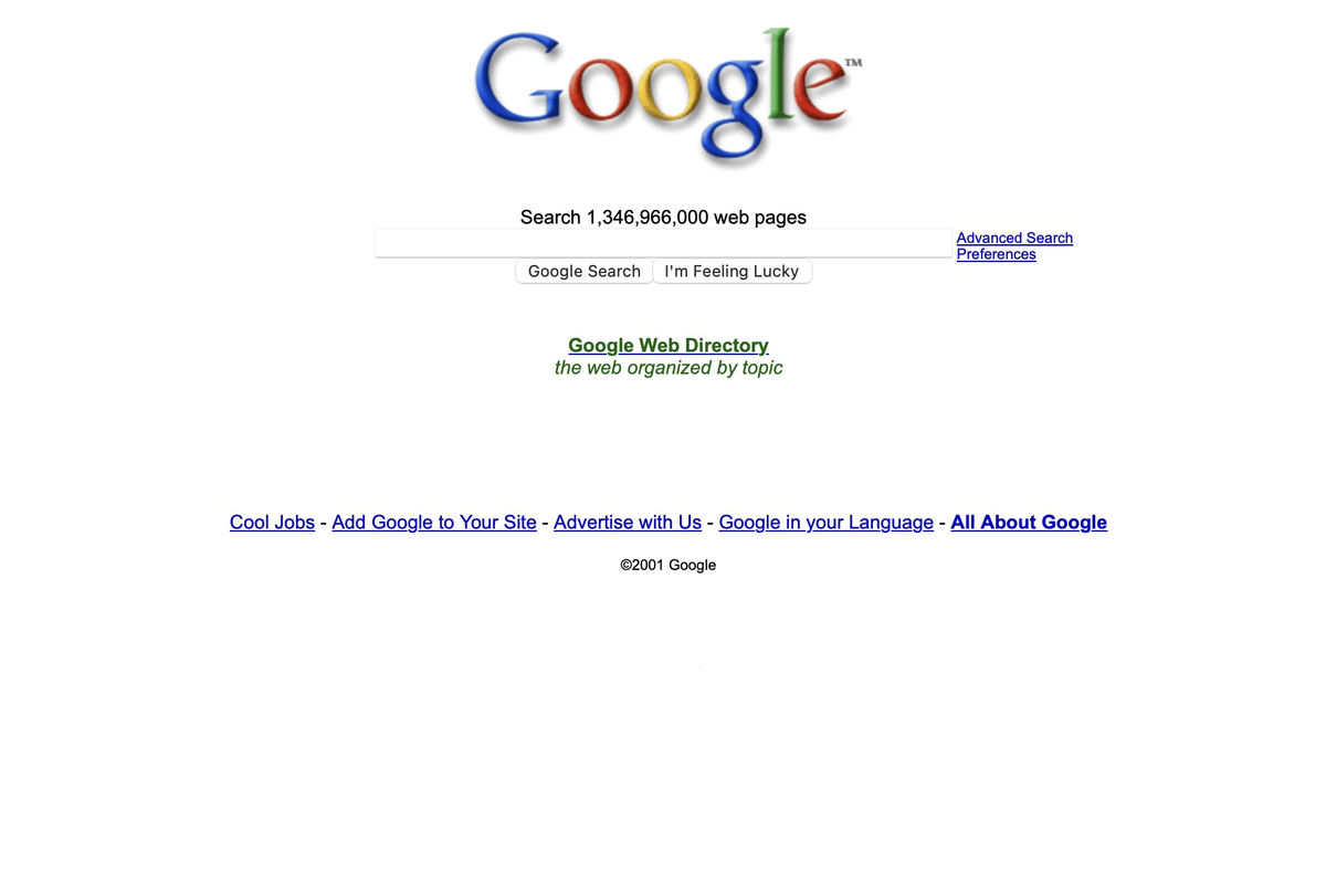
Below is a screenshot of Google's homepage from 2001.
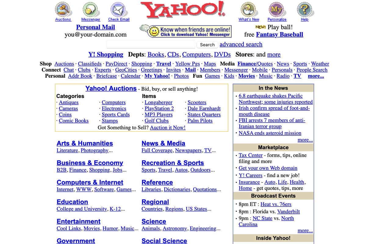
Below is a screenshot of the Yahoo homepage from 2001.
Below is Google in 2024.
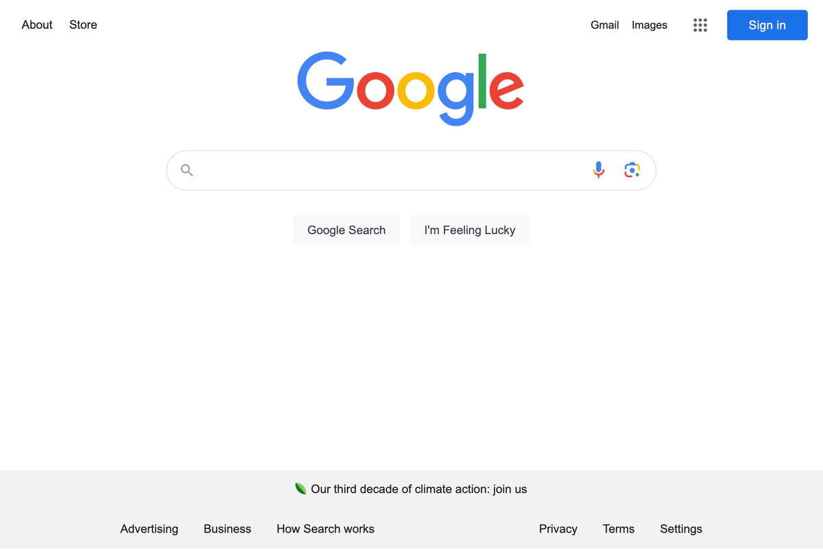
Below is Yahoo in 2024. Strom pointed out, 'Yahoo created value by displaying a lot of information on a page, but Google took a fundamentally different approach. The result is shown by the stock value as of 2024, where Google's stock price has increased 8 times in 20 years, while Yahoo's stock price has fallen to 1/26.'
Finally, Strom defines UI density as 'the value a user gets from an interface divided by the time and space it occupies.' He adds, 'UI density includes all the design decisions that humans make implicitly and explicitly, all the information we display on the screen, and all the time and actions that users take to get value from the software. By considering all of speed, ease of use, consistency, predictability, information richness, and functionality, we can understand why some interfaces succeed and others fail. And by designing for density, we can help people get more value from what we create.'
◆ Forum is currently open
A forum related to this article has been set up on the official GIGAZINE Discord server . Anyone can post freely, so please feel free to comment! If you do not have a Discord account, please refer to the account creation procedure explanation article to create an account!
• Discord | 'Which do you prefer: a UI that displays as much information as possible, or a UI that uses the screen more widely?' | GIGAZINE
https://discord.com/channels/1037961069903216680/1244588024046555136
Related Posts:


in Design, Posted by log1p_kr