Why are Japanese websites with lots of text and flashy colors so 'different'?
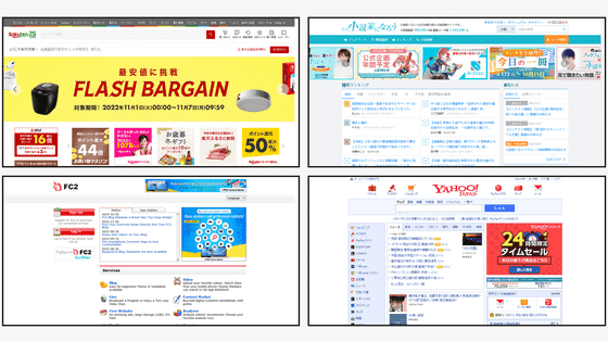
Major Japanese websites, such as
sabrinas.space -
https://sabrinas.space/
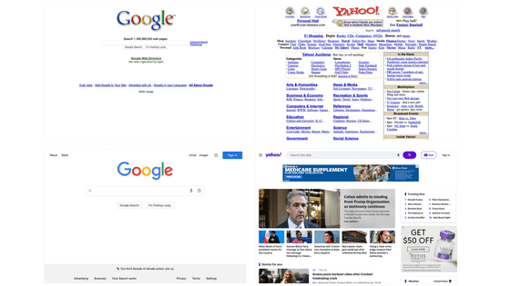
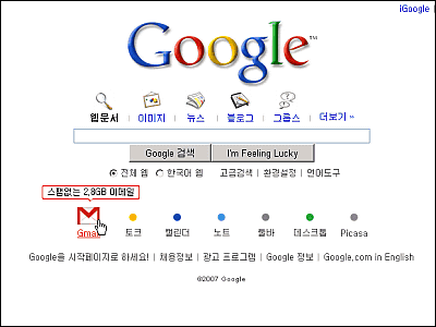
Websites originally had a variety of designs, but as web standards and other standards were standardized, the number of designs decreased. Furthermore, with the spread of smartphones, screen size and data communication volume have become restricted, and the amount of content on a page has further decreased, leading to minimalist web design worldwide. However, Japanese websites are characterized by a high density of information that goes against this trend.
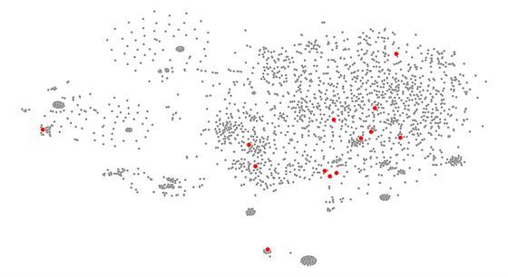
When Mr. Cruz processed 2,671 images from popular websites from various countries using image recognition AI, he was able to group web design patterns from around the world based on their similarities. By analyzing the images using two indicators, ``brightness'' and ``density,'' characteristics unique to Japan were revealed. In the image below, the X axis shows density and the Y axis shows brightness.
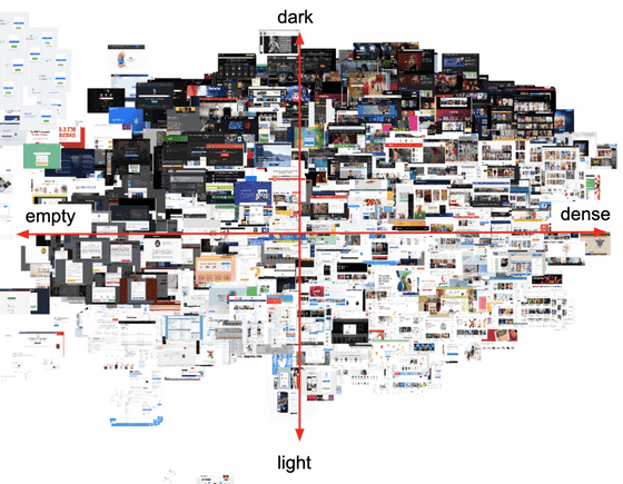
Below is a point graph of the above image. The red dots are Japanese websites, and you can see that most of them are in the first or fourth quadrant, or 'high-density' designs.
This is said to be a different trend from countries where a wide variety of designs exist. The points in the image below are blue for the United States, brown for India, green for the United Kingdom, pink for Indonesia, orange for Ukraine, light blue for Canada, purple for Mexico, and gray for others.
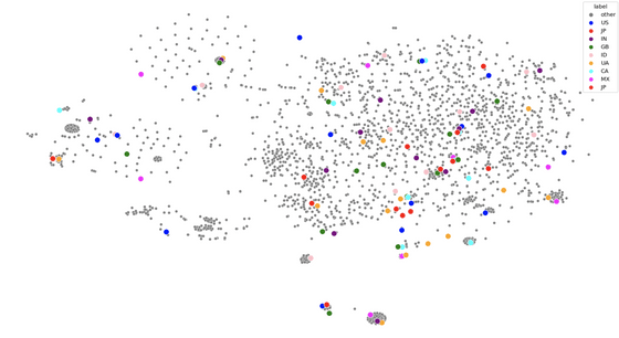
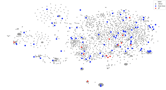
'Interestingly, popular websites in Japan seem to avoid 'blank, dark designs,'' Cruz points out. This trend can also be seen on websites in China, South Korea, and Taiwan, such as
A blog written by David, a designer living in Japan, that Mr. Cruz referenced talks about trends in Japanese web design, as logographic characters , such as kanji, contain many meanings in just a few characters. It is explained that although this design may seem cluttered to Western eyes, it allows Japanese speakers to process a lot of information in a short amount of time. They also point out that ``many designers add decorations or use graphic text to visually emphasize Japanese words without italics or capital letters.''
Additionally, ``Japanese culture generally does not take risks or stand out from the crowd, and once a precedent is set, everyone follows it, regardless of whether there is a better solution.'' The chaotic busyness of the streets, such as the bright neon advertisements and noisy pachinko parlors seen in Shibuya, has also spread to the web.Physical space is limited in Japan.Programming languages He introduced the uniqueness of Japanese websites by citing reasons such as ``most of them were designed by English speakers or Western companies, and they are slow to adopt new technologies and trends.'' .
Mr. Cruz referred to the above opinion, and also based on the opinions obtained from interacting with internet users in Asia: ``Japan is said to have a culture of avoiding risks, and it is difficult to request a lot of information about products.'' I guessed that there was.
'Such display methods may be influenced by the urban structure of regions where brightly colored lighting and compact spaces are common,' Cruz said, but websites in East Asian countries Even when compared with Japan, no pattern similar to Japan was observed.
He also points out that because Japan is an aging society, the way people use the Internet is different from other countries. Cruz also said that Japan developed its own unique culture because of the reluctance to update software, the prevalence of smartphones in Japan before the iPhone, and the predominance of text formats rather than images. guessed.
Finally, Cruz said, 'Japan is slowly but surely moving to adapt to the world's technology, both because younger generations want it and because companies are no longer supporting older technologies. 'Because we have no choice,' he concludes, predicting that the design will change in the future.
Related Posts:
in Web Service, Design, , Posted by log1p_kr

