How to create Chinese fonts covering enormous kinds of Chinese characters?
byFabian Reus
Currently, most of the characters that we see are not handwritten characters, but rather the typeface data that is printed on paper or displayed on the computer screenfont"is. There are many kinds of fonts in different fonts, but unlike fonts such as alphabet consisting of dozens of kinds of uppercase letters and lowercase letters, "Chinese fonts that require tens of thousands of kanji "The creation of a lot of people's enthusiasm is included.
The long, incredibly tortuous, and fascinating process of creating a Chinese font - Quartz
https://qz.com/522079/the-long-incredibly-tortuous-and-fascinating-process-of-creating-a-chinese-font/
The history of kanji dates back to ancient China in the 16th - 11th century BC. When deciding their behavior, the ancient Chinese kings used fortune telling to judge whether the behavior that they thought was good or bad, in the form of cracks in the bones of animals and the shell of the turtle. The result of fortune telling is engraved on bones and shells, now "Bone characterIt is known as.
Since that time the shape of kanji has undergone several transitions, but in the era of Qin Dynasty occurred around the 2nd century BC, plural Chinese were unified, and a certain format was decided. Since then, there has been no major change in the way of writing in Chinese, the next major change occurred under the rule of the People's Republic of China "Simplified characters"Was established in the 1950s. This greatly simplified the Chinese sentence system.
In recent years, it is necessary to record Chinese characters as font which is character font data, but there are major problems in font making in Chinese. In Chinese fonts that make up sentences with a sequence of kanji with each meaning, the number of fonts required becomes enormous compared to languages that repeat characters with a limited number of letters such as English and French It will be. For example, in order to understand the content of a newspaper, it is necessary to know 2000 kanji on average, if you want to read a novel you have to know 1000 more kanji, fonts need more letters will do.
A comprehensive dictionary of kanji used in China "Chinese character seaAlthough the number of recorded Chinese characters is 85568 characters, as expected it is rarely encountered unless most Kanji letters enter the world of ancient Buddhism and calligraphy. However, it is obvious that the Chinese character system is too large, and the development of new fonts does not progress easily at present. Chinese fonts seem to be fewer than Latin fonts which are rarely used now.
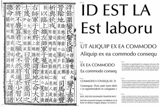
I work as a chief font designer by Czech font production company Rosette typeDavid BresinaSays, "Chinese font production is crazy." "Glyph" which is a unit of font production counts each form such as lowercase letters, capital letters, and symbols as "1". The number of glyphs required by default setting of general English font is 230, 840 in font covering all latin letters, but the glyph of simplified Chinese character fonts used in Mainland China is 7000 It is said that it also extends. Including the traditional Chinese characters used in Taiwan and Hong Kong, the number of required glyphs is likely to be over 13,000.
Generally, if you have one experienced designer you can produce fonts that can describe dozens of European languages within six months, but if you are trying to make a Chinese font, it will take at least two years It is necessary for multiple designers to cooperate with each other.
Taiwanese font production startupJustFontCo-founder ofWinston SuMr. said, "Font making begins with research." As a first step in making fonts, in Latin fonts work is done to make representative fonts from making plain letters H, O, V, lower case letters n, o, d etc And that. In Chinese fonts, it is necessary to make hundreds of major Chinese characters just by image consolidation. In addition, it is impossible for a single designer to handle all of the enormous fonts, so all team members must share the concepts that make up the font, and from there we have to enter into a uniform font.
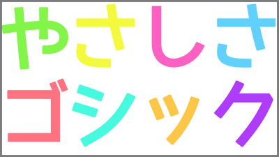
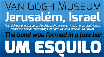
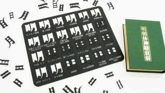
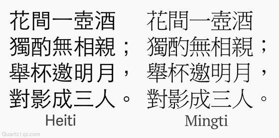
In Latin fonts there is a decoration part at the end of the line "Serif"Typeface and no decoration"Sans serifThere are two types of fonts, Chinese and Gothic style and Mincho type.
Like the sans serif, the Gothic body does not have a decoration at the end of the line and draws a beautiful straight line. Meanwhile, the Mincho body has a decorative part at the end of the line similar to the dialogue, but since there are more parts decorated than the serifs, there seems to be a more handwritten atmosphere It is said that it feels.
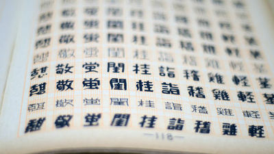
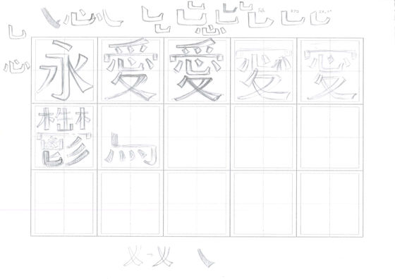
After deciding which font to create in Gothic style or Mincho type or roughly which direction, after investigating what type of font the market is seeking, the designer sketches the actual font I start to draw. Even just designing a representative kanji requires a great deal of effort, and among them the kanji called "ei" is an important kanji in which elements of major kanji such as "hanagi" Designers will design with nerve pointing.
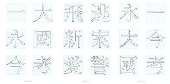
The most difficult point in Chinese font making is that "I can not use individual parts of Kanji". Many of the kanji can be represented by certain radicals and sequence of creation, but you can not create beautiful fonts simply by combining parts of kanji. Mr. Sue says, "It is necessary to adjust delicate balance of all kanji, and each kanji requires its own design."
For example,Speechless (punk)Even in Kanji using "Kanji", the shape of the "word" and the thickness of the line will differ slightly depending on the character. As Chinese users quickly noticed a subtle balance sense of incompatibility, fonts created by combining a large number of parts automatically will not be satisfied.

Even in the early stages of font production, even if we decide that "This font unifies the character of the line like this and the atmosphere of the point like this", it is often forced to change by individual kanji, The condition is that it will continue to change.
As a result of various studies on glyphs designed by font designers, changes in the first design are corrected in the red to the designer and conveyed. Taiwanese font production companyArphic TechnologyThe designer Nguyen Ye said that when he saw the font plan corrected with a lot of deficits, he "trembled".
The designer does not concentrate on only one character individually but it is necessary to worry about how it looks when that character is actually used in a sentence and is aligned with other characters and the appearance as the entire font come out. As the design gets settled through repeated revisions, the designers gradually increase font production speed.

Demand for Chinese fonts has steadily increased as the number of Internet users in China increases, and in the cloud funding that JustFont did when creating a new font, against the target of $ 45,000 (about 4.8 million yen) It is 16 times that 720,000 dollars (about 77 million yen) gathered. Chinese users are positive about paying for fonts and they are looking for unique fonts even if they pay money.
Related Posts:
in Design, Posted by log1h_ik
