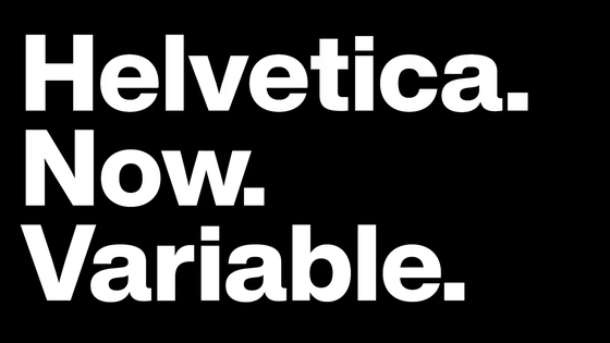
What kind of font is 'Aptos' which became Microsoft's new default font?
' Aptos ' has appeared as a new font to replace '
A change of typeface: Microsoft's new default font has arrived | by Microsoft Design | Jul, 2023 | Medium
https://medium.com/@MicrosoftDesign/a-change-of-typeface-microsofts-new-default-font-has-arrived-f200eb16718d
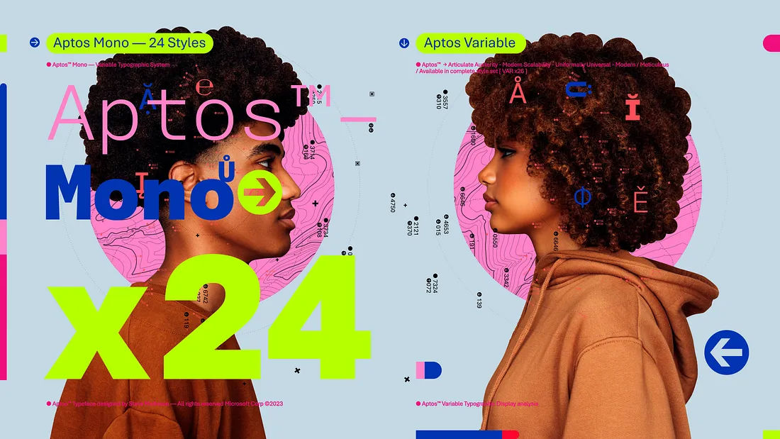
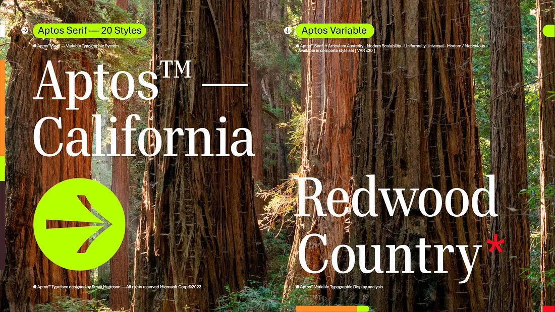
Hand-drawn characters, variable type technology, and even a complimentary serif font—–our new Microsoft default font #Aptos has it all.
—Microsoft Design (@MicrosoftDesign) July 13, 2023
Learn more about its design➡️ https://t.co/P1JcFKfirM pic.twitter.com/YFsFUwXXgi
Meet Microsoft Office's new default font: Aptos - The Verge
https://www.theverge.com/2023/7/13/23793428/microsoft-aptos-new-default-font-office-365
Microsoft Aptos is the next Office default font
https://www.cnbc.com/2023/07/13/microsoft-aptos-is-the-next-office-default-font.html
With the release of Office 2007, Microsoft has adopted 'Calibri' as the standard font for English characters. However, in modern times when full HD (1920 x 1080 pixels) high resolution displays have become commonplace, Calibri was becoming an outdated font, so I was looking for a new font to replace it. In addition, Microsoft cited `` sharpness and uniformity, suitable for display '' as a condition for fonts to replace Calibri.
And announced that 5 new fonts to replace this Calibri will be announced in 2021 , and one of them will be the new default font. Bierstadt, Grandview, Seaford, Skeena, and Tenorite are five fonts that have been named as candidates for Microsoft's new default font to replace Calibri.
Microsoft listened to user feedback and chose 'Bierstadt' as the new default font because it resonated the most out of five candidates. And, officially being selected as Microsoft's default font, Bierstadt has been renamed to 'Aptos'.
In addition, Microsoft will change the default font for Office products such as Word, Outlook, PowerPoint, and Excel to Aptos in line with the decision to use Aptos as the default font for new English characters on July 14, 2023. . It seems that the default font for all users will be changed to Aptos in the next few months.
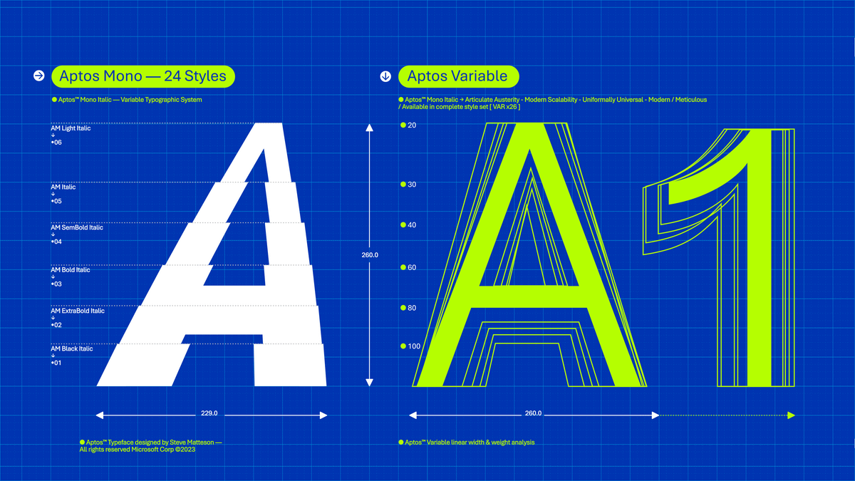
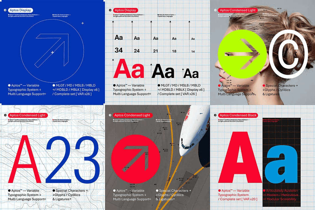
Aptos is a font created by
Matteson aims to design a font that has a human touch, saying, 'The universal appeal of NPR newscaster Karl Kassel and the sharpness of The Late Show host Stephen Colbert. I want to make a font that has a tone,' he said. Specifically, ``In addition to using straight lines, edges, and French curves (templates used to draw uniform curves), I added a little fluctuation to R and G to add a human touch to the font design. I let humanity creep in.'
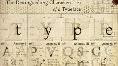
Aptos is
Aptos is composed of various geometric shapes, is bold and clearly defined, and is suitable for expressing various languages and tones. The stems are cleanly cut and the spaces for circles and squares within the character outline improve readability, especially at small sizes.
It also features the tail of the font to distinguish the number '1' from the capital 'I', and the heads of 'i' and 'j' are circular rather than square. Adopt points. The number '6' is a single stroke, but I made it possible to make '8' by overlapping two oval shapes.
“I remember when the default font switched from Times New Roman to Calibri,” says Cathrine Wilhelmsen, MVP of Microsoft Data Platform. I remember it was a change I should have made.This change?I love it already!Makes my inner font nerd happy.I always liked Bierstadt so can't wait for the new Aptos No,' he tweeted.
I remember the switch from Times New Roman to Calibri. I wasn't the biggest fan back then, but it was a welcome change. This change? I like it already! Makes my inner font nerd happy ???? I always leaned towards Bierstadt, can 't wait for the fresh new Aptos look ???? https://t.co/LipkqU9c4E
—Cathrine Wilhelmsen (@cathrinew) July 13, 2023
Overseas media The Verge has become an important evidence of the corruption investigation over the Pakistani Prime Minister in 2017 about Calibri, which has been retired from Microsoft's default font, and in early 2023, the US Department of State will be employed. It introduces how I instructed my staff to use Calibri for memos .
In addition, Grandview, Seaford, Skeena, Tenorite, and Calibri, which are not candidates this time, can be used as fonts in Office products in the future.
Related Posts: