Summary of how to select an appropriate UI for 'waiting time' that users can intuitively understand
In the development of web services, 'what to do with the waiting time' is a big problem. Of course, if we can reduce the waiting time, we would like to reduce it, but there are cases where waiting time will inevitably occur due to the convenience of the mechanism. Design patterns that improve the user experience in such cases are summarized on the blog by 'Pencil & Paper', a company that specializes in design.
UX Design Patterns for Loading
According to the blog, the load pattern can be divided into two patterns, ' passive load ' and ' active load '.
◆ Passive load
Passive loading refers to loading by the system without user action, such as when the system first loads a data-heavy page, opens a file, or displays search results. If the contents to be loaded are separated by component, it is possible to reduce the waiting time experienced by the user by loading them one by one in order.
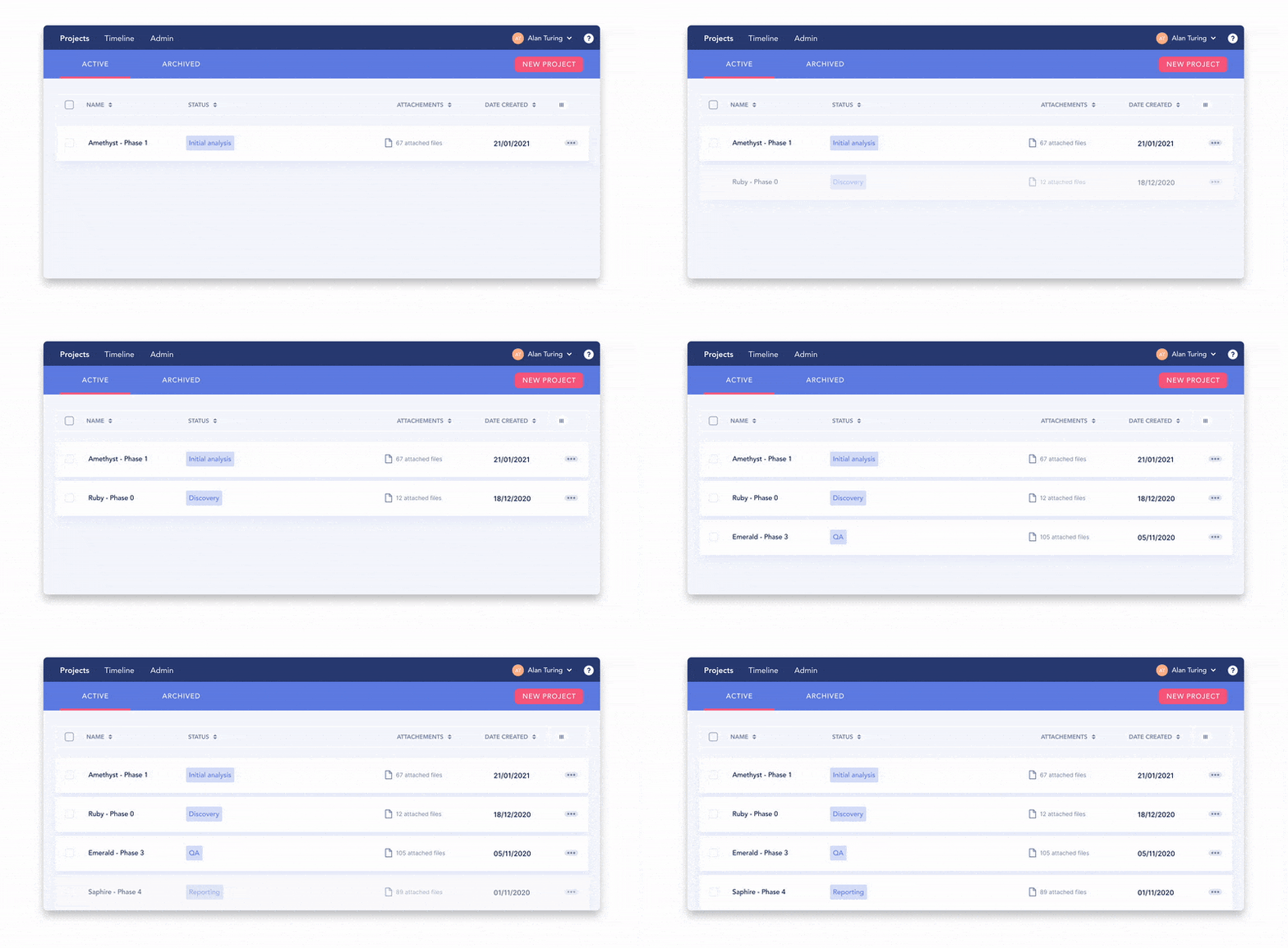
On the other hand, it makes more sense to load together components that are better suited to exist as a group.
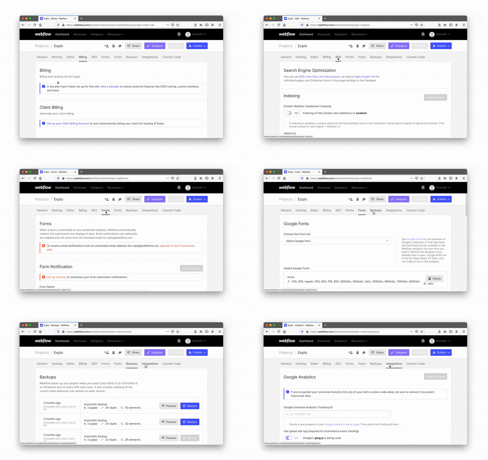
Also, if you have a large number of components, you should use lazy loading to load less in the first place. Scrolling is a typical trigger for loading additional components. Just load additional components as the user scrolls the page.

It is also ant to display buttons such as 'Load More'. It does require user action, but it prevents you from unintentionally loading data.

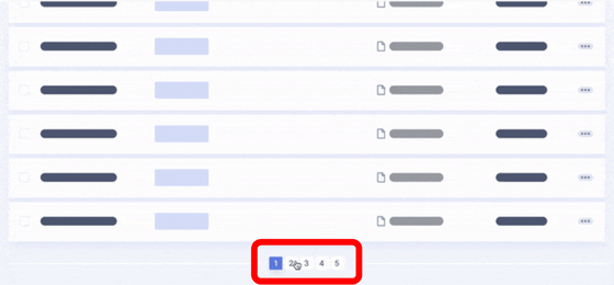
If you have a lot of content, additional loading will slow down your page performance. In such cases, the method of dividing into pages is adopted by many sites.
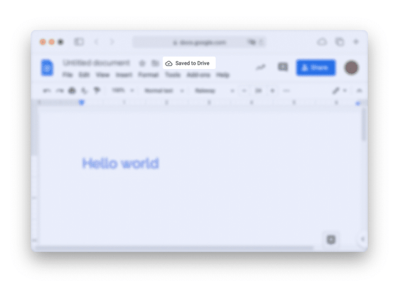
In addition to page loading, there may be latency due to things like synchronization. In such a case, it is important to consider 'frequency' about what kind of UI to notify. For example, if you sync frequently like Google Docs, feedback should be minimal and unobtrusive.
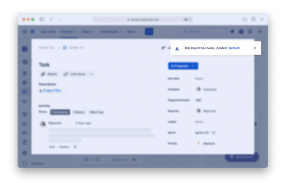
It is effective to display a banner or a toast popup as shown in the figure below for things that are not frequent, such as when notifying that the content of the page needs to be updated.
◆ Active load
Loading in response to user clicks, such as when publishing newly entered data, exporting large files, or running automated tasks, is called active loading. The basic principles of active loading are as follows.
- Always give immediate feedback when a request is received
Use loop animation for waits longer than 2 seconds
Use a percent complete indicator for waits longer than 10 seconds
Use dynamic and contextual messages, not static loading messages
Common examples by load time are also provided.
・Less than 0.1 second
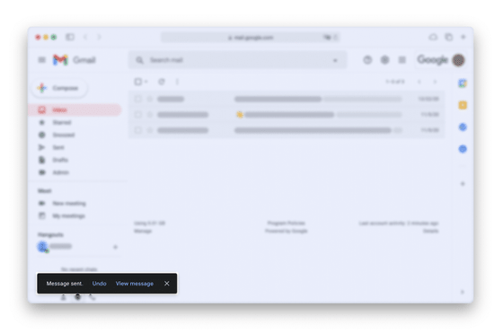
If the task is successfully loaded in less than 0.1 seconds, it can be considered an 'instantaneous task' and does not need to be displayed in the UI. However, it is effective to introduce a fake loader that deliberately delays depending on the scale and severity of the task. For example, email applications such as Gmail send emails after a delay of about 5 seconds after pressing the send button, giving the user time to cancel the operation.
・0.1 second to 1 second
Sub-second delays in online web apps are generally what users expect, and they don't really need animations to fill in the gaps. Adding animation to these short delays can flicker and confuse users.
・More than 1 second
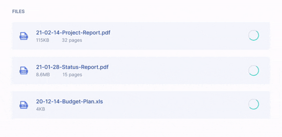
Users will start noticing the presence of a delay when the delay is greater than 1 second. It is said that the use of spinners is effective for small components.
When loading the whole page, it's better to render the framework first instead of placing a huge spinner.
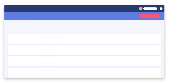
Rather than simply placing a framework, you can animate with shimmer effects and pulse effects to divert the user's attention from the waiting time and reduce the perceived waiting time. 
There is also an option to display a lightweight image using
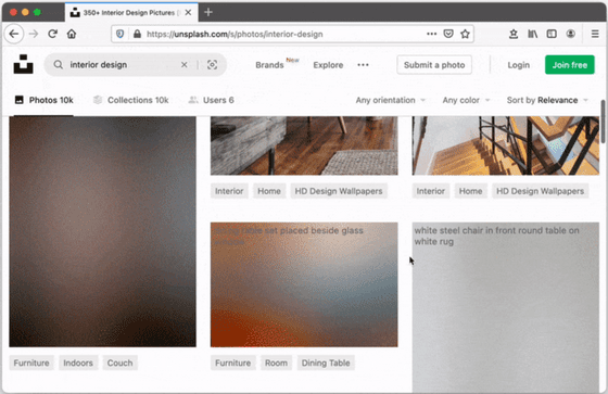
・About 2 to 10 seconds
In this range of delays it is appropriate to introduce a progress indicator. It's difficult for developers to accurately estimate load times, but displaying a general guideline such as 'This process may take several minutes' can help set user expectations. can.
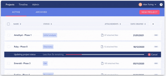
Progress bars are great indicators, both per page and per component. By inserting a pose in the middle or changing the speed, you can create a more 'moving' feeling. 
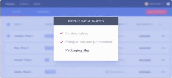
You can also give the user a guideline by dividing and displaying the steps.
・10 seconds or more
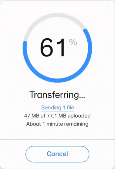
For large tasks, it's important to show work progress and clearly indicate that the task is progressing while you're doing other things. If it is difficult to estimate the time, just display the completion rate. It's important to make sure the user knows how long it will take to complete. However, the act of stopping at 99% and adjusting the balance is absolutely NG. If task length cannot be expressed as a percentage complete, then a different approach should be taken.
・Huge task
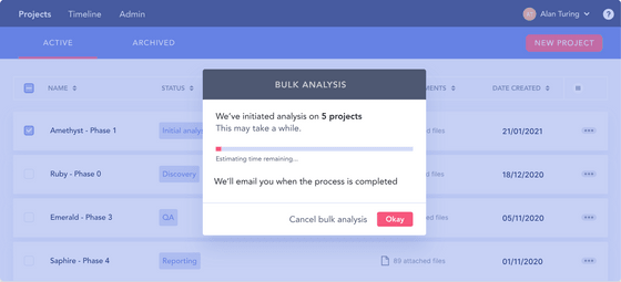
If you have a large task and you can't estimate the load time at all, you should consider the option to show 'Come back later' and notify when done.
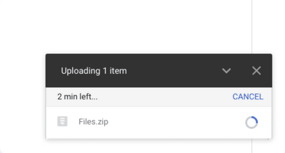
Alternatively, it's a good idea to process the task in the background and keep the status on a small screen. Based on these points, Google Drive's upload UI seems to be perfect, with three points: ``immediate feedback'', ``progress status can be checked'', and ``you can operate the application while processing the task''.
Related Posts:
in Software, Web Service, Web Application, Posted by log1d_ts


