A new feature that was talked about as 'improvement' on Twitter is rewound in just a few days and returns to the previous state
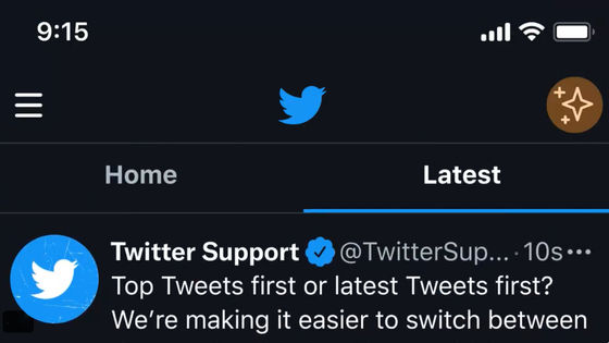
Twitter made a design change with the update on March 10, 2022, but it was flooded with criticism from users so that 'specification deterioration' entered the Twitter trend. In response to such user's voice, Twitter announced on March 14, 2022 that the update will return to the previous specifications.
We heard you –– some of you always want to see the latest Tweets first. We've switched the timeline back and removed the tabbed experience for now while we explore other options. Https://t.co/euVcPr9ij6
— Twitter Support (@TwitterSupport) March 14, 2022
In the update made to the Twitter app on March 10, you can switch between viewing the 'top tweets' suggested by the app for popular tweets or viewing the 'latest tweets' in order with a tab. something like. It was announced in October 2021 that it will be tested on the Web version, but at the time of the announcement, criticism that 'I want you to display the latest tweets preferentially' and 'Few users are using top tweets' Many voices were raised.
Top Tweets first or latest Tweets first? We're making it easier to switch between the two timelines and know which one you're scrolling.
— Twitter Support (@TwitterSupport) October 12, 2021
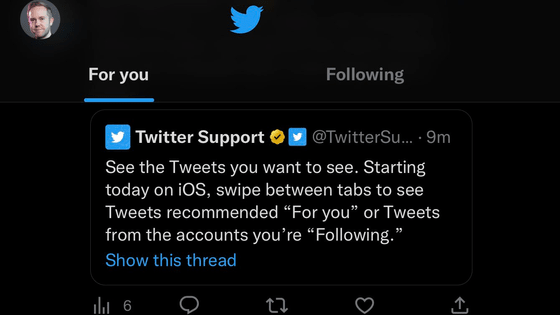
Now testing with some of you on iOS: swipe between 'Home' and 'Latest' on the Home tab to choose which Tweets you see first. Pic.twitter.com/LoyAN4cONu
When it was implemented for all users on March 10, it was announced that 'you can switch between the latest timeline and top tweets by simply swiping', but the 'Home' tab to see top tweets is always the first. Not only is it unnecessary for users who want to keep up to date with the latest timeline, but it also adds to the effort. Therefore, there are so many criticisms that comments such as 'It can be a reason to stop using the Twitter app' are received.
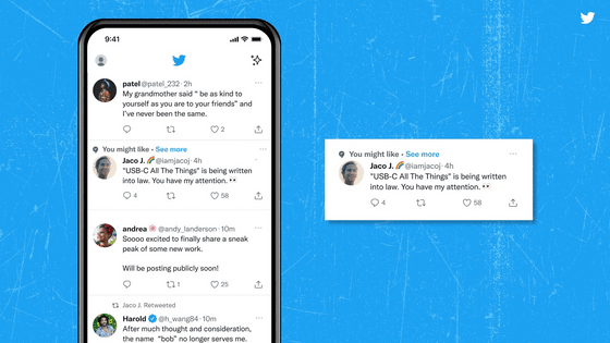
The Home and Latest timelines are now just a swipe away for everyone on iOS, and soon on Android and web.
— Twitter Support (@TwitterSupport) March 10, 2022
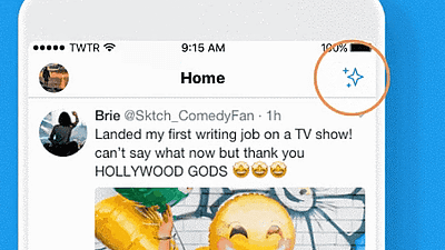
Tap the ✨ icon to pin (or unpin) the Latest timeline to your Home tab for easy access. Https://t.co/cj7ofY3CZq pic.twitter.com/XR0ALOQ5Y6
As a result, the tab display in the Twitter app was removed on March 14th to reflect the user's voice, and it will be rolled back to the specifications before March 10th. According to The Verge , an American news site, 'Top tweets that are chronologically disjointed in'recommended order'can be confusing in situations where the latest news, such as Russia's invasion of Ukraine, is in the spotlight.' Explains why the criticism of Twitter's specification changes was so great. The Verge also reports that Twitter has stated in a statement that 'Twitter is considering other changes to the timeline in the future.'
In 2016, Twitter changed the specifications of the timeline to 'display important new tweets at the top' instead of chronological order, and in September 2018, 'live of the account being followed at the top of the timeline'. We are updating by displaying the distribution, but every time the user criticizes us, we are withdrawing the function.
Twitter is developing a new function that allows the user to control the display method in response to criticism of changing the timeline display --GIGAZINE

Related Posts:
in Software, Posted by log1e_dh

