What is the average 'color' of the world as seen from satellite images?

Some countries in the world have a humid climate and a large forest area, while others have a desert climate and are full of sand and snow. Mr.
Average colors of the world – Data Stuff
https://erdavis.com/2021/06/26/average-colors-of-the-world/
The average color of the world released by Erin looks like this. Although there is a lot of green on the whole, part of the African continent is dyed yellow and the Australian continent is dyed reddish brown.

Looking at it in detail, Africa looks like this. Egypt, which mostly belongs to the desert climate, is almost sand-colored. You can see that the countries just below the equator, such as the Republic of the Congo, have a lot of greenery.

Asia including Japan looks like this. There is a lot of green on the whole.

Europe is even more green.

South America is also almost green.

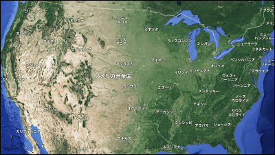
The United States is color-coded by state, and you can see that the green becomes darker from the west to the east.

In creating these images, Mr. Erin said that he used the artificial satellite system 'Sentinel-2' that was also used for ' identifying colonies from penguin poops ' and ' identifying the whereabouts of victims from one image'. .. Sentinel-2 is used by the European Space Agency for surface observations such as forest monitoring, and its satellite images and other data sets are open to the public for free.
Related Posts: