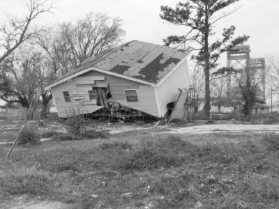
"Death Map" which shows how many dead people are in natural disaster
In the United States from 1970 to 2004, it seems that there are things on the map that observed in which area deaths are caused by natural disasters. There is also a map showing what kinds of natural disasters are many, which may be helpful for traveling to the United States.
The contents of the map are as follows.
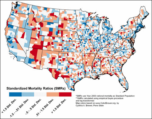
Death map USA: Natural disaster hotspots revealed - environment - 17 December 2008 - New Scientist
This is "Death Map". The white part is standard, the more blue it is, the less deaths are caused by natural disasters, the more it gets red.
Subsequently, a map showing what types of disasters are many.
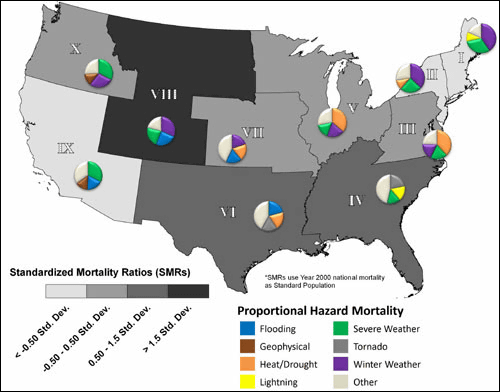
Blue is "Flood", Brown is "Earthquake / Broken Crack," Orange is "Heat · Drought", Yellow is "Thunder", Green is "Bad weather (heavy rain)", Dark gray is "Tornado", Purple is winter Weather (snow and avalanche, etc), light gray as "other"
Mortality indexMap showing.
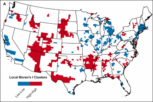
When you look at the above three maps, you can see that there are many deaths due to natural disasters in the Midwest. Even in relatively peaceful areas there are concerns about natural disasters, it seems to be a difficult problem to choose where to live.
Related Posts:


in Note, Posted by darkhorse_log