Why you should use percentiles instead of averages when measuring website performance

Shortening the response time of websites and APIs not only leads to a user experience, but also brings many benefits such
How percentile approximation works (and why it's more useful than averages)
https://blog.timescale.com/blog/how-percentile-approximation-works-and-why-its-more-useful-than-averages/
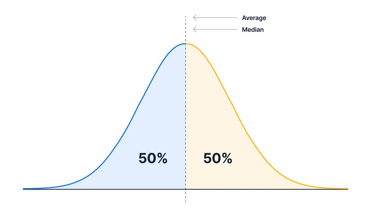
When a large amount of data is collected, there are values such as 'Average', 'Median', and 'Mode' that represent the characteristics of the data. The average value is the total of the data divided by the number, the median is the value at which the number of data is divided into upper and lower halves, and the mode is the value with the highest number of occurrences. For example, in the case of a normal distribution as shown in the figure below, the mean, median, and mode are all the same and exist on the central dotted line.
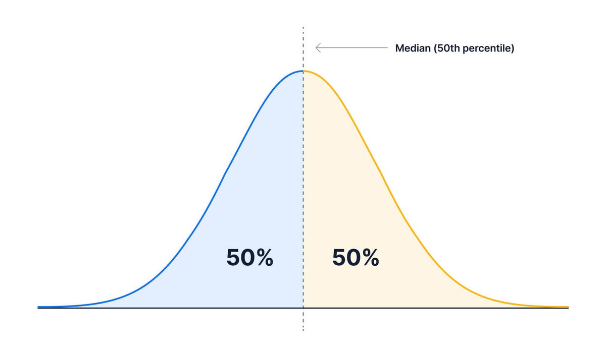
The percentile is defined by 'what percentage of the data is below that value'. For example, the value that divides the number of data into 50% is called the 50th percentile, and it has the same value as the median.
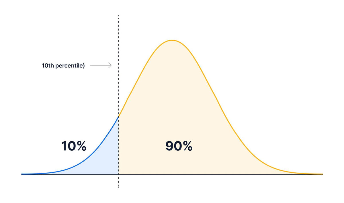
In addition, if it is '10th percentile', it means that 10% of the number of data is smaller than that value and 90% is more than that value ...
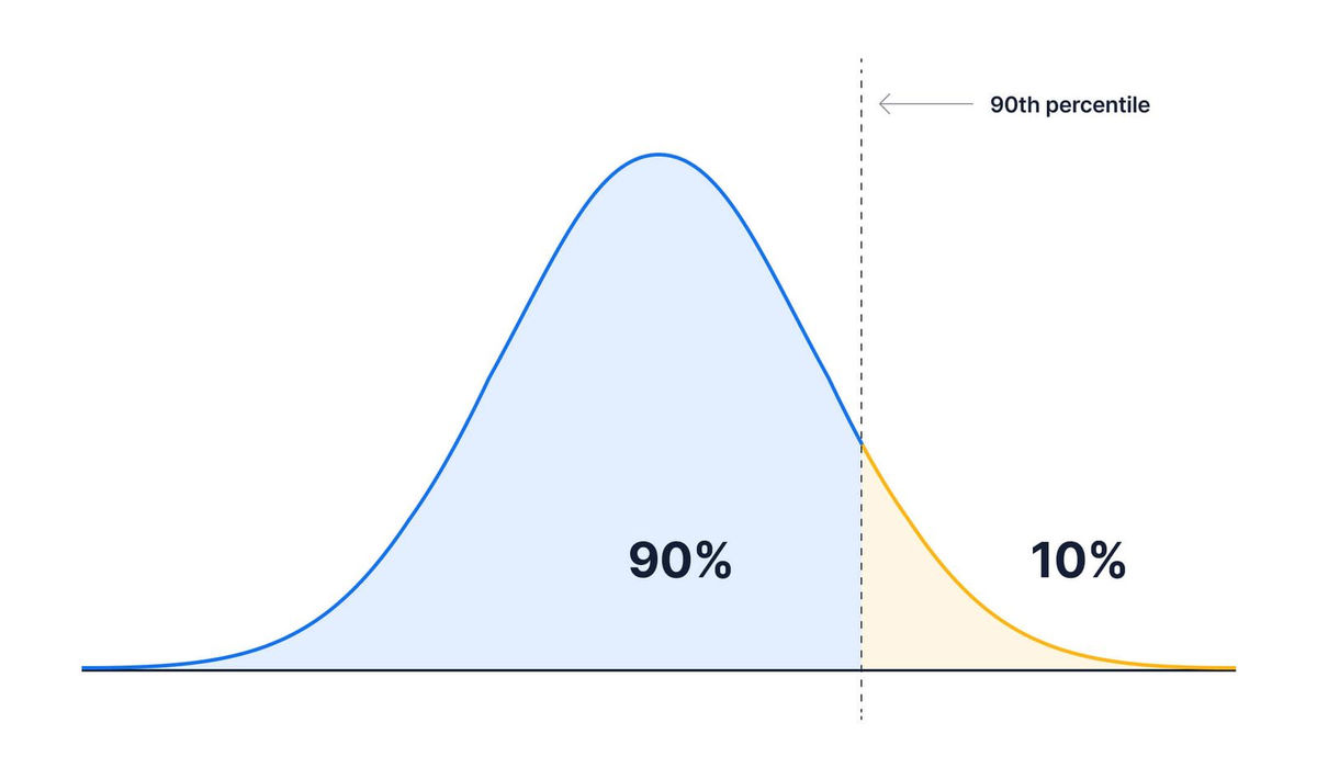
If it is '90th percentile', 90% of the number of data will be the value of the point that is smaller than that value.
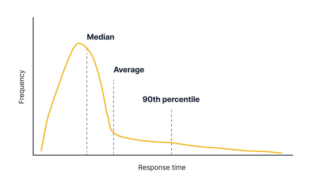
In the actual API, in most cases, the response takes a certain time, but in rare cases, the response becomes very slow, and the graph is as shown in the figure below.
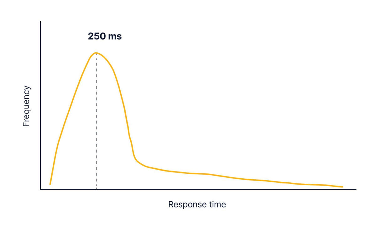
Such a graph is called a long tail distribution as if it were a tail, and in the case of API response time, the average value is significantly larger than the median due to the influence of a small number of slow responses.
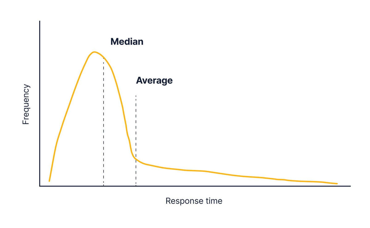
If you change the system and some responses take a long time, the graph will change as shown in the figure below. The median isn't moving much, but the mean is heavily affected, and it looks like the mean is a good way to track changes in API response time.
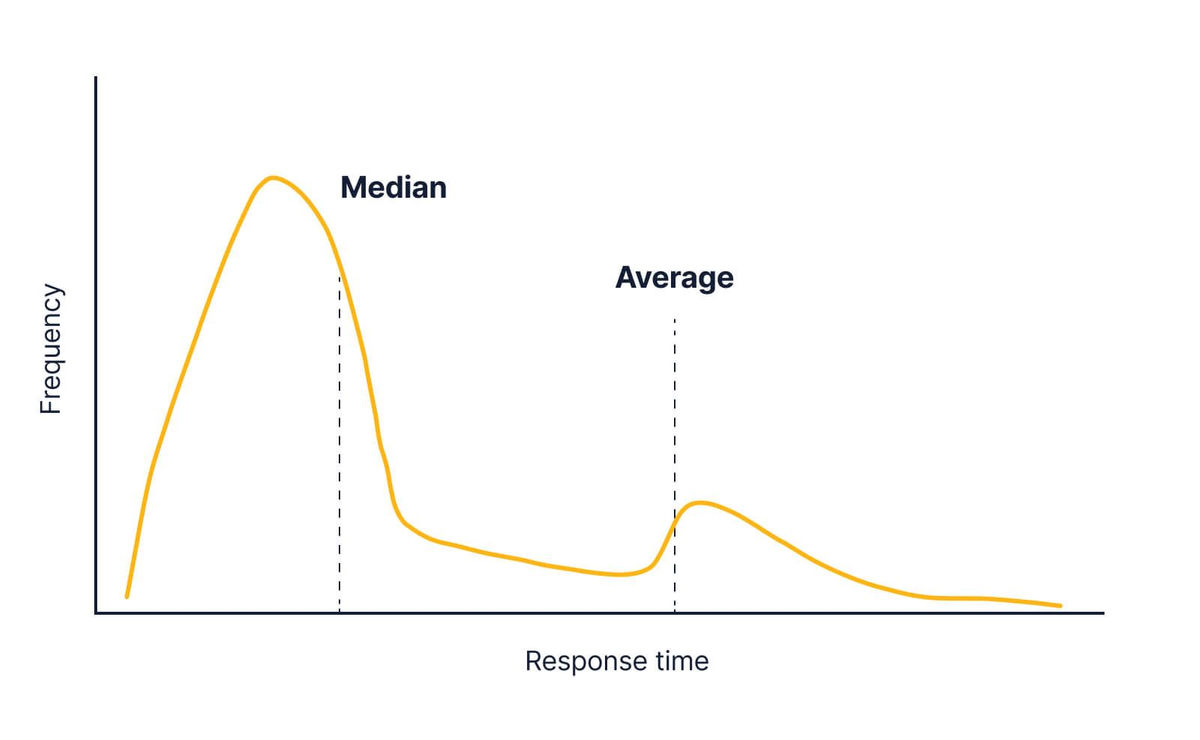
However, if some people request a very time-consuming query like 'download all past data', it will result in an incredibly long response time, just a few huge pieces of data. May move the average value significantly.
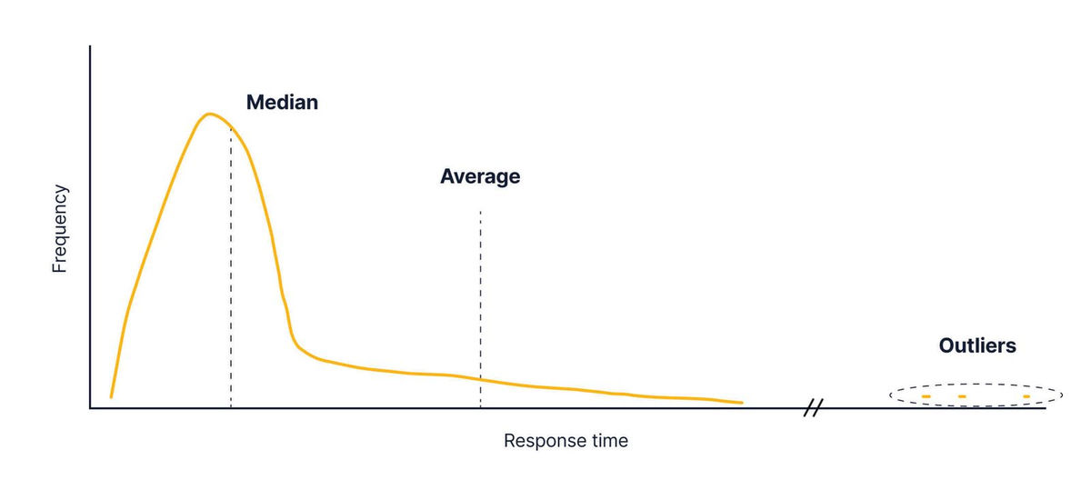
If it affects many of the users, it is necessary to wake up the engineer at midnight and make corrections, but on average, there is a serious response time delay, and only a few heavy queries are issued. It is not possible to distinguish whether it is just or not. That's where the percentile value comes in. For example, if you look at the 90th percentile value, you can see that it took more time than that value with a response of 10%.
The 90th percentile value, unlike the average value, is largely unaffected by a small number of outliers.
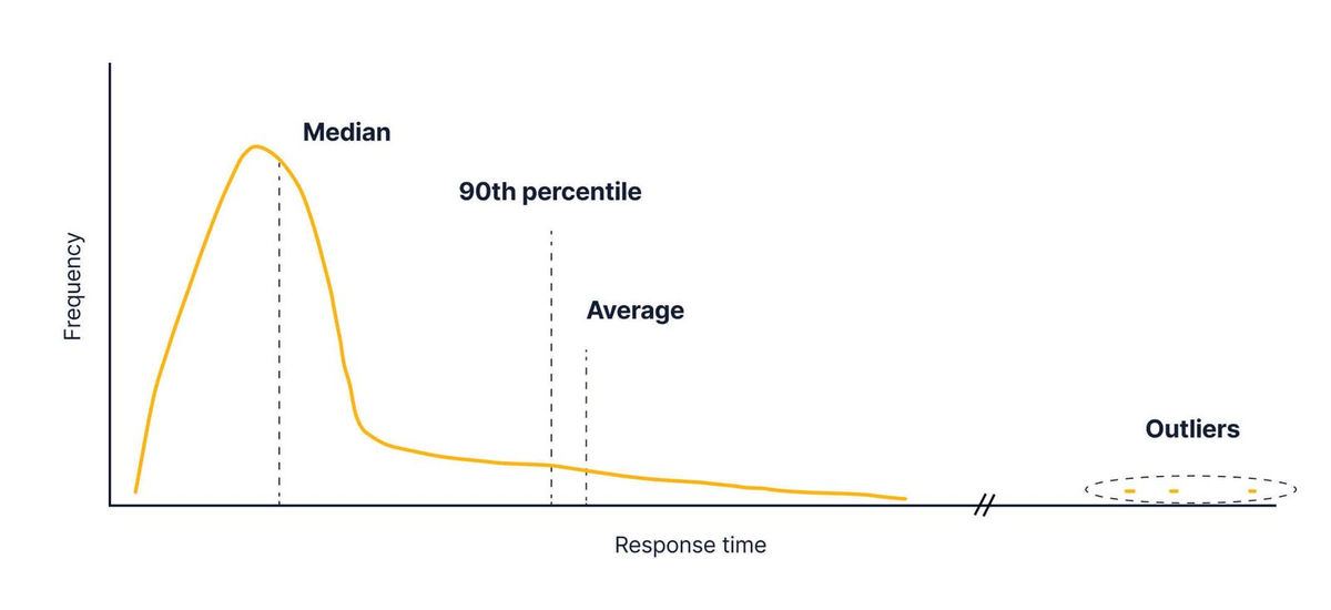
On the other hand, if more than 10% of all API responses are delayed, the 90th percentile value will change significantly. Therefore, it is suitable for detecting only serious cases such as when 10% of users are affected.

Related Posts:


in Note, Web Service, Web Application, Posted by log1d_ts