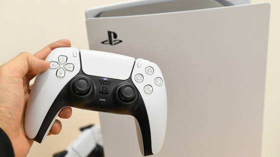
The user experience of PlayStation 5 looks like this, it is possible to display the progress and hints of the game
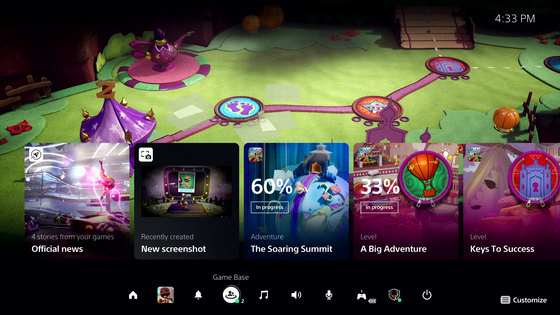
The user experience (UX) of '
PlayStation®5 user experience (UX) unveiled for the first time! – PlayStation.Blog
https://blog.ja.playstation.com/2020/10/15/20201015-ps5/
You can actually see how the UX of PlayStation 5 is designed in the following movie.
First Look at the PlayStation 5 User Experience-YouTube
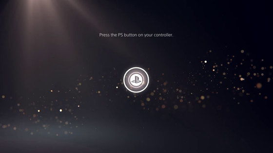
Launch PlayStation 5
Glittering particles of light are flowing ...

'Press the PS button on the controller'
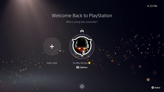
User profile selection screen
Then move to the control center, which is the home screen. With PlayStation 5, it is now possible to instantly access almost all the functions required during the game without ending the game by pressing the PS button on the controller once. The menu is displayed at the bottom of the screen.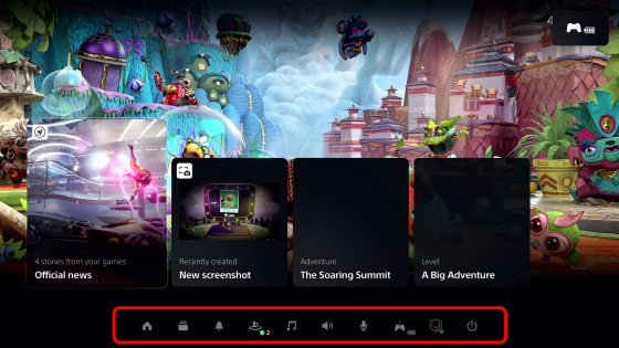
What was reflected in the background of the control center was '
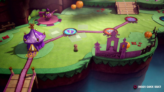
'Game Base' is a function to check friends and communities.
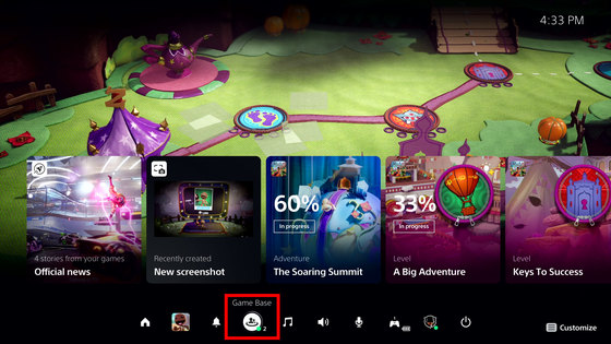
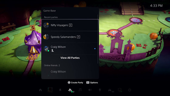
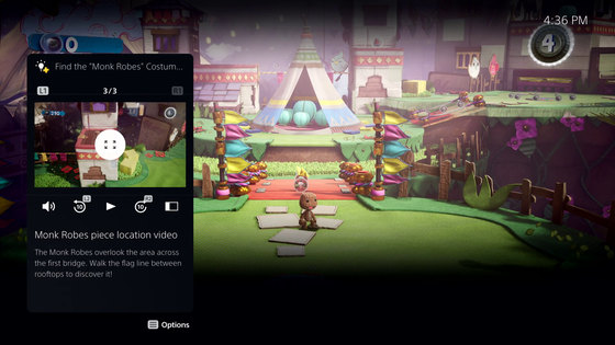
In addition, an activity function has been added for the first time to display the progress and hints of the game being played.
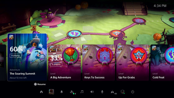
By checking the next goal to be done in the game, you can search for the item you missed ...
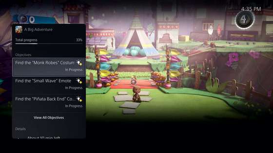
It will navigate you with a video of how you can clear your goal.
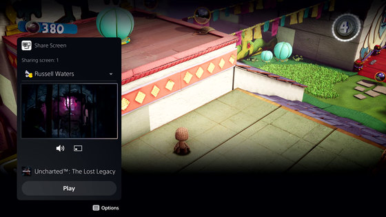
Also, it seems that it is especially easy to interact with friends. Watch captured images and videos of games uploaded by your friends while playing another game ...
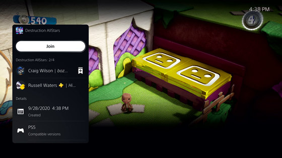
It is possible to participate in a friend's game.
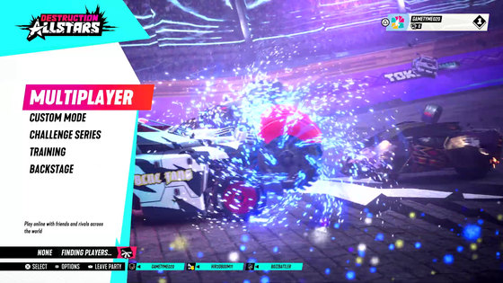
Launched '
Take a screenshot alongside your friends.
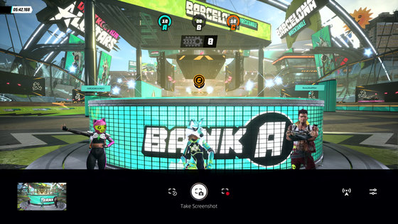
Share the screenshots you take online.
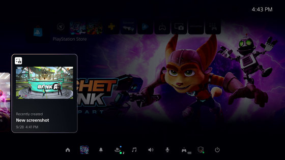
It can also be linked to Twitter.
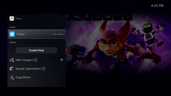
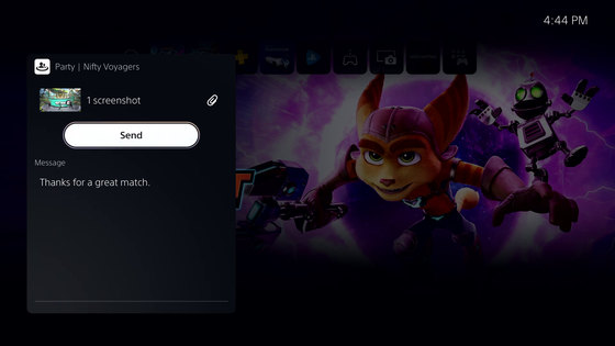
You can also share it by sending a message to your friends as it is.
The menu to turn off the power looks like this.
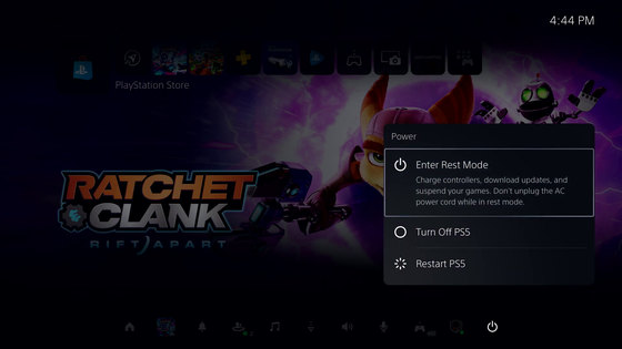
In addition, the PlayStation development team added that 'Since we shot in the development environment, there may be some changes before the release.'
Related Posts:

