Visualizing the magnitude and depth of earthquakes that occurred between 2017 and 2018 on a global scale

When an earthquake occurs, information on the seismic intensity and epicenter of each place is reported in a preliminary report, but unlike the seismic intensity actually felt, the depth and scale of the epicenter are difficult to understand intuitively even if they are indicated by numbers.
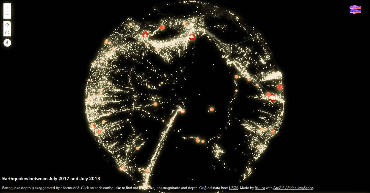
Earthquakes between July 2017 and July 2018
https://glowy-earthquakes.glitch.me/
Earthquakes with exaggerated depth (and CSS filters of course ????) just had some fun for # 30DayMapChallenge .Check it out on Glitch: https://t.co/nqSa2NXN16 pic.twitter.com/exaCuVieXf
— Raluca Nicola (@nicolaraluk) November 1, 2019
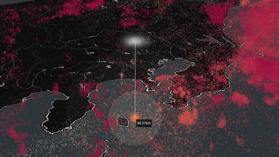
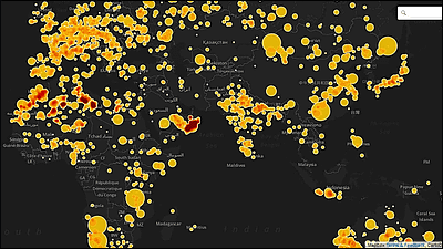
When you visit the site published by Nicola, the epicenter map will be displayed. The epicenter is displayed with countless points on the earth where the land is drawn with thin lines. The position of the point indicates the depth of the epicenter, and the size of the point indicates the magnitude. In addition, in order to display the epicenter easily, the depth has been expanded by 8 times. The earthquake data is published by the US Geological Survey (USGS).
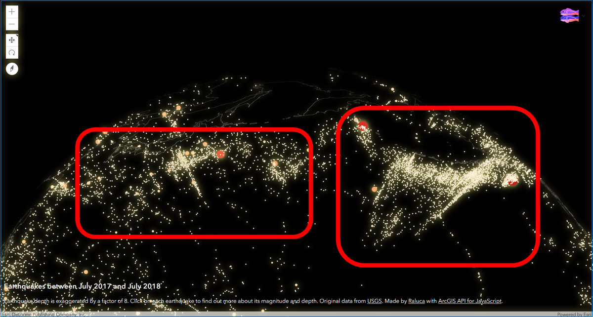
The globe can be moved freely by dragging, and you can zoom in and out with the mouse wheel. For example, when zooming around Japan, an earthquake-prone country, it looks like the following. The epicenter is off the Pacific and is concentrated along the red line ...

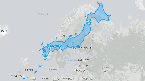
Compared with the following figure released by the
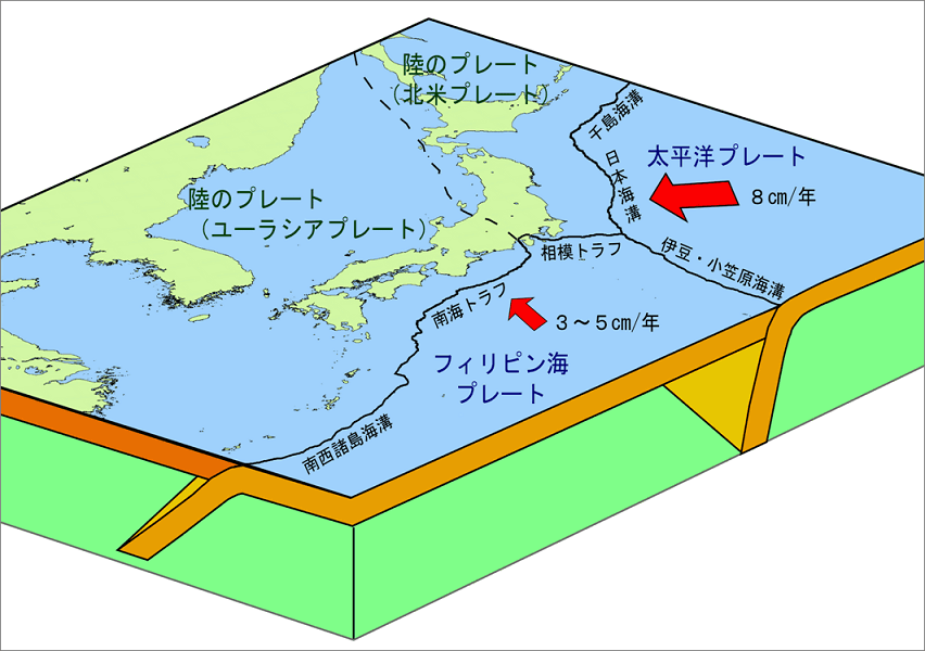
In addition to the offshore Tohoku region, the Pacific Plate is also sinking into the North American Plate in the
Nicolas, who develops a globe that can be operated from a web browser with the web API ' ArcGIS API for JavaScript ' for mapping application development, creates this epicenter map as part of the hackathon ' # 30DayMapChallenge ' that creates a map with the given theme I was told. Nikola's epicenter map is published using Glitch , a service that allows you to publish web apps for free.
Related Posts:
in Science, Web Application, Posted by log1i_yk