Commentary on the essence `` obvious is the supreme '' reached from Google's repeated design changes

by
Google has created various products such as Google search and Gmail, but there is a joint project ' Google Design ' by designers and developers to gather the knowledge gained while designing such products. Google Design explains that important elements in user interface (UI) design are summarized as “the obvious UI is the supreme UI ”.
The Obvious UI is Often the Best UI-Google Design-Medium
https://medium.com/google-design/the-obvious-ui-is-often-the-best-ui-7a25597d79fd
Designers design their products to be as easy to use as possible and as inductive as possible. In order to emphasize product functionality, designers need to understand the exact needs and challenges of their users, but that takes time. Google Product Director Luke Wolobsky says `` obvious design wins '' and argues that `` clarifying the design '' by simplification is important in mobile UI design .
◆ Burger icon on the bottom navigation bar
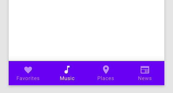
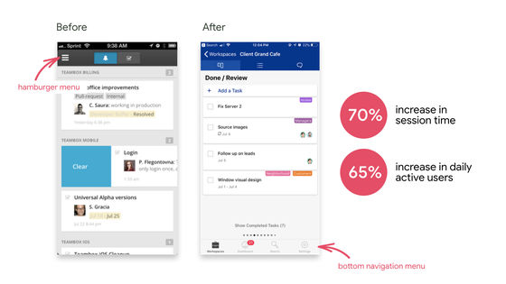
In fact, Mr. Wolobsky analyzed the user engagement rate of apps that switched from “ hamburger icons that are unclear what to use” to “ navigation bars at the bottom of the screen”, and the more obvious navigation bar is more obvious It ’s a design, and you know it ’s suitable for UI design.
“The navigation bar clearly shows what you can do in the app, and it ’s more obvious what you can do and what you should do than the obscure hamburger icon. The rate will also increase (each function will be used more). '
When the project management application
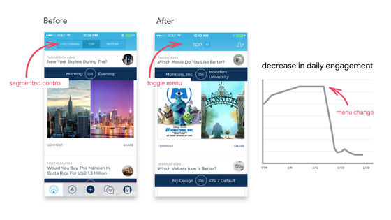
On the other hand, Mr. Wolobsky also points out that “the obfuscation rate decreases when the function is difficult to see”. When the UI design was changed to hide the control menu (left), which was segmented at the top of the screen, in the toggle menu (middle), the engagement rate was drastically reduced (right).
◆ Bottom navigation bar and accessibility
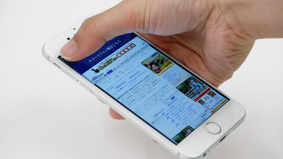
Making the design clearer can have the side benefit of making the design more accessible. Ergonomically, users with large display smartphones and tablets basically hold the device with one hand. In that case, the navigation bar at the bottom of the screen is easier to tap than the hamburger icon at the top left of the screen. In other words, from the viewpoint of accessibility, the bottom navigation is more “accessible” than the hamburger icon.
Google brand manager Orb Lily said that users with muscular dystrophy and other movement disorders are not always at the top corner of the screen and can tap the icon at any time, “The bottom navigation bar can be a game changer. 'We point out that an obvious design is excellent from an accessibility perspective.'
◆ 'Clear icons' are not always 'universal icons'
The obvious design not only makes it easier to understand where the various components that make up the product are stored, but also has the advantage of making it easier for users to understand the UI actions and options.
For example, not all users can immediately understand how icons and symbols in an app work. The symbol “$” means “money” in the US, Canada and other countries, but in other countries it is not treated as a symbol meaning currency, so it is a symbol that represents “money” to all users. It is not always understood that there is.

by
Also, those who grew up using a computer with a floppy disk can easily understand what the floppy disk indicates, and it should be easy to understand that it is an icon that means saving data. However, it is difficult for the younger generations who have come to touch the computer after the floppy disk is no longer used to understand what the floppy disk icon shows.

Therefore, Google Design introduces two proposals that can be used to maintain universality in the icon design used in the UI.
1: Pair text and icon
Also, by combining text and icons, you can immediately understand the function of each button, which will improve the accessibility as a product.
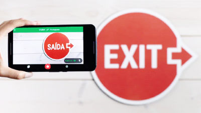
In fact, Google has incorporated this technique of “pairing text and icons” into Google translation, and as a result, the usage rate of the “handwritten translation” function has increased by 25%. Although the handwritten translation function itself has existed for a long time, Google Design speculated that many users could not understand the value of the function because it did not have a detailed description on the icon, and it was not used.

2: Add text / hint text / icon with text
For those who are accustomed to using cloud services, the upload button shown with a cloud icon etc. is familiar, but for users who are not familiar with it, it is written as `` UPLOAD (upload) '' etc. with only text rather than a cloud icon It may be easier to understand if you are.
'Google Photo' changes the side menu icon to an icon with text, and adds a hint text in the search bar to help you 'how to use it'. The UI design change was made to change the icon next to the search bar to text only, which was difficult to understand for what purpose. As a result, the usability of Google Photo has been greatly improved.

◆ Copying the UI of other products does not result in a clear design
To keep design clarity, copying another app's UI doesn't make it the best design for your app. It's easy to copy the features of a popular app and assume it's a good design, but it's possible that a specific design pattern suitable for each app is used.

by Sara Kurfeß
◆ What is necessary to find an obvious design is to “get closer to the problem”
Without analyzing long-term usage data or hiring researchers, we cannot find a “design that is obvious to the user”. If you are not the target user of the product, you can observe and learn from the user and repeat it to get close to the product's problems.
Find problems with the product by talking to existing users, or by assuming that you are the user and not the work that requires enormous research and large amounts of data. It seems possible.
As a means to uncover problems, Mr. Wolobsky recommends the “ RITE method (fast iteration test evaluation)” that “fast changes” “UI changes”. “While every week we have the subjects check the design changes we ’ve been working on in a week and observe how they ’re going to use it, so they ’ll always be immersed in users and potential customers. “It ’s going to be like,” commented on the effect of the RITE method.
In other words, spending the same amount of time with the user on a regular basis often confirms that the design is more appropriate and “obvious”.
Related Posts:
in Design, Posted by logu_ii
