Basic design principles for reducing "cognitive load" which is the cause of difficult-to-use applications / websites

ByNicola Albertini
When using the website or application for the first time, we are working on how to manipulate the contents unconsciously, that is, "Do you tap" "Do you slide?" "Where is the menu?" I will. In order to operate the content for the first time, it is necessary to temporarily memorize various information, but at this time, if the task exceeds the limit of capacity which can keep memory at once by too many tasks, I do not know, "I will quit using my website or application on the way. Too many tasks to process are said to be "cognitive load high", but the basic principle of minimizing this "cognitive burden" as much as possible in making websites and applications is web design creation serviceMarvelIt is open to the blog.
Design Principles for Reducing Cognitive Load - Marvel Blog
https://blog.marvelapp.com/design-principles-reducing-cognitive-load/
◆ What is cognitive load?
It is said that cognitive load is generally increased when there are the following factors.
1: There are many choices
2: I often think about it
3: To be ambiguous
If the above three elements are often found in websites and applications, it will be difficult for users to understand the content and usage when viewing the contents, psychological burden will be increased.
◆ How to reduce cognitive load
As a general rule of reducing cognitive burden, the following can be mentioned.
1: Reduce unnecessary elements

ByKit
The basic way of thinking for creating a good design is "to have less than a lot", that isBeing simple. The same can be said about cognitive loading, and elements that do not help users achieve their objectives can only increase the user's work and eat memory capacity. Avoid extra colors, images, design decorations, layouts etc. that do not create value. However, be careful that you are asking for simplicity too much, which makes it difficult to understand.
2: incorporate a universal design style
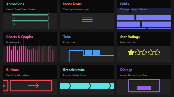
The design style mentioned here means "to use a hamburger icon to indicate that it is a menu" or "to use five stars to indicate the height of the evaluation". Because the user already understands how to use universal design style, the user can achieve the purpose without learning new usage. If the universal design style makes sense, please incorporate it into the content.
3: Reduce unnecessary tasks
ByDaniela Meleo
Please remember that all mechanisms that prompt users to read sentences, store information and make decisions increase cognitive load. As a difficult thing, to minimize these tasks to concentrate the user on achieving the goal. Let's reduce the number of tasks by accumulating mechanisms such as making default settings and automatically reflecting previously input information.
4: Minimize choices

ByQuinn Dombrowski
In the case of selling 24 kinds of jams and the case of selling 6 types of jams, there is a research result that the total sales are significantly larger than the six kinds of jams, although the response to the commodity does not change very much. this is"(PDF file)Decision paralysisIt is a phenomenon called "phenomenon called" If you put a huge choice before, people say "I will not buy because I do not understand well" that he will hold the decision. Decision paralysis is caused by high cognitive load. Minimize the number of choices, especially navigation, input forms, pull down menus, so that users can make decisions within a given time.
5: Display alternatives as one chunk

ByDarwin Bell
When choices are divided into chunks and some of the chunks are not displayed on the screen, the user tends to think that the option appearing on the screen is "all choices". In addition to the problem of reducing the choices that the user can select, this causes the problem that the user can not make a decision because there are no options to choose. Instead of dividing the choices into several chunks, it is important to display them as one chunk.
6: pursue readability

ByChris Piascik
Content is not merely "easy to read", but also "interesting" that draws interest from the reader is necessary. In other words, typography should be beautiful, suitable for the content, and easy to read. And while pursuing the charm of typography, it is necessary to reduce the factors that interfere with the user's understanding of the content.
7: Use icons carefully

ByCursor Creative House
From past research, icons are difficult to memorize, they are not intuitive, and we know that they increase cognitive load. However, already popular icons such as "print", "play / stop", "tweet", "Facebook" etc. can make people work well. If you use icons, it is best to display them together with text labels for clarity.
Related Posts:


in Design, Posted by darkhorse_log