What is the font 'FE-Schrift' created to prevent license plate camouflage?

by
There are various fonts (typefaces) in the world, and differences in fonts change the impression that people receive from letters, or make them more impactable even in the same writing. The font “ FE-Schrift ” is a special font developed for the purpose of “preventing license plate disguise”, and it is now used in many countries.
FE-Schrift-Wikipedia
https://en.wikipedia.org/wiki/FE-Schrift
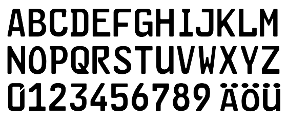
FE-Schrift's FE is the acronym for German 'Fälschung (altered)' and 'erschweren (prevention)', and Schrift means German font. FE-Schrift is a sans serif font born in Germany. There is no character decoration ( serif ), and the width of the slightly thick and even character is not only easy for machine reading but also effective for preventing forgery of license plate And that.
Originally in Germany, the Sans serif font of the type DIN 1451 was widely used in transportation, administration, and technical fields including the license plate. However, with the rising threat of terrorism by the German Red Army in the 1970s and the increase in license plate theft, the idea of requiring a new font to replace DIN 1451 has grown.
Although DIN 1451 is an easy-to-read font, it has a weakness that it can be easily disguised as another character by adding a little black paint or drawing a character with black tape. For example, by changing 'P' to 'R' or rewriting 'L' or 'F' to 'E', it is possible to disguise the license plate and scratch the inspection. On the other hand, it is difficult to hide part of the character with white paint because of the problem of the paint.
by
Therefore, the font developed by Karlgeorg Hoefer, who worked for the German Federal Institute for Highway Studies, in cooperation with Giessen University , was FE-Schrift from 1978 to 1980. In FE-Schrift, the width of the lines was set equal to improve the readability of the machine, and improvements were made to make it difficult for each letter to be mistaken for another letter.
Above all, what was stressed in developing FE-Schrift is 'to make it difficult to falsify by adding lines to the text.' The image below is the one with FE-Schrift at the top with the text ' PBF ' and the red below is trying to falsify ' PBF ' to ' R3E '. At the bottom is the correct 'R3E' written by FE-Schrift. If you look at each of them and compare “P” and “R”, the shape of the upper part is different, or there is a difference between the straight and curved points, “P” can not be easily rewritten as “R”. You can see that it is Similarly, even with similar characters such as 'B' and '3', 'F' and 'E', tampering is made difficult by intentionally creating subtle differences in shape.

It was a highly developed FE-Schrift, but by the time it was completed in 1980, the pressure to adopt a new font was weakening, and eventually it was about to be forgotten without being used. However, in the 1990s, there were more cases of stolen cars being transported to Eastern Europe after the disappearance of the
Since FE-Schrift was a machine readable font, it favored adoption as it was convenient for automatic license plate recognition technology using optical character recognition (OCR) . The introduction of license plates using FE-Schrift started in the eastern German states in 1994, and since 1998 the share format of the Europlate was defined, the number of adopted countries has increased.
In recent years, not only Europe, but also Central Asian countries such as Uzbekistan and Armenia, South American countries such as Uruguay and Argentina, African countries such as South Africa, Kuwait, etc. adopted by FE-Schrift or arranged based on FE-Schrift The font which added the is used.

by Hans
Related Posts:
