'User Inyerface' that lets you realize how much you usually read the text and browse the website

When using web services on the Internet, you need to register personal information such as your e-mail address and agree to various terms. However, there should be many people who have read the terms of service and fine words in practice. ' User Inyerface ' uses a site design that dares to lead users' misunderstandings, so it's a game-like feeling, 'How much of a message on the website has been read out on a daily basis?' It is a site that you can experience.
User Inyerface-A worst-practice UI experiment
When I visit User Inyerface, the message, 'Well, welcome to User Inyerface. Here we will explore user interaction and design patterns in a challenging way. Please fill out the form as quickly as possible to play the game.' It is displayed in green letters on a blue background. It is likely that you will click the green button that is displayed large below it, but if you look closely the button will say 'NO' and nothing will happen when you click.
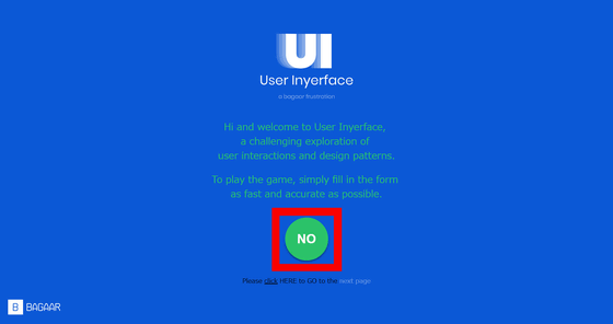
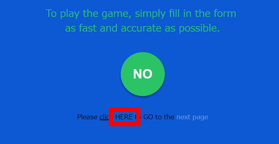
If you look closely, you will find the text “Please click HERE to GO to the next page (click here to go to the next page)” under the NO button. However, clicking on the underlined 'click' or 'next page' with a different text color has no effect. Then click on 'HERE' ...
A timer and a field have appeared. At the same time, the message 'This site uses cookies. Do you have any problems?' Appears at the top of the page with a red background. You will want to click on the 'Yes' button that will appear large to dismiss the message, but it will 'Not really have to be clicked to indicate that there is no problem?' If you click, no message disappears.
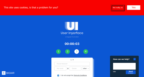
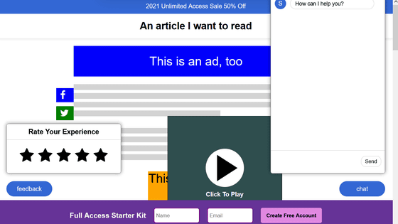
The timer displayed in the center of the screen is constantly advancing while being shaken by the message of cookie permission. When one minute passed, the warning 'Hurry up, time is ticking!' Was popped up and the screen was locked as shown in the following image. Click on the upper right to delete the popup but ...
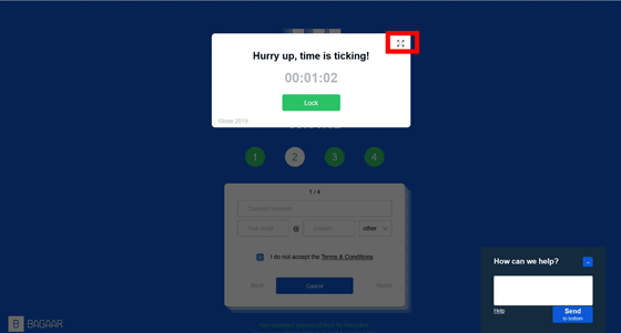
If you look closely, the result was that the pop-up covered the entire screen because it was not the 'x' but the enlarged icon that was in the upper right of the pop-up.

You can not delete the pop-up by all means, so 'Unable to close popup. What should I do?' In the 'How can we help?' 'Can't do it. What should I do?' And enter a question and click 'Send'. But if you look closely, you will notice after clicking 'Send' followed by 'to bottom' after clicking.

As it was written on the button, the help section which sinks quietly out of the screen. The screen below is where I feel sad that no one will help anymore.

Re-access again, this time enter the password and e-mail address by haste without shaking aside. Taking advantage of the previous reflections, we have found that the central prominent button is 'Cancel' and click 'Next' on the left.

However, an error was displayed and it was not possible to register the entered information. If you look closely, under the input field, there are detailed conditions such as '10 or more characters for password', 'Capitalize at least one character in password', 'Enter at least 1 character for password', etc. Was written in green letters. However, the color is too hard to see, the font size is too small, and visibility is the worst.

I tried to re-enter a password or e-mail address that satisfies the conditions, but after 1 minute passed, the timer pop-up was displayed again and I was in a state where I could not help it.

There are many other tricks in User Inyerface, so if you are concerned about it, please check it with your own eyes.
Related Posts:
in Review, Web Service, Posted by log1i_yk
